Article Contents:
- Why the wall behind the sofa is the main one in the living room
- What makes the wall behind the sofa truly strong
- Which molding schemes work best
- One wide frame in the center
- Three vertical panels
- Central accent panel and two smaller side ones
- Panels with a top decorative element
- Panel zone plus cornice and high baseboard
- How to choose a composition based on room size
- Small living room (up to 16 m²)
- Medium living room (16–25 m²)
- Spacious living room (from 25 m²)
- Narrow wall behind the sofa
- Wide wall without windows
- Living room combined with a dining room or kitchen
- Which moldings and stucco are suitable for a neoclassical living room
- Smooth profiles: when appropriate
- Medium complexity profiles: for more pronounced classic style
- Decorative corner elements
- Why proportion is more important than ornament
- How to combine decor with lighting, paintings, and a console
- Empty painted wall inside a frame
- Wall sconce with moldings
- Painting and mirror inside a frame
- Console in front of a sofa
- Color solution: tone-on-tone or contrast
- Tone-on-tone: safe and elegant
- Nuanced contrast: acceptable and beautiful
- Sharp Contrast: Only Consciously
- Ready-Made Kit or Custom Layout: A Balanced Comparison
- Custom Molding Layout
- Ready-Made Set of Decorative Molding
- Common Mistakes When Decorating the Wall Behind a Sofa
- Too Small Frames on a Wide Wall
- Too Complex Ornament in a Small Living Room
- Lack of Connection with the Sofa
- Decor on All Walls Simultaneously
- Conflict of Moldings with Sconces
- Uncoordinated elements from different collections
- How to choose a solution for a specific living room scenario
- About the Company STAVROS
- Frequently Asked Questions
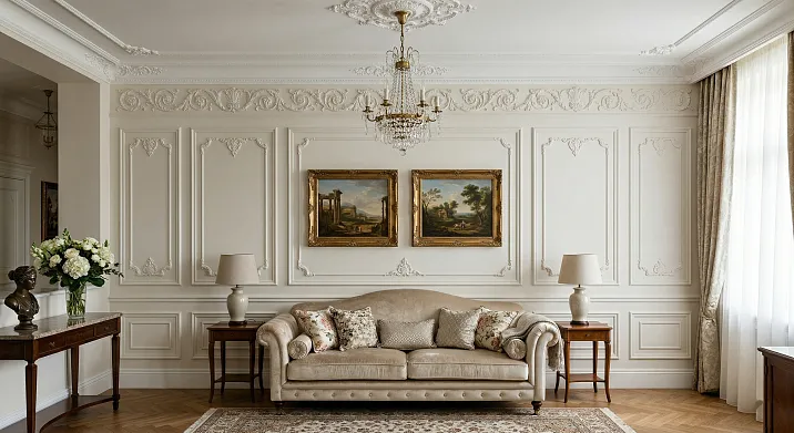
The sofa is in place. The wall behind it is empty. And it's precisely this feeling of incompleteness that haunts most homeowners after renovation: the furniture is arranged, the lighting is chosen, yet the main wall of the living room still looks like an unfinished draft. Sound familiar? It's not a question of budget or taste—it's a question of missing architectural design.
Wall behind the sofa with moldings— is one of those techniques that works flawlessly in neoclassicism: it transforms a flat painted surface into a full-fledged architectural object, sets the character for the entire room, and unifies the relaxation area into a single visual system. And it doesn't require complex installation or palace-scale stucco ceilings.
This article provides a detailed practical breakdown. Which wall decoration schemes behind the sofa work best. Which moldings to choose for a neoclassical living room. How to avoid mistakes with proportions and not overload the space. And how to link the wall decor with the sofa, sconces, console, and everything else that shapes the main space of the apartment.
Why the wall behind the sofa is the main one in the living room
Try entering the living room and fixing your gaze. Where does it go first? Almost always—to the sofa area. This is psychologically the most significant part of the room: it's the focal point, where socializing happens, where most of the time is spent.
The wall behind the sofa is the backdrop for this area. And what happens (or doesn't happen) on it determines 70% of the perception of the entire living room. An empty wall makes the sofa look 'abandoned' in the space. A wall with chaotic decor—paintings of different sizes, random mirrors, mismatched objects—creates a sense of disorder. A wall decorated with moldings in a system instantly elevates the interior to another level.
In neoclassicism, the accent wall behind the sofa traditionally serves as the main architectural object of the living room. This is where decor is concentrated: frames, panels, symmetrical compositions, sconces. The other three walls act as a calm backdrop, supporting the style through cornices, baseboards, and monochromatic finishes.
This is precisely what distinguishes Neoclassicism from other styles: not to 'decorate everything,' but to create one strong architectural focal point—and let everything else serve as the background.


What makes the wall behind the sofa truly strong
The strength of an accent wall lies not in the quantity of decor, but in its systematic arrangement. Three molding frames aligned along a single axis, symmetrical sconces at the same height, a mirror or painting integrated into the logic of the frames—that is architecture. Several paintings of different sizes hung 'by mood'—that is simply objects on a wall.
Moldings in the living roomwork precisely because they create structure: horizontal and vertical lines divide the wall plane into meaningful fields, establish rhythm, and form depth. The wall ceases to be 'just a wall' and becomes part of the interior architecture.
Our factory also produces:


Which molding schemes work best
Let's examine specific compositions—from simple to complex. Each scheme has its own logic, conditions for application, and typical mistakes.
Get Consultation
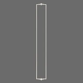
One wide centered frame
The most elegant and restrained solution. A single frame occupying the central part of the wall—equal in width to the sofa or slightly wider. Height—from the baseboard (or with a 20–30 cm offset from it) to a level approximately 30–40 cm below the ceiling cornice.
This solution works in several scenarios. When the sofa is small and the wall is not very wide—the frame holds the focus. When the interior is executed in soft, calm Neoclassicism without heavy decor—a single frame provides architectural character without unnecessary accents. When a painting, mirror, or an empty painted wall with a different shade is planned inside the frame—it creates a 'stage' for that item.
The main mistake here is a frame that is narrower than the sofa. It looks random and does not 'anchor' the seating area. The rule: the frame width should be no less than the sofa's width and no more than the wall's width with a 15–20 cm margin on each side.
Three vertical panels
One of the strongest scenarios for a symmetrical living room. Three frames of the same size with equal gaps between them create a clear, rhythmic, architectural image.
Proportions that work:
-
the width of each panel is 30–40% of the distance between them;
-
the height of the panels is 70–80% of the wall height (from a level 20–25 cm above the baseboard to 25–30 cm below the cornice);
-
the gaps between panels and from the outer panels to the wall corners are equal.
Equal gaps are a mandatory condition. Breaking the rhythm is immediately perceived as an error. It is precisely symmetry and rhythm that constitute the 'architectural language' of neoclassicism, distinguishing it from eclecticism.
Three panels pair well with three accent points: the central one for a mirror or painting, the side ones for sconces or decorative objects. Alternatively, three empty panels with monochrome paint create a strict, almost minimalist look in the neoclassical spirit.
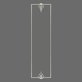
A central accent panel and two smaller side panels
A more formal option. The central panel is large, dominant, often with an additional decorative element inside or above it. The side panels are vertical, narrower, serving as architectural 'pilasters'.
This scheme works especially well in living rooms with high ceilings (from 2.8 m). The central panel visually 'anchors' the sofa area, while the side panels create a sense of a framed, formal space.
An important nuance: the central panel must be noticeably larger than the side panels—not just slightly wider, but one and a half to two times larger. If the difference is insignificant, the scheme loses its hierarchy and reads as 'three different frames'.
Panels with an upper decorative element
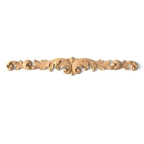
The next level of classical character. Above one or several panels—a decorative horizontal element: a rosette, a small cartouche, corner appliqués with a floral motif.
This solution is for those who want pronounced neoclassicism, not just a hint of it.Polyurethane decorative appliques— corner elements, rosettes, central appliqués—add relief and ornamentation inside or above the frames without the need to use bulky plaster moldings.
The main condition of scale: decorative elements must be proportional to the molding. A large ornamental cartouche above a thin molding is a visual dissonance. A corner element 80–90 mm wide is organic with 22–25 mm molding; an element 120–150 mm wide—with 28–35 mm molding.
Panel zone plus cornice and high skirting board
The most architectural of all scenarios. The wall behind the sofa is designed as a full-fledged architectural surface: a high skirting board 80–120 mm sets the lower base,Ceiling cornice— top, and molding panels form the structure of the wall's middle zone.
This scheme requires clear coordination of all elements: the baseboard, molding, and cornice must be from the same collection or visually similar profiles. Mismatched elements disrupt the integrity of the image.
The result, when executed correctly, is a living room where the wall behind the sofa looks like an architectural fragment, not like a painted surface with glued-on frames.
How to choose a composition to fit the room size
Scale is where mistakes are most often made. Small frames on a wide wall look toy-like. Large, heavy panels in a small living room feel oppressive and narrow the space. Let's examine specific scenarios.
Small living room (up to 16 m²)
In a small living room, the accent wall behind the sofa should be particularly delicate. Rules:
-
molding profile no wider than 20–22 mm;
-
one frame or a maximum of two vertical panels;
-
monochromatic painting — moldings in the same tone as the wall or half a tone lighter;
-
no decorative relief on corners or in the center of panels;
-
cornice no more than 40–50 mm.
One properly proportioned frame in a small living room gives more than three poorly chosen ones. Restraint is not poverty, it is precision.
Medium living room (16–25 m²)
Here there is already space for a more developed scheme. Three vertical panels or a central large frame with side ones—both options are appropriate. Molding—22–28 mm. A light nuanced contrast is acceptable: white-toned moldings on a cream or pearl wall. Decorative corner elements can be added.
Spacious living room (from 25 m²)
In a large living room, the wall behind the sofa can be truly formal. Three panels with a central accent one, decorative corner and central elements, an elaborate cornice, a high baseboard—all this is appropriate and works to create an architectural image. Molding—28–40 mm. Contrast is acceptable, as are sconces, a console in front of the sofa, and paintings inside the frames.
Narrow wall behind the sofa
If the sofa is placed against a short wall—the main task is not to enrich it with decor, but to 'stretch' it vertically. Solution: one or two tall vertical panels that run almost from the baseboard to the cornice. A vertical accent visually raises the ceiling and makes the narrow wall architecturally significant.
Wide wall without windows
This is the best situation for a full molding scheme. The wide surface allows for a three-panel or five-panel composition with a central accent. The main thing is to maintain rhythm: the distances between panels should be equal, and the width of the outer gaps (from the corner to the outermost panel) should be equal or close to the gaps between panels.
Living room combined with dining room or kitchen
In an open floor plan, the wall behind the sofa is often the only 'closed' surface in the living area. Clarity is especially important here: the accent wall should clearly 'belong' to the relaxation zone and not compete with the kitchen area's finish. A molding scheme on this wall visually 'anchors' the sofa area in the open space—it becomes its architectural anchor.
Which moldings and moldings are suitable for a neoclassical living room
Neoclassicism is not about the quantity of ornament, but its quality and proportions. This is a fundamental thesis to start from when choosing profiles.
Smooth profiles: when appropriate
Smooth moldings for paintingMDF — the optimal choice for a soft, modern version of neoclassicism. Clear geometry, a clean line, no ornament—only architectural structure. Such molding pairs well with minimalist furniture, a neutral palette, and restrained textiles.
Profile width for the living room — 20–30 mm, section height — 10–14 mm. This is the working range: the profile creates a readable line and sufficient shadow with side lighting, but does not create a heavy relief.
Medium-complexity profiles: for more pronounced classicism
Moldings with a slight bevel, a bead, or a stepped profile are the next level. They add relief and classic character without venturing into heavy plasterwork. Width: 25–35 mm. Suitable for living rooms with ceiling heights from 2.7 m and an area from 18 m².
Decorative corner elements
Polyurethane corner overlayswith a floral or geometric motif add completeness and classic ornamentation to the frames. The projection of the element for the living room is 15–25 mm, size is 60–120 mm. The ornament should be moderate: a small leaf, an acanthus motif, a light swirl. Not a baroque cartouche covering half the frame.
The size of the corner element should be proportional to the width of the molding. An element too small on a wide molding is unnoticeable. An element too large on a thin profile creates dissonance.
Why proportion is more important than ornament
This can be repeated endlessly because this mistake is the most common. Neoclassicism is based on proportions, rhythm, and symmetry—not on the quantity of plaster details. A frame made of smooth, thin molding with correct proportions will always look more elegant than an overloaded frame made of a rich profile with massive corner elements.
A verification question before installation: if you remove all decorative elements and leave only the molding lines—does the scheme read as beautiful architecture? If yes—everything is correct. If no—the problem is in the proportions, and decor will not fix it.
How to combine decor with lighting fixtures, paintings, and a console
Moldings are the structure. But what is inside and around this structure is no less important. Let's examine how the wall behind the sofa works in conjunction with other items.
Empty painted wall inside a frame
The most elegant solution—and one of the most underrated. Inside the frame is simply a painted wall. The same color as outside, or one or two tones darker/lighter. No pictures, mirrors, objects. Just a clear molding line and the field inside.
This technique works especially powerfully in restrained neoclassicism: the frame organizes the wall plane, creates depth through nuanced color contrast, but doesn't 'shout' with decor. The result is an architecturally rich, yet absolutely calm wall.
Sconce on a wall with moldings
Sconces and molding frames are the perfect duo for a neoclassical living room. The rules for their interaction are simple but fundamental.
Sconces should not hang in the middle of a frame. Optimal positions:
-
strictly between frames, along the symmetry axis of the gap;
-
above the top horizontal line of the frame, along the panel axis;
-
on side walls—outside the accent wall, creating side lighting.
The height of the sconce is approximately at the level of the upper third of a mirror or painting, if present. On average—160–170 cm from the floor to the center of the sconce.
Two symmetrical sconces on either side of the central frame — a classic scheme that works flawlessly.
Painting and mirror within the frame
If a painting or mirror fits inside the frame — it should occupy 50–70% of the inner area. Less — the painting looks lost. More — it competes with the molding in scale.
Placement in the center of the inner field — strictly along the horizontal and vertical axes of the frame. Offset disrupts symmetry and reads as accidental, not intentional.
Console in front of the sofa
The console is a powerful tool for completing the sofa zone. It is placed behind the sofa (between the sofa back and the wall) or replaces it as a central piece against the wall if the sofa is in the center of the room.
The axis of the console should align with the axis of symmetry of the accent wall — or the central frame if there are several. On the console — two or three items in a symmetrical arrangement. The console connects the horizontal line of the sofa with the vertical scheme of the moldings, completing the architectural 'scene' of the relaxation zone.
Moldings and furniture decor— is a system where the lines of the wall continue and support the lines of the furniture. A console with horizontal lines finds its reflection in the horizontal lines of the molding frames. The verticals of the legs — in the verticals of the panels. This is what makes a cohesive interior.
Color solution: tone-on-tone or contrast
One of the most important choices. It determines whether the wall behind the sofa will look like architecture or like a decorative sticker.
Tone on tone: safe and elegant
Moldings painted the same color as the wall are a monochrome solution. The decor is read through relief and chiaroscuro, not through color contrast. With side lighting (sconces, floor lamps), the molding lines 'come alive' with shadows—the frame becomes three-dimensional and expressive. In daylight, the wall looks like a solid, structured surface.
This solution is almost foolproof for neoclassicism. It does not depend on the size of the room, ceiling height, or saturation of the wall color. Monochrome molding is the main classic technique.
Nuanced contrast: acceptable and beautiful
Moldings that are half a tone to a tone lighter than the wall create a soft contrast. This makes the lines more readable during the day, adding lightness and airiness. It works well on cream, pearl, and light gray walls, where moldings in white or ivory do not contrast aggressively but softly outline the structure.
Sharp contrast: only with intention
White moldings on a rich, dark wall is a bold solution that requires confidence. In a small living room, it can fragment the space into overly active graphic elements. In a spacious living room with high ceilings, it creates a spectacular, formal look. Use only when the interior as a whole is designed for expressive contrast.
Ready-made set or custom layout: a balanced comparison
The question asked most often—and for which there is no universal answer. But there are clear criteria.
Custom molding layout
Freedom in choosing proportions, the ability to adapt to non-standard wall geometry, full control over every parameter — these are the advantages of a custom layout.
But the risks are significant:
-
mismatch between the molding profile and decorative corner elements (different style, scale, relief);
-
error in calculating the frame spacing — disruption of rhythm;
-
incorrect proportions of frames relative to the wall height;
-
difficulty with symmetry on a non-standard wall width.
In the living room, where the wall behind the sofa is the main focal point, a layout error is especially noticeable. This isn't a bedroom, where something can be hidden behind the bed.
Ready-made set of stucco decor
Ready-made set of stucco decor for the living room— is a system with pre-coordinated elements. The molding and decorative corners are matched in style and scale, and the composition is calculated for standard panel formats. For neoclassicism, this is fundamentally important.
Advantages of a ready-made set:
-
elements are coordinated in style, texture, and proportions;
-
lower risk of scale error;
-
simplifies calculation and purchasing;
-
faster to implement in a project;
-
visual result is predictable.
For most living rooms — especially medium-sized ones with a classic sofa arrangement — a ready-made set is the optimal solution. It provides precision where independent selection requires experience and time.
When it's still better to assemble manually: non-standard geometry (walls with niches, slopes, openings), a designer project with custom proportions, working with a professional designer who knows exactly what they want to achieve.
Typical mistakes when decorating the wall behind the sofa
This is not a theoretical list — these are real scenarios that occur in most apartments where the owners tried to make something beautiful, but something went wrong.
Frames too small for a wide wall
Frames whose width is one-third or less of the wall width look like random inserts on a wide surface. The wall 'doesn't hold' them—they get lost. The minimum total width of all frames should occupy 70–75% of the wall width.
Overly ornate pattern in a small living room
Corner elements with large Baroque relief, a rich molding profile with several setbacks, decorative overlays in the center of each panel—in a 14–16 m² living room, this creates a feeling of crampedness and visual overload. The smaller the room, the simpler the profile should be.
No connection with the sofa
Frames that do not relate in any way to the width and position of the sofa look like decoration on their own. The axis of symmetry of the molding layout should coincide with the axis of symmetry of the sofa—or be a justified offset with a clear intention.
Decor on all walls at once
Attempting to decorate all four walls of the living room with moldings to make 'everything beautiful' is one of the most common mistakes. The result: no wall is an accent wall, the eye finds no rest, the space feels 'decorated from all sides'. In neoclassicism—one accent wall, three walls—a calm background with a cornice and baseboard.
Conflict between moldings and sconces
Sconces that overlap the molding line, hang in the middle of a frame without logical placement, or break the axis of symmetry—ruin the entire layout. Light fixtures need to be planned simultaneously with the frame layout, not after.
Mismatched elements from different collections
Molding from one style, corner elements from another collection, baseboard from a third manufacturer — the space feels like a set of unrelated details.Coordination of elements— is not just aesthetics, it is a fundamental principle of Neoclassicism as an architectural style.
How to choose a solution for a specific living room scenario
Practical table — because 'living room' can be very different.
| Scenario | Recommended scheme | Molding | Nuances |
|---|---|---|---|
| Small living room up to 16 m² | One central frame | 18–22 mm, monochrome | Only one wall |
| Medium living room 16–25 m² | Three vertical panels | 22–28 mm | Nuanced contrast is acceptable |
| Spacious living room from 25 m² | Central + side + decor | 28–40 mm | Full classic scheme |
| Wall with sconces | Three panels + sconces between frames | 22–28 mm | Sconces strictly along the axis of intervals |
| Living room + dining room | Accent wall only by the sofa | 20–25 mm | Wall "anchors" the zone |
| Soft neoclassicism | Smooth profile, monochrome | 20–25 mm | No decorative corners |
| Pronounced classicism | Medium complexity profile + corners | 28–35 mm | Corner elements 80–100 mm |
| Ceiling from 2.8 m | Tall vertical panels | 25–32 mm | Use height to the maximum |
About the company STAVROS
A living room in the neoclassical style is a space where the quality of lines is tested at first glance. The straight geometry of the molding, the precise relief of corner elements, the coordinated profiles of the baseboard and cornice—all of this either creates architectural quality or destroys it. There are no small details here.
STAVROS is a Russian manufacturer of architectural wall decor: paintable MDF moldings, polyurethane decorative elements, cornices, baseboards, corner overlays, ready-made sets of stucco decor. Made in Russia, stable quality of geometry and relief, a wide selection of profiles from thin smooth to rich classical.
STAVROS works with private clients, designers, and suppliers. Consultation on selection for a specific living room—including calculating a frame layout to fit your wall dimensions.
Full catalog:moldings of all profiles, decorative polyurethane overlays, Ready-made molded decor kitsfor the wall behind the sofa and the entire interior — on the STAVROS website.
If you need an entryway — proceed to the article aboutneoclassical entryways with moldings and portals. If you need a general guide on polyurethane profiles — in theguide on types and installation of moldingseverything is covered: from material selection to final painting. If you're interested in neoclassicism in general — read aboutdecorative plasterwork for neoclassical and modern classic styles.
Frequently asked questions
Which moldings to choose for the wall behind the sofa?
Depends on the size of the living room and the character of the neoclassical style. For small rooms — profile 18–22 mm, smooth or with minimal relief, monochrome painting. For medium and spacious ones — 22–35 mm, decorative corner elements and nuanced contrast are acceptable. The main rule: the profile should be proportional to the wall height and panel size.
What's better for the living room: one frame or several?
One large frame is for restrained neoclassicism in a small living room and for scenarios where a mirror or painting is planned inside the frame. Three panels are for a symmetrical living room with a sofa in the center. Central + side panels are for a formal solution in a spacious room. The choice depends on the wall width, sofa scale, and overall interior character.
Is molding suitable for a small living room?
Yes, with the right scale choice. Thin molding, one frame, monochrome painting—this works excellently in a small living room, structuring the space and adding architectural character. The mistake is a large profile and rich ornamentation, not molding as such.
How to combine moldings and sconces?
Sconces are placed strictly along the axis of symmetry: between frames, above panels, or on the sides of the central frame. The fixtures should not overlap the molding lines or disrupt the symmetry axis of the layout. The sconce height is about 160–170 cm from the floor to the center of the fixture.
Can only one wall be decorated?
Not only can it be done—it's correct. In neoclassicism, there is one accent wall. The others are a calm background with a cornice and baseboard. Decorating all walls with moldings means depriving the interior of hierarchy and focus.
Is it worth buying a ready-made set?
For most living rooms of standard sizes with classic sofa placement—yes. A ready-made set provides element coordination, reduces the risk of proportion errors, and simplifies the entire process. Custom layout is justified with non-standard wall geometry or when working with a designer who knows the exact desired result.
What color to choose for moldings in the living room?
For neoclassicism — tone-on-tone with the wall color or a nuanced contrast (half a tone lighter). A monochrome solution always works and at any scale. Contrasting white moldings on a dark wall — only in spacious living rooms with high ceilings and a deliberate design decision.