


Article Contents:
- Joint anatomy: why gaps occur and how to read them
- Profiled strips: cross-section geometry and functional form
- Edges and trim elements: protection and completion of the edge
- Gap concealment: from invisibility to accent
- Seam optics: how jointing alters the perception of space
- Jointing installation: techniques of hidden and visible fastening
- Perimeter aesthetics: framing as a finishing touch
- Materials and finish: from raw material to final coating
- Application errors and how to avoid them
- Conclusion: making joints part of the design

The joint is the meeting point of two surfaces, two materials, two planes. In an ideal world, the joint is invisible, surfaces merge seamlessly, without seam, without gap, without dividing line. But the real world of construction and finishing is far from ideal. Materials have tolerances, wall geometry deviates from vertical, building settlement creates movement, thermal expansion requires compensatory gaps. The joint is inevitable. And it is precisely at this moment that the stage is set forwooden floor— a trim element that transforms a technical necessity into an aesthetic solution.
Jointing does not mask the joint in the sense of completely hiding it. It transforms chaotic, random gaps into intentional, graphic lines. Where there was a defect — a detail appears. Where there was a problem — an accent emerges. This is not an attempt to hide imperfection, but a way to integrate it into the visual logic of space, making it part of the design, an element that does not distract but directs the gaze, organizes perception.
Seam optics is the science of how the human eye perceives linear elements in space. A fine line is perceived as an elegant stroke. A wide line — as a band dividing the surface. A contrasting line — as a boundary, an accent. A nuanced line — as a barely noticeable shadow, a hint. Jointing works on all these levels, and the choice of its width, profile, color, and installation method determines how the joint will be read by the viewer: as a technical necessity, as a decorative element, as an architectural detail.


Joint anatomy: why gaps occur and how to read them
The joint is not a mounting error or a sign of poor workmanship. It is an inevitable consequence of material physics and spatial geometry. Understanding the nature of joints allows one to correctly choose methods of their finishing and avoid mistakes that make the problem more noticeable rather than solving it.
Thermal expansion is a fundamental property of all materials. Wood changes size with temperature and humidity changes. In summer, when it is warm and humid, wood swells. In winter, when the air is dry due to heating, wood shrinks. The amplitude of changes for wood across the grain is 3-8% of its size. For a 100 mm wide board, this means a change of 3-8 mm depending on the season. If boards are installed flush without a gap, summer expansion will push them out, causing warping. If installed with a gap — in winter, this gap will increase and become noticeable.
Compensatory gaps are intentionally left gaps between finishing elements, allowing materials to expand and contract without deformation. For wooden planks, the recommended gap is 1-2 mm between boards, 5-10 mm between finish and walls, floor, or ceiling. For MDF panels — 3-5 mm around the perimeter. These gaps are functional and necessary, but visually unattractive. The task of jointing is to cover them in such a way that the compensatory function is preserved (jointing is attached to one surface, not blocking movement), while improving aesthetics.
Geometric imperfections of building structures are a reality that any finisher encounters. Walls are not vertical — a deviation of 10-20 mm over the height of the room is typical even for quality construction. Angles are not right — 89 or 91 degrees instead of 90 — normal. Surfaces are not flat — waviness, bumps, and dips are present even after plastering. When a finish made of rigid straight elements (boards, panels, strips) is applied to such imperfect geometry, gaps of variable width inevitably form at corners, along the perimeter, and at joints. Jointing compensates for these irregularities by pressing against both surfaces and filling the gap.
Installation tolerances and human factors also create gaps. Even an experienced craftsman has a cutting accuracy of ±0.5 mm and an installation accuracy of ±1 mm. Over several meters, these millimeters accumulate, creating noticeable gaps. The joint between two elements that should ideally meet has a gap of 1-3 mm in practice. For a critical eye, this is noticeable, irritating, and creates a sense of incompleteness. A jointing strip 16-40 mm wide completely covers such a joint, creating visual continuity.
Building settlement — a process lasting 1-3 years after construction, especially pronounced in wooden houses. The building settles under its own weight, timber and logs shrink, the foundation stabilizes. As a result, vertical movements of up to 30-50 mm occur, which break rigid connections between elements. Finishing materials fixed permanently crack. Finishing materials with compensatory gaps and sliding fasteners survive settlement, but gaps increase. Jointing installed on sliding fasteners or with elastic gaskets adapts to settlement, continuing to cover joints.
Joint between different materials — a special case requiring a delicate approach. When wooden planks meet painted drywall, when MDF panels border ceramic tiles, when wood transitions to stone — materials have different expansion coefficients, different textures, different colors. A direct joint looks crude, random, unfinished. Jointing creates a buffer zone, a neutral element that reconciles different materials, creating visual and tactile continuity.
Reading the joint — a skill of understanding why a gap occurred, what its nature is, what the amplitude of possible changes is. A static joint (between elements of stable material in stable conditions) can be covered with a narrow jointing strip or even spackled. A dynamic joint (between wood in a room with variable humidity) requires a wide jointing strip on a sliding fastener. An uneven joint (at the corner of curved walls) requires a flexible or profiled jointing strip, capable of adapting to variable gaps.


Profiled strips: cross-section geometry and functional form
Jointing profile — not a decorative whim, but a functionally determined geometry that defines how an element interacts with the surfaces it connects. Different profiles solve different tasks, and choosing the right profile is critical for the quality of the result.
Rectangular jointing — basic profile, a strip with constant rectangular cross-section. Width is usually 16-60 mm, thickness 5-20 mm. This is the universal soldier among jointing strips, working in most situations. Rectangular jointing is mounted flat on the joint, covering it from both sides. Its visual logic is simple: it is a strip lying over the joint, creating a step, a relief. The width of the strip determines its visual weight: a narrow jointing strip 16-20 mm is read as a thin line, an accent; a wide one 40-60 mm — as a band dividing the surface.
Rectangular jointing works on flat joints where both surfaces lie in the same plane or with minimal elevation. It requires a flat base — if the joint is wavy, the jointing will repeat the wave, which will be noticeable. Rectangular jointing is usually glued and finished with countersunk screws or self-tapping screws. This is a simple, fast, reliable option suitable for most interior joints.
Triangular jointing (corner, cove) has a cross-section of a right triangle. One leg is adjacent to one surface (usually a vertical wall), the other leg — to another (horizontal floor or adjacent vertical wall), the hypotenuse — is the visible face, connecting surfaces with a smooth sloping line. Triangular jointing creates not a step, but a rounded transition, visually softening the angle, making the transition smoother, more organic.
Triangular trim is ideal for internal corners — where wall meets floor (as well asSkirtingwhere wall meets ceiling (as well ascasingTriangular trim is mounted in the corner using adhesive or nails, pressing both legs against the surfaces. If the angle is not perfectly straight (which is usually the case), the elasticity of wood allows the trim to slightly deform, adapting to an 88-92 degree angle. For significant deviations, adjustment or use of flexible materials is required.
T-shaped trim (also called a 'grommet' or 'cap') has a T-shaped cross-section: a narrow leg (or 'tongue') and a wide head. The leg is inserted into the gap between elements (e.g., between boards in a panel or between panels), while the head covers the joint from above. This is a structural profile that does not require fasteners — the leg stays in place due to friction or elasticity, while the head rests on both surfaces.
T-shaped trim is used to cover joints in paneling, especially in corners where boards meet at an angle and form a gap. The leg enters the gap, and the head covers it, creating a neat connection. For external corners, T-shaped trim with a symmetrical head is used, while for internal corners, an asymmetrical head is used. The leg width should match the gap width (typically 3–10 mm), and the head width should overlap the joint with a margin (typically 20–50 mm).
T-shaped trim saves installation time — no fasteners required, simply insert and it’s ready. It allows for disassembly — remove the trim and the gap is exposed (useful for accessing utilities). It compensates for movement — if the gap slightly increases or decreases, the elastic leg adapts.
Radius trim has a convex or concave cross-section. Convex (also called 'staple' or 'half-round') — this is a semicircular strip that creates a soft, three-dimensional protrusion. Concave (also called 'groove' or 'cannelure') — this is a strip with a longitudinal groove. Radius trims add volume, play of light and shadow, and classical or decorative expressiveness.
Radius trim is used in classical, neoclassical, and Provencal interiors, where relief, decorative elements, and references to architectural traditions are valued. Convex trim (also called 'staple') frames door panels, divides walls into panels, creating framed compositions. Concave trim creates recesses and grooves, visually separating surfaces. The radius size (typically 5–15 mm) determines expressiveness: a small radius creates a delicate rounding, while a large radius creates pronounced volume.
Rounded molding is used in classical, neoclassical, and Provencal interiors, where relief, decorative elements, and references to architectural traditions are valued. Convex molding (stap) frames door panels, divides walls into panels, creating framed compositions. Concave molding creates recesses and grooves, visually separating surfaces. The radius size (usually 5–15 mm) determines expressiveness: a small radius creates a delicate rounding, while a large radius creates pronounced volume.
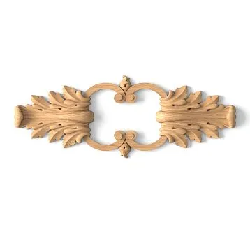
Figured (complex) trim has a combined cross-section: combinations of straight sections, rounded edges, protrusions, and recesses. This can be an imitation of classicalmoldingwith cannelures and moldings, or modern asymmetrical profiles. Figured trim is a decorative element where the function of covering joints is supplemented by the function of decoration.
Figured trim is milled, requires more complex processing, and is more expensive. But it transforms a utilitarian element into a piece of joinery art. Classical figured trim with cannelures, beads, and grooves is used in historical interiors, restoration projects, and classical furniture. Modern figured trim with asymmetrical cross-sections, edges, and breaks is used in custom projects where individuality and non-standard design are important.
Profile selection is determined by function and aesthetics. For a simple flat joint — rectangular trim. For a corner — triangular. For panel joints — T-shaped. For decorative framing in a classical style — radius or figured. The correct profile makes the trim invisible (functionally) or visually striking (decoratively), depending on the task.
Our factory also produces:


Edges and filler elements: protection and finishing of edges
An edge is a vulnerable spot in any construction. Here, material is exposed, here scratches, abrasion, and moisture penetration are possible. Edges require protection. But protection must be aesthetic, organically integrated into the overall composition. Edges and filler elements solve this problem, transforming a technological edge into a finished detail.
End trim — an element that covers the end (cross-section) of boards, panels, or countertops. Wood ends are porous, actively absorb moisture, are susceptible to damage, and look unfinished. End trim is a narrow strip glued or nailed to the end, protecting it and creating a neat edge. The trim width corresponds to the thickness of the covered element (typically 10–30 mm), and the trim thickness is 3–8 mm (to avoid protruding beyond the element’s surface).
End trim is used on countertops, shelves, and facades of MDF or particleboard furniture, where an exposed end looks unattractive.Wooden trimon the end of a budget countertop creates the impression of expensive, solid furniture. Trim made from the same wood species as the main material creates visual continuity. Contrasting trim (light on dark surfaces or vice versa) creates a graphic accent, emphasizing the lines of the object.
Installing end trim requires precision: the end must be flat, and the trim must be glued flush with the element’s surface, without steps or protrusions. Use carpentry PVA glue, clamp or weight it during drying. After drying, excess glue is trimmed, the trim is sanded flush with the main surface, and finished with the same finish.
Perimeter trim — an element that frames the perimeter of a surface: wall panels, ceiling coffers, mirrors, paintings. This is a frame that separates the element from its surroundings, creating a visual boundary, and accentuating it. Perimeter trim can be surface-mounted (glued over the edge of the element) or recessed (the element’s edge is inserted into the trim’s groove).
Perimeter trim on wall panels creates the classic 'boiserie' effect — dividing the wall into framed sections, characteristic of French, English, and neoclassical interiors. Trim 30–60 mm wide forms rectangular or square frames, within which the wall is painted, wallpapered, or covered with fabric. Frames can be uniform or of different sizes, symmetrically or asymmetrically arranged, creating a rhythmic wall structure.
Perimeter trim on ceiling coffers creates a three-dimensional relief on the ceiling, where the trim forms a grid of beams, within which the ceiling is recessed. This visually raises the ceiling, adding architectural expressiveness, characteristic of classical, Mediterranean, and country interiors. Coffers can be shallow (trim thickness 15–20 mm) or deep (with surface-mountedbeamswith thickness 50–100 mm).
Filler strip — a general term for elements that complement the main structure, fill gaps, and cover unused parts. The most common case is a door frame filler strip. Standard frames are designed for walls 80–100 mm thick. If the wall is thicker (150–200 mm after insulation and finishing), a gap forms between the frame and the wall surface. A filler strip is a wide (100–200 mm) wooden board that covers this gap, creating a slope from the frame to the wall edge.
Filler strip is made from the same wood species and finish as the door frame, creating visual unity. It is mounted to the frame or wall, and its edge is coveredwith a casingcreating a neat frame around the opening. The width of the filler strip is selected individually based on the thickness of the specific wall minus the width of the frame. Standard widths: 100, 120, 150, 200 mm. For non-standard wall thickness, the filler strip is custom-made.
Corner trim (angle) — a finishing element designed to protect exterior corners from mechanical damage. Exterior wall corners are prone to impacts, chipping, and abrasion. A wooden or MDF corner trim, mounted at the angle, absorbs these impacts, protecting the main finish. The corner trim section is a right angle (90 degrees) or slightly less (85–88 degrees for tight fit to imperfect angles). The shelf width is 20–50 mm, thickness 5–15 mm.
Corner trim is used in areas of active movement: hallways, entryways, corners near doors. It can be painted to match wall color (for visual camouflage) or in contrasting color (for graphic accent). Wooden corner trim in interiors with wooden finishes creates an organic unity. MDF corner trim painted with enamel — a budget alternative.
Baseboard (skirting board, plinth) — an element covering the junction between wall and floor. This is not merely decorative but functional: it conceals the expansion gap of the floor covering, protects the lower part of the wall from dirt and impacts during cleaning, and creates a visual base for the wall. Plinth height varies from 40 mm (minimalist interiors) to 150–200 mm (classical, high-ceilinged interiors). The profile may be simple rectangular, rounded, or decorative.
Upper trim (Cornice, casing) — an element covering the junction between wall and ceiling. It performs a similar function: conceals the gap, creates a visual finish to the wall, and may serve as a base for concealed lighting. The size and profile of the upper trim are selected according to ceiling height and interior style.
Get Consultation
Gap concealment: from invisibility to accent
Concealment is not the only strategy for dealing with joints. Depending on the task and style, the layout can make the joint invisible, subtly highlight it, or turn it into a striking accent. These are three different approaches, each with its own logic and tools.
Invisible concealment — a strategy where the goal is to make the joint unnoticeable, so the eye glides smoothly over the surface without pause. The layout is chosen to match the color and texture of the surfaces being covered as closely as possible. If both surfaces are light — the layout is light. If one is dark and the other light — the layout is intermediate tone. The width of the layout is minimal — 16–25 mm, sufficient to cover the gap but not creating a wide stripe.
The profile of the layout for invisible concealment — rectangular or slightly rounded, without pronounced relief. The surface is smooth, without router cuts or decoration. The finish is matte or semi-matte, not creating reflections that attract attention. If the main surface is painted — the layout is painted the same color. If the surface has wood texture — the layout is selected from the same species or tinted to the same shade.
Installation for invisible concealment requires care: the layout must be installed level, without misalignment, ends must be precisely fitted, fasteners must be hidden (on adhesive or recessed nails with spackled holes). The goal — to create the impression that the layout is not a separate element, but part of the surface, a natural thickening, a fold of material.
Subtle accent — a strategy where the joint is visible but does not dominate. The layout differs from surfaces in tone (slightly lighter or slightly darker), but remains within the same color range. The width of the layout is 25–40 mm — sufficient to create a visual line, but not so wide as to divide the surface into segments. The profile may be slightly more pronounced — with light rounding, beveled edges, barely noticeable relief.
Subtle accent creates visual structure without aggression. Layouts form a grid of lines that organizes perception of the surface without overloading it. This works in Scandinavian, minimalist, and Japanese interiors, where clarity and order are valued, but without rigidity. Light gray layouts on white walls, or white layouts on light beige surfaces — examples of subtle accent.
Finish for subtle accent — matte or silk-matte, creating a gentle texture contrast. If the main surface is smooth and painted — the layout may have visible wood texture, adding tactile interest. If the main surface is textured (wallpaper, decorative plaster) — the layout is smooth, creating contrast between smooth and rough surfaces.
Accent highlighting — a strategy where the layout is not concealment, but a decorative element. The layout color contrasts with surfaces: black layouts on white walls, white on dark, bright colors on neutral. Layout width 40–60 mm and more — this is no longer a line, but a stripe visually dividing the surface. The profile may be expressive — decorative, with relief, beveled edges.
Accent highlighting transforms the layout grid into a graphic composition, where lines are the main design element. This works in interiors with clear geometry, art deco style, modern classic, loft with graphic accents. Dark layouts on light walls create the effect of windows, frames, divisions, characteristic of French apartments. Metallic layouts (painted gold, brass, copper) in classic interiors create luxury and decorative appeal.
Finish for accent highlighting — may be glossy (to enhance contrast and create reflections) or matte deep (for elegance and weight). Painted layouts require proper surface preparation and multi-layer paint application for perfect color uniformity. Layouts from valuable species with pronounced texture, coated with transparent varnish or oil, create accent through materiality and noble wood.
The choice of strategy depends on context. In minimalist interiors, where walls are a neutral background for furniture and art, joints are concealed invisibly. In interiors with complex finishes, where walls are an active design element, joints are subtly marked, creating structure. In interiors where geometry and graphics are the core concept, joints are accentuated, becoming a key visual element.
Optics of joints: how layout changes perception of space
Layout is not just closing a technical gap. It is a line in space, and a line affects the perception of that space. Vertical, horizontal, diagonal; frequent, infrequent; contrasting, nuanced — each configuration creates its own visual effect, changing the sense of height, width, depth, and character of the room.
Vertical layouts visually raise the ceiling, making the room taller, slimmer, and more upwardly oriented. This works at the psychological level of perception: the eye, following vertical lines, moves from bottom to top, creating a sense of vertical expansion. In rooms with low ceilings (2.5–2.7 meters), vertical layouts are a visual correction tool, making the space less oppressive and more airy.
Vertical layouts are created when walls are clad with vertical paneling, where board joints form vertical lines. Or when creating a lath wall, wherevertical planksare installed at a certain spacing. Or when dividing the wall vertically into panels with layouts. The frequency of verticals determines the intensity of the effect: frequent rails with spacing 50–100 mm create an active rhythm, clearly expressed elongation; infrequent with spacing 500–1000 mm — subtle, calm.
Horizontal layouts visually expand the space, making it wider but lower. Horizontal lines are associated with stability, solidity, calm. In narrow, elongated rooms (hallways, long rooms), horizontal layouts on long walls visually shorten the sense of length, making the space more balanced. In rooms with very high ceilings (3.5–4 meters and above), horizontal layouts make the space more intimate and cozy.
Horizontal layouts arise during horizontal paneling (imitation of beams, log cabin), during installation of horizontal laths, or during creation of panel divisions with horizontal bands. The level of placement of horizontal layouts affects perception: low (at 0.8–1.2 meters from floor) creates the effect of paneling, baseboard, foundation; medium (at 1.5–1.8 meters) divides the wall in half; high (at 2.2–2.5 meters) creates a frieze under the ceiling.
Diagonal layouts introduce dynamism, movement, and non-standard elements. Diagonal lines break the rectangular geometry of the room, creating visual tension and attracting attention. This is a bold, non-standard solution used in modern, authorial, experimental interiors. Diagonal layouts can be parallel (all at one angle) or intersecting (forming rhombuses, zigzags).
Layout grid — a system of vertical and horizontal lines intersecting, forming rectangles or squares — creates an orderly, structured surface. This is characteristic of classical interiors, where walls are divided into panels (boiserie). The size of grid cells determines the composition scale: large panels 800×1200 mm create a calm, measured rhythm; small 400×600 mm — more active, fragmented.
Cell proportions are also important. Square cells create a static, balanced composition. Vertically elongated rectangles (proportion 1:1.6 — golden section) create a light upward stretch while maintaining harmony. Horizontally elongated — expand. Alternating cells of different sizes create a complex, irregular rhythm.
Contrast of layouts with background determines the visual weight of the grid. High contrast (black layouts on white background) creates a graphic, expressive grid that dominates the interior. Low contrast (light gray layouts on white) creates a subtle structure that organizes the surface without overloading. Medium contrast — a balance between expressiveness and restraint.
Layout color affects psychological perception. Light layouts (white, cream, light gray) create lightness, airiness, visual expansion. Dark (black, dark brown, graphite) create weight, depth, visual compression. Warm colors (honey, walnut, terracotta) create coziness, warmth, proximity. Cool (gray, bleached, bluish) create distance, coolness, detachment.
Layout width determines visual density of the composition. Thin layouts 16–25 mm create a light graphic grid, perceived as hatching, texture. Medium 30–50 mm create an expressive structure, where lines are independent elements. Wide 60–100 mm create a massive, heavy grid, where layouts are perceived not as lines, but as stripes, beams.
Optical effects — an additional level of working with panels. Layouts arranged with variable spacing (narrow gaps in the center, gradually increasing toward the edges) create a perspective effect, visual depth. Layouts changing width (thin at the top of the wall, gradually thickening toward the bottom) create a visual sense of stability and solidity. Layouts forming a trapezoidal grid instead of a rectangular one create a dynamic, non-standard composition.
Panel mounting: techniques of hidden and visible fastening
The method of fastening panels affects not only the structural reliability but also the aesthetics. Visible fastening (nails, screws) can be a defect or a decorative element depending on the style. Hidden fastening creates visual purity but is technically more complex. The choice of method depends on the task, the base material, and the operating conditions.
Adhesive mounting — a clean, invisible method for lightweight panels on flat surfaces. Interior carpentry PVA glue is used for light panels, construction glue (liquid nails) for heavier elements or uneven surfaces, polyurethane glue for wet areas. Glue is applied in zigzag or dots to the back of the panel, the panel is pressed against the surface, and it is held in place during curing (30-60 minutes for PVA, 10-20 minutes for construction glue).
Adhesive mounting requires a clean, degreased, primed surface. If the surface is porous (gypsum board, plaster), primer reduces glue absorption and improves adhesion. If the surface is smooth and glossy (painted enamel), light sanding creates roughness, improving grip. The temperature during installation should be 15-25°C, humidity 40-60% for normal polymerization of the glue.
Advantages of adhesive mounting: completely hidden fastening, smooth panel surface without holes, fast installation. Disadvantages: requires a flat surface, not suitable for heavy elements, difficult to remove (panel removal damages the surface).
Finishing nail mounting — a classic method for wooden panels on wooden or soft surfaces. Finishing nails are thin nails with a small cylindrical head of 1.5-2 mm diameter. They are driven in with a hammer or pneumatic nail gun, and the head is pressed below the surface by 1-2 mm using a nail set. The hole above the head is filled with wood putty matching the panel color, sanded flush. After finishing (painting, varnishing), the nail spot is almost invisible.
Finishing nails are used 30-50 mm long depending on panel thickness and base type. For a 10 mm thick panel on a wooden frame, 35 mm nails are sufficient. For a 20 mm thick panel on gypsum board, 50 mm nails are needed to penetrate through the gypsum board and into the frame profile. A nail spacing of 300-500 mm ensures secure fastening.
Advantages: speed, reliability, ability to mount on various bases, visually hidden fastening after puttying. Disadvantages: requires precision driving (to avoid cracking the panel), visible fastening points (even if masked), inability to mount on concrete or brick.
Screw mounting — a universal method for various bases. Wood screws with 3.5-4 mm diameter and 30-60 mm length are screwed through the panel into the base. For concrete and brick, a pilot hole is drilled, a plastic anchor is inserted, and the screw is screwed into the anchor. The screw head is pressed 2-3 mm below the surface, the hole is filled with putty, sanded, and painted.
Alternative to puttying — decorative plugs: wooden dowels (shanks) inserted into holes and cut flush; plastic plugs in wood color, inserted into holes. In industrial, loft, and country-style interiors, screw heads may remain visible as an aesthetic element emphasizing construction and craftsmanship.
Advantages of screws: maximum reliability, ability to mount on any base, possibility of removal and reinstallation. Disadvantages: more labor-intensive process (drilling, screwing, puttying), visible fastening points (even after masking, they are noticeable upon close inspection).
Brace mounting with a stapler — a method for thin, lightweight panels on wooden or soft bases. Pneumatic or electric stapler drives in brads 15-25 mm long, which penetrate the panel and base, securing them. Brads are almost invisible, especially if pressed flush. Brad spacing 200-300 mm. Method is fast but less reliable than nails or screws, suitable for panels up to 10 mm thick.
Hidden mounting on clips — an advanced system for fast and easy installation and removal. Metal clips (clamps) are mounted on the base with screws. The panel has a groove or protrusion on the back that clicks into the clip. The panel is held mechanically, without glue or visible fasteners. The panel can be removed by releasing the clip. This system is used in commercial interiors where fast installation and serviceability are important.
Combined mounting — glue + nails or glue + screws — optimal for heavy panels or complex conditions. Glue provides surface adhesion, mechanical fastening secures the panel during glue curing and prevents detachment. Panel is glued, pressed, and secured with nails or screws. After glue sets, the main load is borne by the adhesive joint, while mechanical fastening plays a secondary role.
Perimeter aesthetics: framing as a finishing touch
Perimeter — boundary, frame, contour. In interiors, perimeters are numerous: wall perimeter (junction with adjacent walls, floor, ceiling), panel perimeter, mirror perimeter, niche perimeter, opening perimeter. Quality of perimeter finishing determines the sense of completion, refinement, and professionalism.Wooden paneling— tool for creating flawless perimeters.
Wall perimeter in wooden cladding — critical area where siding or panels meet floor, ceiling, or adjacent walls. Direct junction is impossible: a compensating gap of 5-10 mm is required for thermal expansion. This gap is covered by panels: at the bottom —baseboard, at the top —a cornice or molding, at corners — corner panels.
Baseboard — not just gap coverage, but a visual base of the wall, a line separating vertical surface from horizontal, creating transition. Baseboard height determines the visual weight of this transition. High baseboard 100-150 mm creates a classic, solid look typical of historical interiors. Medium 60-80 mm — universal, suitable for most interiors. Low 40-50 mm — minimalist, modern, makes the wall visually appear to start almost from the floor.
Baseboard profile enhances the effect. Simple rectangular — neutral, unobtrusive. Rounded (with molding at the top) — classic, softens transition. Ornamental (with grooves, beads) — decorative, creates classical or neoclassical aesthetics. Baseboard made of the same wood species and finish as wall cladding creates visual unity. Contrasting baseboard (white on dark wall) creates a graphic accent.
Cornice at wall-ceiling junction performs a similar function but is perceived differently. It is not a base, but a finish, not the start of vertical, but a transition to horizontal. Cornice can be simple (narrow molding 20-30 mm, barely indicating transition) or complex (wide cornice 80-150 mm with multi-step profile, creating architectural expressiveness).
Cornice with backlighting — modern technique where an LED strip is hidden behind the cornice, directing light toward the ceiling. Cornice is set back from the ceiling by 50-100 mm, creating a gap from which light emanates. This creates a floating ceiling effect, visually lifting the ceiling, adding modernity and technology. Wooden cornice combined with technological backlighting — a mix of traditional material and modern solution.
Panel perimeter — when a wall is divided into sections (boiserie), each section is framed by panels. This creates a framed structure characteristic of classic French and English interiors. Panels form rectangular or square frames, within which the wall has a different color, texture, or material (wallpaper, paint, fabric covering).
Width of framing panels determines composition scale. Narrow panels 20-30 mm create a delicate frame barely indicating panel boundary. Medium 40-60 mm create a pronounced frame actively participating in composition. Wide 80-120 mm (actuallyMoldings) create a massive, heavy frame characteristic of Baroque, Empire, and formal interiors.
Corner joints are critical areas where four moldings meet. A 45-degree butt joint (on the edge) is classic and requires precise cutting. The ends of moldings are mitered at 45 degrees, joined at the corner to form a straight frame. Even the slightest cutting error creates a gap at the corner, so a miter saw with precise angle adjustment is required. A lap joint is simpler, where horizontal moldings run from wall to wall, and vertical moldings are attached between them. Visually less elegant but more reliable and easier to install.
The perimeter of a niche — an indentation in the wall — requires careful framing for a finished look. Moldings are installed along the inner perimeter of the niche, covering the end of the wall (which is usually roughly plastered). The molding creates a clean edge, visually separating the wall plane from the depth of the niche. If the niche has a decorative purpose (for a vase, sculpture, or backlighting), quality framing is critical for perception.
Niche moldings can be simple rectangular or profiled. Profiled molding (with a protrusion directed into the niche depth) creates a volumetric border, visually deepening the niche. Contrasting color molding (dark on a light wall) emphasizes the niche, making it a focal point. Molding in wall color makes the niche subtle and unobtrusive.
The perimeter of mirrors, paintings, or panels — a classic application of moldings as picture frames. Four moldings, joined at 45 degrees, form the frame. Molding width determines frame scale: narrow (16–25 mm) — elegant framing, not competing with the content; wide (60–100 mm) — substantial frame, a significant element in itself.
The profile of picture frame molding determines the style. Simple flat — modern, minimalist. Rounded (stap) — classical, neutral. Ornate with fluting — Baroque, Classicism. The profile may be symmetrical (identical on both sides) or asymmetrical (inclined plane from outer edge to center, creating visual depth).
Finishing of picture frame molding is critical. Natural wood with transparent varnish or oil highlights the material’s nobility, works well in eco-, Scandinavian, and country styles. Whitewash, cream, pastel tones — classic Provence, shabby chic. Black, graphite — modernity, graphic style. Gilding, silvering, patination — classical interiors, where the frame is a work of art.
Materials and Finishing: from raw material to final coating
Molding begins with wood, and the choice of species determines not only price but also performance characteristics, visual character, and workability. Different species — different stories, different applications.
Spruce — the workhorse among moldings. Available, easy to process, has a pleasant resinous aroma, light yellowish-pink color with characteristic annual rings. Density 520 kg/m³, medium hardness, holds fasteners well. Spruce accepts stains well, allowing imitation of more expensive species. Under transparent coating, resinous texture with contrasting rings is revealed. Price of spruce molding — from 50 to 150 rubles/meter depending on size and grade.
Fir — similar to spruce, but slightly softer, lighter, with less resin, more knots. Used in budget projects where cost-saving is important. After painting with enamel, the difference from spruce is not noticeable. Price slightly lower than spruce — from 40 to 120 rubles/meter.
Linden — soft, light, almost white wood with uniform fine-pored structure. Ideal for carving, easy to process, does not crack when drying. Linden does not exude resin, does not overheat, traditionally used in saunas and steam rooms.Linden moldingsSuitable for humid rooms, for carved decorative elements. Price — from 100 to 250 rubles/meter.
Oak — an elite choice, symbol of strength and durability. Density 700 kg/m³, hardness 3.7–4.0 on Brinell, resistance to rot, beautiful pronounced texture with radial rays. Oak moldings serve for decades, acquiring noble patina over time. Color ranges from light yellow to dark brown depending on processing method. Oak is poorly suited for covering with opaque paints (texture still shows through), but excels under transparent coatings. Price — from 300 to 800 rubles/meter.
Ash — similar in properties to oak, but lighter, with more contrasting texture. Very strong, elastic, resistant to loads. Ash moldings are used in areas with high mechanical loads. Price comparable to oak — from 350 to 800 rubles/meter.
Beech — dense (680 kg/m³), hard, uniform wood of rose-cream color. Easily bends after steaming, allowing creation of curved elements. Beech moldings are suitable for furniture decoration, arches, bay windows. Price — from 250 to 600 rubles/meter.
Larch — coniferous species with density and strength comparable to deciduous trees (660 kg/m³). High resistance to rot due to resin content. Color golden-yellow with reddish tint. Larch moldings are used in rooms with high humidity and for outdoor applications. Price — from 200 to 500 rubles/meter.
Wood moisture for moldings is critical. Only dry wood (moisture 8–12%) maintains geometric stability, does not warp or crack. Moldings with natural moisture (40–80%) are unacceptable for interiors — deformation is guaranteed. Kiln drying is a mandatory stage in producing quality moldings.
Wood grade determines visual quality. Extra grade (A) — no visible defects, knots, cracks. First grade (B) — small healthy knots are permissible. Second grade (C) — knots, minor cracks, color unevenness. For visible moldings in quality interiors — extra or first grade. For hidden, opaque-painted moldings — second grade is acceptable.
Finishing determines not only appearance but also wood protection. Oil-wax — optimal coating for interior moldings, highlighting texture, providing matte or semi-matte surface, easily renewable. Varnish — durable glossy or matte coating, more resistant to dirt, but removes wood’s tactile naturalness. Paint — opaque coating, hiding texture, providing any color.
Staining with stains allows changing wood color while preserving texture. Spruce stained to resemble walnut is visually almost indistinguishable from walnut at significantly lower cost. Brushing — mechanical removal of soft fibers, creating pronounced texture relief. Brushed moldings have tactile and visual expressiveness characteristic of country and rustic styles.
Moldings — a simple tool, but improper use creates problems instead of solving them. Let’s consider typical errors and ways to avoid them.
Mismatch of molding width to gap width. Molding must overlap the gap with a minimum reserve of 3–5 mm on each side. A 20 mm wide molding can cover a maximum 10 mm gap (5 mm overlap on each side). For wider gaps, a wider molding is needed. Error — installing narrow molding on a wide gap, resulting in visible gap edges.
Incorrect profile for the task. Rectangular molding in a corner works poorly — it creates a step, rigid joint. A corner requires triangular or T-shaped molding. T-shaped molding on a flat joint doesn’t hold — it has nothing to grip with its leg. For flat joints, rectangular molding is needed. Error — using an inappropriate profile due to ignorance or desire to save money.
Absence of compensatory gap. Molding covers the gap but should not block material movement. If molding is nailed firmly to both surfaces, the wooden cladding won’t expand and will warp. Correct — nail molding to one surface, the other surface must be able to move under the molding. Error — rigidly nailing molding to both surfaces.
Visible screw heads in a claim for cleanliness. If the interior is positioned as quality, classical, minimalist — visible screw heads ruin the impression. Fasteners must be recessed, spackled, painted, or covered with caps. Or adhesive fastening should be used. Error — careless visible fasteners in interiors where this is inappropriate.
Visible screw heads in objection to cleanliness. If the interior is positioned as quality, classic, minimalist — visible screw heads ruin the impression. Fasteners must be recessed, spackled, painted, or covered with caps. Or adhesive fastening should be used. Mistake — careless visible fasteners in interiors where this is inappropriate.
Mismatch of molding color with overall palette. Moldings of random color, unrelated to cladding or other wooden interior elements (baseboards, doors, furnitureThe veneers create visual chaos. Veneers should either match the main finish (for subtlety), or coordinate with other wooden elements (for unity), or be intentionally contrasting (for accent). Mistake — using veneers 'as they were in the store', ignoring interior color logic.
Imprecise joints at frame corners. A frame composition with veneers joined at a miter (45 degrees) requires perfect cut accuracy. A 1-degree deviation creates a noticeable gap at the corner. Using a miter saw with fixed angles or, preferably, a precision table saw — mandatory. Mistake — cutting 'by eye' with a hand saw, hoping for luck.
Wooden trim made from natural humidity wood. This is guaranteed deformation within 1-2 months. The trim will be screwed out, crack, and gaps will open. Only dry wood (8-12% humidity) is stable. When purchasing, require documentation on humidity or check with a moisture meter. Mistake — buying cheap trim at the market without humidity control.
Install trim before final wall finishing. Trim should be installed after walls are painted, wallpapered, or finished. Otherwise, paint will get on the trim during wall painting, and wallpaper will adhere to the trim during wallpapering. Exception — when trim and walls are painted the same color simultaneously. Mistake — install trim, then paint walls, smudging the trim.
Conclusion: making joints part of the design
wooden floorThis is not masking a problem, but transforming technological necessity into an aesthetic solution. Joints, gaps, and seams are inevitable in construction and finishing. But they should not be defects that irritate the eye or create a sense of incompleteness. Properly selected and installed trim turns a joint into a line, a gap into a boundary, and a seam into a detail.
Neat joints are a sign of professionalism, attention to detail, respect for material and space. When trim is selected by size, profile, and color; when installed level, with proper fastening, and precise corner joints — space achieves completeness. The eye glides over the surface without hesitation, not stumbling over carelessness, not pausing at defects. The wall is perceived as a single whole, the composition is clearly readable, and the space functions as intended.
Joint optics — this is managing perception through lines. Vertical trim raises the ceiling, horizontal trim expands walls, diagonal trim adds dynamism. Frequent lines create an active texture, sparse lines — a calm rhythm. Contrasting seams become graphics, nuanced seams — delicate structure. Each solution changes how space is perceived by the eye, how it is felt by the body, and how it affects the mood of those within it.
Perimeter aesthetics — this is the final chord of the composition. The perimeter is the boundary, frame, contour that separates an element from its surroundings or connects it to its context. A well-processed perimeter creates a sense of completeness, thoughtfulness, and professionalism.Skirtingat the bottom,Corniceat the top, trim in corners, along panel contours, around openings — all this creates a system of frames that organizes visual perception, makes space readable, understandable, and harmonious.
wooden floorThis is a tool for transformation. It turns a technological gap into an architectural detail. It transforms a random joint into an intentional boundary. It turns a problem into a solution. And in this — the philosophy of working with material, space, and details. Do not hide imperfections, but integrate them into the design. Do not ignore limitations, but make them part of the concept. Do not fear joints, but make them part of the interior’s visual language.
Company STAVROS offers a full range ofwooden mouldingsSuitable for solving any task of joint finishing and creating decorative compositions. From simple rectangular pine trim for utilitarian applications to decorative profiled trim from oak and beech for premium interiors. All wood species — pine, spruce, linden, oak, beech, ash, larch — are kiln-dried to 8-12% humidity, ensuring geometric stability.
A wide range of finish options allows integrating trim into any interior style. Natural wood under transparent oil or lacquer for eco, Scandinavian, and country interiors. Toned trim in walnut, wenge, or bleached oak shades for creating the desired color accent. Painted with enamel in white, black, gray, or colored tones for modern, minimalist, and Provencal interiors. Brushed with pronounced relief texture for rustic and country solutions. Patinated with aging effect for classic and vintage spaces.
A wide range of finishing options allows integrating veneers into any interior style. Natural wood with transparent oil or lacquer for eco, Scandinavian, and country interiors. Toned veneers in walnut, wenge, or bleached oak shades to create the desired color accent. Painted with enamel in white, black, gray, or colored tones for modern, minimalist, and Provencal interiors. Brushed textures with pronounced relief for rustic and country solutions. Patinated with an aged effect for classic and vintage spaces.
Professional consultants from STAVROS will help select trim for a specific task. Determine the correct width to cover the gap with necessary allowance. Choose a profile matching the joint type and fastening method. Select color and finish harmonizing with the overall interior palette and other wooden elements (baseboards, plinth, doors, furniture). Calculate required material quantity with allowance for trimming and possible defects. Explain the installation technology suitable for the specific substrate and operating conditions.
STAVROS material quality is guaranteed by multi-stage control. Incoming wood inspection with rejection of raw material with critical defects. Moisture control upon exit from drying chamber using moisture meters — only material with 8-12% humidity is allowed for processing. Geometry control after planing — dimensions checked with calipers, deviations exceeding ±0.5 mm are not permitted. Visual inspection of finished product before packaging — each trim is inspected for surface defects, chips, or cracks.
Packaging and delivery are organized to ensure trim arrives at the customer in perfect condition. Trim is packaged in shrink wrap protecting against moisture and contamination. Long pieces are laid on pallets with protective padding to prevent deformation. Delivery is performed by transport with soft securing to prevent damage during transit. Delivery geography — Moscow, Moscow region, Saint Petersburg, regions of Russia.
Investment in qualityWooden panelingWooden trim — this is an investment in interior completeness. This is choosing professionalism, when every detail is thought out, every joint is carefully processed, every perimeter is correctly finished. This is understanding that space quality is created not by the scale of elements, but by attention to the small, to joints, transitions, and boundaries. This is the philosophy according to which perfection lies in details, and details are what distinguish well-done work from exceptional work.
Neat joints, correct joint optics, flawless perimeter aesthetics — this is the language of professional interior design, indicating that here people worked who understood material, respected space, and valued quality.Wooden panelingWooden trim from STAVROS — this is a tool for those who create interiors where every line matters, every joint tells a story of attention to detail, and every perimeter testifies to craftsmanship.