


Article Contents:
- Philosophy of Color in Architectural Design
- Historical Traditions of Color Decoration
- Psychophysics of Color Perception
- Technological Aspects of Color Solutions for Decorative Racks
- Preparation of Surface for Painting
- Modern Painting Systems
- Special effects and textures
- Classification of Color Solutions for Decorative Racks
- Achromatic Colors: Elegance of Simplicity
- Natural Tones: Harmony with the Surrounding World
- Vibrant Accent Colors: Energy and Individuality
- Color Combinations and Harmonies
- Monochromatic Compositions
- Complementary Combinations
- Analogous Schemes
- Practical Aspects of Choosing Colors for Decorative Racks
- Influence of Lighting on Color Perception
- Room Size and Color Solutions
- Functional Purpose of the Room
- Combining Colored Racks with Other Interior Elements
- Coordination with Floor Coverings
- Interaction with Furniture
- Textile Accents
- Trends in Color Solutions for Decorative Racks
- Natural and Eco-Friendly Tones
- Technological Colors
- Personalization and uniqueness
- Technological Innovations in Color Coatings
- Smart Coatings
- Self-Healing Coatings
- Ecological innovations
- Cultural Aspects of Color Perception
- National color preferences
- Age-related characteristics of color perception
- Psychological aspects of color design
- Color therapy in interior design
- Mood correction through color
- Practical recommendations for color selection
- Creating color samples
- Color balance in interior design
- Conclusion: color as a tool for creating a unique space
- Frequently Asked Questions

Color is the language of emotions, capable of instantly changing the mood of a space, creating an atmosphere of coziness or grandeur, calmness or energy. When we talk aboutdecorative color railswe open an infinite universe of design possibilities, where each shade tells its own story, creates a unique mood, and forms a distinctive character of the interior.
Have you ever wondered why one color makes us feel calm and relaxed, while another awakens energy and creative potential? The secret lies in deep mechanisms of human perception, shaped over millennia of evolution. And it is precisely this secret that allows appropriately chosen color decorative rails to transform an ordinary room into a dream space.


Philosophy of color in architectural design
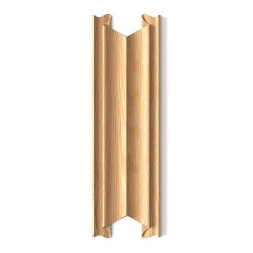
The color palette of an interior is not just an aesthetic choice — it is a powerful tool for managing a person's psychological state.Decorative slats on the wallDifferent colors can radically change the perception of space, its scale, temperature sensations, and the overall atmosphere of the room.


Historical traditions of color decoration
For centuries, various cultures have developed their own traditions of decorating living spaces. European classicism leaned toward noble, muted tones — deep burgundy, emerald green, royal blue. Eastern design philosophy preferred natural, earthy shades symbolizing harmony with the surrounding world.
The modern era has brought freedom of choice and mixing of styles. Todaydecorative plankcan be any color — from soft pastel to bright neon, from classic white to extravagant metallic. This freedom both inspires and intimidates — for the correct color choice requires a deep understanding of color theory fundamentals.
Our factory also produces:

Psychophysics of color perception
The human eye can distinguish millions of shades, but our brain groups them into understandable categories, each of which evokes specific emotional and physiological reactions. Warm colors — red, orange, yellow — stimulate activity, increase body temperature, accelerate pulse. Cool shades — blue, green, purple — calm, lower blood pressure, promote concentration.
Decorative wooden stripWarm tones create a sense of closeness and intimacy, making the room visually smaller but cozier. Cool tones, on the contrary, expand space, creating a feeling of air and freedom.
Get Consultation
Technological aspects of color solutions for decorative rails
Creating a high-quality colored coating for wooden decorative elements is a complex technological process requiring a deep understanding of wood properties and modern lacquer materials.
Preparation of the base for painting
The quality of the colored coating directly depends on the thoroughness of preparing the wooden base. The surface must be perfectly smooth — any defects, scratches, or unevenness will be intensified by the colored coating and become noticeable flaws in the finished product.
Sanding is performed in several stages with gradually decreasing abrasive grit. Initial processing removes obvious defects and unevenness, intermediate stages level the micro-relief, and final sanding creates a mirror-smooth surface ready for coating application.
Special attention is paid to end surfaces of the rails — these are the most intense areas for absorbing coloring agents and may result in uneven color. Special primer-isolators create uniform absorption across the entire surface of the product.
Modern coloring systems
Water-emulsion paints have become the standard for interior work due to their ecological safety and wide range of available colors. Modern acrylic compositions provide deep, rich color with excellent coverage and durability.
polyurethane enamels create a more durable coating, resistant to mechanical impacts and abrasion. They are ideal fordecorative plank panelsthat will be subjected to intensive use.
Powder coatings are a new word in wood finishing. They provide perfectly even color, highest strength, and resistance to fading. However, this technology requires special equipment and is available only to large manufacturers.
Special Effects and Textures
Modern technologies allow creating not just colored coatings, but complex decorative effects. Metallic, pearlescent, chameleon — these effects are achieved by adding special pigments that reflect light differently at various angles.
textured coatings imitate various materials — leather, fabric, metal, stone. Suchdecorative plank colorsopen up boundless creative possibilities for designers.
Patination — artificial aging of the surface — creates an effect of noble antiquity. Various patination techniques allow mimicking natural wood aging under the influence of time and external factors.
Classification of color solutions for decorative planks
The world of color is so diverse that it requires systematization for understanding and practical application. Let's consider the main categories of color solutions, each of which has its own features and areas of application.
Achromatic colors: elegance of simplicity
White, black, and all shades of gray — this is the basis of classic design. Achromatic colors never go out of fashion; they are universal and serve as an ideal background for other interior elements.
White decorative planks create a sense of purity, freshness, and spaciousness. They reflect the maximum amount of light, making the room brighter and visually larger. Various shades of white — from warm cream to cool Arctic — allow creating different moods within the same color palette.
Black planks — a bold and stylish solution. They create a dramatic effect, add depth and contrast to the interior. The color black requires careful use — in excess, it can make the room gloomy and cramped.
Gray tones — a compromise between white and black. They create a calm, neutral atmosphere, serving as an ideal background for bright accents. From light gray to charcoal — each shade has its own character and area of application.
Natural shades: harmony with the surrounding world
The brown range — from light beige to dark chocolate — remains one of the most popular for wooden decorative elements. These colors are associated with natural wood, creating a sense of warmth and coziness.
Green shades symbolize nature, growth, harmony. From delicate mint to deep emerald — the color green calms the nervous system, reduces stress, and promotes concentration.Frame profileGreen color is especially popular in eco-interiors.
The blue palette — from sky blue to deep ultramarine — creates a sense of coolness and freshness. The color blue lowers blood pressure, slows the pulse, and promotes relaxation. It is ideal for bedrooms and relaxation zones.
Vibrant accent colors: energy and individuality
Red — the color of passion, energy, life force. Red decorative planks create focal points in the interior, attract attention, and stimulate activity. However, excess red may cause aggression and irritation.
Orange — a softer alternative to red. This color is associated with warmth, joy, creativity. Orange planks are ideal for children's rooms, creative workshops, and kitchens.
Yellow — the color of the sun, optimism, intellectual activity. Yellow decorative elements make the room brighter and more cheerful, stimulating mental processes. Particularly effective in work offices and libraries.
Color combinations and harmonies
The art of coloristics lies not only in selecting individual colors, but also in their proper combination. Correctly chosen color combinations create harmonious, balanced interiors.
Monochromatic compositions
Monochromatic schemes are based on using various shades of one color. This approach creates calm, elegant interiors without visual strain.Buy decorative planksof various shades of one color can be used to create deep, multi-layered compositions.
Monochromatic palettes are especially effective in small rooms, where contrasting combinations may create a sense of confinement. Different textures and finishes add interest to monochromatic compositions without disrupting color harmony.
Complementary combinations
Complementary colors are located opposite each other on the color wheel — red and green, blue and orange, yellow and purple. These combinations create maximum contrast and visual tension.
Using complementary colors requires caution — in pure form, they may be too intense for living spaces. It is better to use muted shades or apply one color as the main tone and the other as an accent.
Analogous schemes
Analogous colors are adjacent on the color wheel — for example, blue, blue-green, and green. Such combinations create smooth, harmonious transitions without sharp contrasts.
Analogous schemes are ideal for creating calm, relaxing interiors. They are easily perceived by the eye and do not cause fatigue even with prolonged exposure in the room.
Practical aspects of choosing the color of decorative planks
Theoretical knowledge of color must be supported by practical considerations. When choosing the color of decorative planks, numerous factors must be considered — from room size to its functional purpose.
The influence of lighting on color perception
Color does not exist in isolation — it is always perceived in the context of lighting. The same sample may appear completely different under daylight, incandescent lamps, or LED lighting.
Warm light (2700–3000K) enhances warm tones — red, orange, yellow — and dulls cool tones. Cool light (5000K and above) emphasizes blue and green hues, making warm colors less saturated.
When choosing the color of decorative planks, be sure to examine samples under the lighting that will be used in the room. What looks attractive in a store under bright lamps may disappoint at home under natural lighting.
Room size and color solutions
Light colors visually expand space, dark colors narrow it. This is a basic rule to consider when choosing colors for small rooms. However, blindly following this rule may lead to monotonous, dull interiors.
In small rooms, dark colors can be used, but sparingly — as accents, not as a main background. One wall with dark planks can create depth and interest without making the room feel cramped.
In large rooms, conversely, only light colors can create a sense of emptiness and coldness. Warm, saturated tones make large spaces feel cozier and more human.
Functional purpose of the room
Different room functions require different color solutions. A bedroom should promote relaxation — here, calm, muted tones are appropriate. A workspace requires colors that stimulate concentration and mental activity.
Children's rooms can accommodate brighter, playful colors, but it's important not to overdo it — overly active color schemes may overstimulate a child and interfere with sleep.
Kitchens and dining rooms are traditionally decorated in warm tones that stimulate appetite. Bathrooms are usually kept in cool tones, creating a sense of freshness and cleanliness.
Combining colored planks with other interior elements
Decorative planks do not exist in a vacuum — they must harmoniously complement other interior elements.Wooden baseboardFurniture, textiles, flooring — all of this affects the perception of colored decorative elements.
Coordination with flooring
The color of decorative planks should harmonize with the floor color. This does not mean they must be identical — often contrasting combinations appear more interesting and dynamic.
Light planks on a dark floor create a sense of airiness and lightness. Dark elements on a light floor add depth and character.wooden skirting board purchaseMatching the color of the planks — a classic solution that creates a unified finish.
Parquet and laminate in wood tones require special attention to color combinations. Planks can match the floor color, creating a monochromatic composition, or contrast with it, highlighting architectural elements.
Interaction with furniture
Colored decorative planks can serve as a backdrop for furniture or, conversely, contrast with it, creating visual accents. Neutral colors — white, gray, beige — are universal and match any furniture.
Vibrant colored planks require a more cautious approach to furniture selection. They become an active element of the interior and may compete with other bright items.
wooden baseboardMatching the color of the furniture creates a visual connection between horizontal and vertical elements of the interior, unifying the space into a cohesive whole.
Textile accents
Curtains, cushions, rugs — all these elements contribute to creating color harmony in the interior. Colored decorative planks can echo textile accents, forming a unified color theme.
Seasonal changes in textiles allow easily refreshing the interior without major changes. Neutral planks serve as a stable background for experimenting with bright fabrics.
Trends in decorative plank color solutions
Color trends are cyclical — what was popular decades ago may return in a new interpretation. However, there are enduring trends that define the development of color solutions in interior design.
Natural and eco-friendly shades
Growing environmental awareness in society influences color choices in interiors. Natural shades — moss green, sandy beige, sky blue — are becoming increasingly popular.
These colors are not only beautiful but also psychologically comfortable. They are associated with natural landscapes, creating a sense of calm and harmony with the surrounding world.
Technological colors
Technological advancements are reflected in color preferences. Metallic shades — silver, gold, copper — symbolize progress and innovation.
Neon colors, characteristic of the digital age, find application in modern interiors. However, their use requires caution — they should be used as controlled accents, not dominant elements.
Personalization and uniqueness
Modern consumers seek individuality and uniqueness in their interiors. This leads to growing popularity of unusual, non-standard color solutions.
Gradients, ombre, multi-color compositions — all these techniques allow creating unique decorative elements that no one else has.
Technological innovations in color coatings
Advancements in the chemical industry and materials science continuously expand the possibilities for color decoration of decorative planks. New technologies not only improve the appearance of coatings but also enhance their functional properties.
Smart coatings
Thermochromic coatings change color depending on temperature. This is not only an interesting decorative effect but also a functional feature — such planks can serve as temperature indicators in the room.
Photochromic materials change color under ultraviolet radiation. They appear one color during the day and another under artificial lighting.
Self-repairing coatings
New polymer compositions can "heal" minor scratches and defects. Such coatings retain their original appearance significantly longer than conventional ones.
Antibacterial additives make colored coatings not only beautiful but also hygienic. This is especially important for spaces with high cleanliness requirements.
Ecological Innovations
Paints based on natural pigments are returning to common use due to growing environmental awareness. Modern technologies allow creating durable, vibrant colors from natural materials.
Coatings with negative carbon footprint — a new direction in the development of eco-friendly materials. They not only do not harm the environment but also actively absorb carbon dioxide from the atmosphere.
Cultural aspects of color perception
Color perception is not universal — it depends on cultural traditions, personal experience, and age-related characteristics. What appears attractive to one culture may be unacceptable to another.
National color preferences
Scandinavian countries traditionally prefer light, clean colors — white, light gray, soft blue. This is due to the climatic features of the region and the desire to maximize the use of scarce northern light.
Mediterranean culture leans toward warm, saturated shades — terracotta, ochre, azure. These colors reflect the characteristics of the local climate and nature.
Eastern cultures have their own color symbolism. Red in China is the color of luck and prosperity, in India — of purity and fertility. Understanding these differences is important when creating interiors for people of different cultural traditions.
Age-related characteristics of color perception
Children prefer bright, saturated colors. Their nervous system is not yet fully developed, and bright stimuli are necessary for normal development.
As people age, preferences shift toward calmer, muted tones. Elderly individuals often choose traditional, time-tested color combinations.
Psychological aspects of color design
Color has a powerful effect on a person's psyche. Properly chosen color solutions can improve mood, enhance productivity, and promote relaxation.
Color therapy in interior design
Green color reduces eye fatigue and calms the nervous system. Green decorative planks are ideal for offices and libraries.
Blue color lowers blood pressure and slows the pulse. Blue elements in the bedroom promote deep, restful sleep.
Yellow stimulates brain activity and enhances concentration. Yellow accents in a child's room help the child better absorb information.
Mood correction through color
Depressive states can be corrected with warm, cheerful colors — orange, yellow, red. They stimulate the production of serotonin — the happiness hormone.
Increased excitability requires calming colors — blue, green, purple. These shades reduce stress levels and promote relaxation.
Practical recommendations for choosing color
Choosing the color of decorative planks is a responsible decision that will influence the perception of the interior for many years.with a classic profile creates a sense of solidity, reliability.and other decorative elements should harmoniously match the chosen color of the planks.
Creating color samples
Before making a final choice, create color samples in real conditions within the room. Stick cardboard samples of selected colors to the wall and observe how they look under different lighting throughout the day.
Remember that color on a large surface is perceived differently than on a small sample. Bright colors on a large scale may appear too stimulating, while muted shades may seem dull.
Color balance in interior design
Follow the 60-30-10 rule: 60% of the area should be the main color, 30% — the secondary, 10% — the accent. This creates a balanced, harmonious composition.
Do not be afraid to experiment, but remember to maintain balance. Even the most beautiful color in excess can become irritating.
Conclusion: color as a tool for creating a unique space
Color is a powerful tool in the designer's hands, capable of transforming an ordinary space into a dreamlike environment.Decorative planks in coloropen up boundless creative possibilities, allowing you to create interiors that are not only beautiful but also psychologically comfortable for living.
In a world where individuality is increasingly valued, colored decorative planks become a means of self-expression, a tool for creating a unique, one-of-a-kind space. They allow you to tell a story about your owners, reflect their personality, preferences, and life philosophy.
Choosing color is not only an aesthetic decision, but also an investment in quality of life. Properly selected color solutions create a comfortable psychological environment, promote good mood, enhance productivity, and improve rest quality.
STAVROS Company understands the importance of color selection in creating a perfect interior. Years of experience working with natural materials, deep knowledge of coloring technologies, and modern production equipment allow us to create decorative elements of any color and shade with a guarantee of quality and durability. Every STAVROS product is the result of meticulous work by professionals who understand that color in interior design is not just beauty, but the foundation of comfortable living.
Frequently asked questions
How to choose the color of decorative planks for a small room?
For small rooms, light neutral colors — white, light gray, beige — are recommended. They visually expand the space and reflect the maximum amount of light. You can use one dark accent on one wall, but no more than that. Avoid contrasting combinations and overly bright colors — they will make the room even smaller.
Does the color of decorative planks affect the lighting in the room?
Definitely. Light colors reflect up to 80% of incoming light, significantly improving room illumination. Dark colors absorb light, making the room more shadowy. In case of insufficient natural light, choose light shades. In very sunny rooms, dark planks will help create a more calm atmosphere.
Can planks of different colors be combined in one room?
Yes, but follow color theory principles. Use no more than 2-3 colors, adhere to the 60-30-10 rule for their distribution. Combine either shades of one color or harmonious color pairs. Avoid random combinations — each color must be justified by the composition.
How does the color of planks affect the perception of ceiling height?
Light planks, especially when placed vertically, visually increase ceiling height. Dark horizontal elements, on the contrary, visually lower the height, making the room cozier. For low ceilings, use light vertical planks; for high ceilings, dark horizontal elements can be applied.
What colors are suitable for a child's room?
For children's rooms, cheerful but not overly bright colors are recommended — pale yellow, mint green, lavender, peach. Avoid pure red and bright orange — they may overstimulate the child. You can use bright accents, but in limited quantities. Consider the child's age — younger children need more soothing tones.
Do colored decorative planks fade over time?
Modern quality coatings with UV stabilizers practically do not fade when used indoors. The most durable are acrylic and polyurethane paints from well-known manufacturers. Organic dyes are less resistant to light than synthetic pigments. Direct sunlight accelerates fading of any coating.
How does the color of planks combine with natural wood texture?
Full-color coatings completely hide wood texture, creating a smooth, uniform surface. To preserve the wood grain, use toning agents — stains, pigmented oils, semi-transparent lacquers. They change the color of the wood while preserving its natural beauty and tactile feel.
Is it necessary to consider the direction of natural light when choosing plank color?
Absolutely. Rooms facing north receive cool light — here, warm plank colors are suitable to create coziness. South-facing rooms are bathed in warm light — cool tones will help balance the atmosphere. Eastern-facing rooms require colors that look good in morning light, while western-facing rooms — in evening light.