


Article Contents:
- Why light modern furniture can look expensive — and why it sometimes looks cheap
- What makes light furniture look expensive
- What makes light furniture look cheap
- Which light shades work best in a modern living room
- Pure white
- Milky and warm white
- Greige and light beige
- Light wood: ash, bleached oak, maple
- How to decorate a living room with light furniture so it doesn't look flat
- Use texture contrast
- Add wood as an essential element
- Leave breathing space and avoid creating a monolithic look
- Alternate closed and open sections
- White furniture in modern style: when it's a successful choice and when it's better not to choose pure white
- When pure white is the right choice
- When it's better to choose something other than pure white
- How to make a light-colored living room look more expensive: 7 effective techniques
- Technique 1. Light furniture + natural wood
- Technique 2. Matte surfaces instead of cheap gloss
- Technique 3. Hidden or high-quality hardware
- Technique 4. Calm, large forms without excessive fragmentation
- Technique 5. Soft textiles and warm lighting
- Technique 6. Accent with quality, not quantity of decor
- Technique 7. Proper proportions between storage and empty space
- How not to overload a living room with light furniture: typical pitfalls
- Pitfall 1. Too many identical modules
- Pitfall 2. All white without a single contrast
- Pitfall 3. Overloaded open shelves
- Trap 4. Mixing different white shades without logic
- Trap 5. Too much gloss and 'chrome details'
- How to combine light furniture, wood, soft seating area, and TV composition
- Wood as a connecting element
- Sofa: an ally, not a competitor
- TV zone in a light interior: a special task
- Tie the interior together with two or three repeating materials
- Which light modern furniture is better suited for a small living room
- Hanging modules — technique number one
- Light facades — not an option, but a rule
- Furniture on thin legs
- One large accent instead of many small ones
- Shallow storage systems
- What to choose: white, cream, or light wood-tone furniture
- Lighting and its role in a bright living room interior
- Natural light: the main condition
- Color Temperature of Light
- Furniture lighting
- Practical checklist before buying light-colored furniture for the living room
- Most common mistakes when decorating a bright living room
- "All furniture of the same color and size"
- "White walls + white furniture + white ceiling"
- "Bought cheap white furniture — should look expensive"
- "Added a lot of decor — made it more interesting"
- "Filled all open shelves with books"
- FAQ: answers to popular questions about light-colored furniture for the living room
- Conclusion
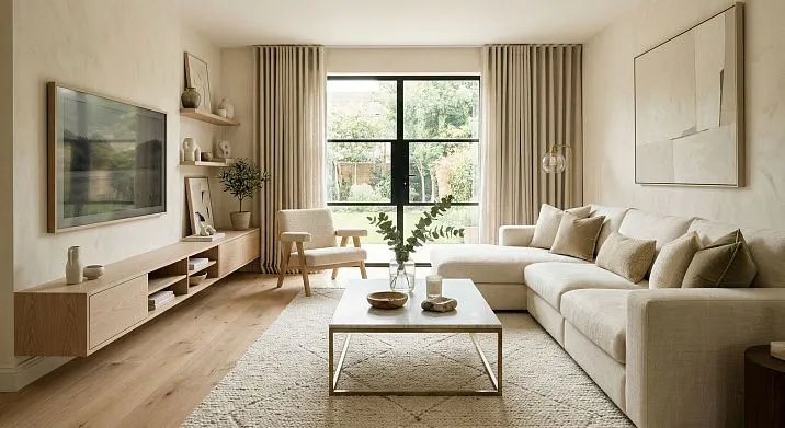
What went wrong? Not the furniture — the approach.Modern Furniture in light tones works brilliantly, but only when it has depth: texture, air, precise proportions, and a skillful combination of materials. This is exactly what this article is about.
Furniture for the living room, modern and light — it's not just 'white fronts plus particleboard'. It's a system of solutions where every choice (shade, shape, texture, number of elements) either elevates the interior to the level of 'expensive and calm' or lowers it to the level of 'hastily assembled'. Modern living room furniture in light tones requires the same precision of design as dark and saturated furniture — it's just that its mistakes look different.
If you're looking for a way to make your living room feel light, bright, and yet visually substantial — this text is exactly for you.


Why light-colored modern furniture can look expensive — and why it sometimes looks cheap
Let's start with an honest conversation that is rarely had in articles about furniture. White and light colors are not a guarantee of a good look. They are just a background. And what is layered onto this background determines everything.


What makes light-colored furniture look expensive
Visual value is not the price tag. It is a combination of several qualities that the brain registers within the first seconds:
Thickness and mass of the fronts. Expensive modern white furniture has fronts that are 18–22 mm thick with properly finished edges. Cheap furniture has thin, 'ringing' panels with a visible foil edge. The eye senses the difference even without touch.
Matte finish versus cheap gloss. A matte finish softly diffuses light and creates a sense of depth. Cheap gloss 'screams' and glares — unevenly, chaotically. The difference is not in cost, but in the signal the surface sends.
Rhythm of volumes. An expensive light-colored living room has variety in relief: a recessed handle, a soft shadow from a reveal, a wooden insert — all of this creates a play of light. When all fronts are flat and identical, the space becomes flat, like a sheet of paper.
Visible hardware. This is a subtle point. Chrome-plated cheap handles on a white front instantly lower the perception. Matte metal, wooden pulls, or push-to-open mechanisms, on the contrary, elevate it.
The presence of wood. Natural veneer or solid wood against a light-colored front is not just decoration. It is a contrast of textures that creates visual depth.
Our factory also produces:


What makes light-colored furniture look cheap
Straight and honest:
-
Too uniform whiteness without any tonal variation
-
Glossy fronts with uneven highlights
-
Small and chaotically placed decorative elements
-
Mixed white shades (cool white cabinet + warm milky wardrobe = disharmony)
-
Thin front edges with peeling corners
-
Too much furniture in a small space
-
Open shelves filled with small, varied decor without logic
All of this works against perception even when the furniture itself is expensive.
Get Consultation
Which light shades work best in a modern living room
The word 'white' is too broad. In a modern living room, there is no single correct white. There are several families, each with its own logic of application.
Pure white
The most contrasting and graphic of the light shades. Works in living rooms with good natural lighting, in interiors with clear wall geometry, and in the presence of warm contrasting accents — wood, textiles, live plants.
Without these accents, pure white turns into a cold, clinically sterile background. Therefore, when they say 'white furniture in a modern style,' it's important to immediately clarify: what walls, what floor, what light.
Works: in living rooms with warm wood parquet, warm gray-beige walls, concrete or light patterned flooring.
Doesn't work: in living rooms with cold gray flooring, white walls, and neutral curtains — the interior will drown in monochrome.
Milky and warm white
Shades in the RAL 9010–9001 range — warm, soft, creamy. This is the best choice for those who want a light living room without sterility. The milky facade absorbs the warmth of wooden floors, warm walls, fabric sofas and creates a feeling of coziness and quality at the same time.
It is milky and warm white tones that are most often found today in well-made furniture for the living room in a modern style.
Greige and light beige
Greige is a mix of gray and beige. Neutral, yet warm. It doesn't feel cold or oppressive, and pairs well with most flooring and wall colors.
This shade is for those who want 'not white, but light'. Modern living room furniture in light tones like greige or warm beige is a more durable and less demanding solution than pure white.
Light wood: ash, bleached oak, maple
Formally, it's not 'white furniture', but in function, it is exactly that. Light wood with a matte finish creates a warm, neutral tone with a living texture. This is the most 'organic' solution among all light options—and the most forgiving to matching errors.
Light wood furniture is never perceived as cheap—provided it's real veneer or solid wood, not a 'wood-look' film with a repeating pattern.
About howfurniture in modern colorsis interpreted in current trends—covered in detail in a separate article.
How to style a living room with light furniture so it doesn't look flat
This is the main practical question. The answer lies in understanding that a 'flat' interior results not from a light color, but from a lack of contrast.
Use texture contrast
Light furniture with uniform matte fronts + light furniture with veneer inserts = already interesting. Add a fabric sofa, a wooden table, and textile curtains — and depth will appear in the interior, despite the unified color palette.
Rule: at least three different textures in one zone. Matte front + wooden insert + fabric. Or: veneer + lacquer + metal. Uniformity is the enemy.
Add wood as a mandatory element
Wood is the strongest ally of light furniture. It is warm, textured, alive, and always stands out against a white or cream front. One wooden element in the TV area or one wooden shelf is enough to make the entire light system 'come alive'.
Modern wood-look furniture— not a separate style, but a technique. It works in Scandinavian interiors, in minimalist interiors, and in warmer, cozier living rooms.
Leave air and don't assemble everything into a monolith
A common mistake: making an entire wall of furniture 'from corner to corner,' without gaps. Even light furniture creates pressure in this case. Leave free sections of the wall — they are not empty, they are breathing.
Principle: one main volume (cabinet, dresser, main module) and one or two supporting ones (wall shelf, open shelving). Between them — the wall.
Alternate closed and open sections
If all furniture consists of solid closed fronts, the interior loses its rhythm. If everything is open, it loses order. The optimal solution: 60–70% closed sections, 30–40% open or glazed. This creates an alternation of shadow and light, depth and surface.
White furniture in a modern style: when it's a successful choice, and when it's better not to choose pure white
White is a strong choice. But it's demanding. Here's how to understand if it suits your interior.
When pure white is the right choice
Small living room: white fronts visually expand the space, make it brighter, and reduce the feeling of tightness. This is a classic technique that works.
Living room with good natural light: white looks vibrant and rich in daylight. Warm light makes it creamy, morning light makes it neutral. The interplay works.
Interior with accent colors: if the living room has a dark sofa, a rich rug, or bright decor, white furniture becomes the perfect neutral background.
Architecturally clean interior: high ceilings, smooth walls, large windows — in such a space, white furniture reads as an architectural statement, not a random choice.
When it's better not to choose pure white
A dark and north-facing living room — without good natural light, a white facade will look gray, 'dirty,' dull. It's better to choose a milky or light beige.
Old parquet in a warm reddish-brown tone — cold white will clash with the warm floor. Milky or ash with milky is the best choice.
A living room where coziness is desired, not strictness — pure white creates distance. If the 'homey' atmosphere is important, choose warm milky shades or light wood.
HowBeautiful light furnitureworks within the system of a cozy and stylish interior — a detailed breakdown in a separate expert article.
How to make a light living room look more expensive visually: 7 working techniques
This block is for those who want specifics. Not 'light shades are good,' but precise techniques that work.
Technique 1. Light furniture + natural wood
This combination never goes out of style. It reads as deliberate, warm, and confident. Wood doesn't have to be an entire cabinet. It can be one shelf, the side of a cabinet, a coffee table, or a table base in a wooden tone. The main thing is that it's there.
Whitewashed oak + milky matte facade — this is an example of a combination that doesn't require expensive materials or complex design. It works on its own.
Technique 2. Matte surfaces instead of cheap shine
Matte finish is quiet dignity. It doesn't shout, doesn't shine inappropriately, doesn't show every fingerprint. Gloss is appropriate as a detail, but not as a base. Modern furniture in light tones with matte fronts always looks more expensive than similar pieces with glossy ones.
The conclusion is simple: if you're choosing between matte and glossy at the same price — take matte.
Technique 3. Concealed or high-quality hardware
Furniture handles are a small detail with a big impact.handles for modern furniturein a unified style and material give the interior a sense of completeness. Metal in matching tones (matte nickel, matte black, bronze) — elevates the perception.
Built-in groove niches instead of protruding handles (the 'push-to-open' principle) — another strong technique for handle-less opening in light interiors. The front looks clean and monolithic.
handles for furniture in a modern stylewith a matte metal finish — a separate story that deserves attention during final assembly.
Technique 4. Calm, large form without excessive fragmentation
Many small sections, many small doors, many small drawers—this fragmentation makes furniture look restless. An expensive look is created by large, calm volumes. One wide door instead of two narrow ones. One long shelf instead of three short ones.
The larger and calmer the forms, the more serious and stable the furniture appears.
Technique 5. Soft textiles and warm light
Even perfect light furniture needs support. Linen, velvet, or dense fabric cushions, warm floor-length curtains, a plush rug—this is not decor, it's temperature. They turn 'beautiful' into 'cozy and expensive'.
Light: warm (2700–3000 K)—for a residential, cozy feel. Neutral (4000 K)—for a more strict, architectural look. In a light-colored living room, warm light works better: it doesn't make white look 'blue' and creates proper shadows.
Technique 6. Accent with quality, not quantity of decor
Three large, high-quality decorative items look more expensive than twelve small ones from the market. A large vase, a heavy book in a good binding, a small sculpture—that's enough. Shelves shouldn't be a showcase of everything bought in recent years.
Technique 7. Correct proportions between storage and empty space
Again and again: air is a design element. Don't fill every centimeter. An empty wall or empty space between modules doesn't signal 'unfinished.' It says: 'proportions were considered here.'
How not to overload a living room with light furniture: typical pitfalls
Light furniture seems 'safe,' and that's exactly what leads to overload. 'It's light, it won't feel oppressive' — a mistake. Oppression can come from volume, density, quantity, mismatched shades, and overly saturated decor.
Trap 1. Too many identical modules
If the entire living room consists of typical white square modules in a single line — that's not a modern interior, it's a particleboard warehouse. Variety is needed: different sizes, different heights, alternating closed and open sections, mandatory pauses.
Trap 2. Everything white without a single contrast
White walls + white furniture + white curtains = a space that disappears. No shadows — no volume. No contrast — no interest. Even one warm element (a wooden countertop, a gray sofa, a green plant) dramatically changes the situation.
Trap 3. Overloaded open shelves
Shelves crammed with assorted decor, books, frames, and electronics — kill the lightness. Open storage should be brief: three to five items, chosen with meaning. Everything else — behind closed doors.
Trap 4. Mixing different white shades without logic
A warm milk-colored cabinet + a cold white wall-mounted cabinet + a neutral gray shelf — that's not 'variety,' it's disharmony. In a light living room, all white and light shades should belong to the same temperature family: either warm, or cold, or neutral.
Trap 5. Too much shine and 'chrome details'
Chrome handles, mirror inserts, glossy elements—in large quantities, they create an unsettling 'sparkling' effect. Light reflects chaotically, making the furniture look restless. The principle: no more than one shiny accent per zone.
How to combine light furniture, wood, a soft seating area, and a TV composition
Modern living rooms are systems, not sets of items. Everything is interconnected, and it is in this interconnectedness that the 'expensive' look resides.
Wood as a connecting element
Wood is a material that appears in several zones at once: a TV console made of bleached oak, wooden sofa legs, a wooden coffee table. Three different items, one material—and the living room gains integrity. This is howModern Wooden Furnitureworks in a light interior system.
Sofa: an ally, not a competitor
If the sofa is dark, rich, accent—the light furniture should be as calm as possible. If the sofa is light and neutral—the furniture can take on a bit more character: add a wooden element, an interesting handle, an open shelf with decor.
The main prohibition: do not make the sofa and TV zone two competing accents. In a modern living room, there should be one center. Everything else supports, not competes.
TV zone in a light interior: a special task
A dark rectangle of a TV on a light wall is always a problem. Solutions:
-
Surround the TV with a light frame: a light media console + light shelves on the sides → the screen becomes part of the overall system, not a dark spot.
-
Accent panel behind the TV: wood slats or stone veneer behind the television — creates a background that integrates the screen with the interior.
-
Console backlighting: an LED strip behind a wall-mounted console creates a halo and softens the contrast with the dark screen.
Chests and Dressers— the right starting point for those building a light TV zone from scratch.
Tie the interior together with two or three repeating materials.
A good light living room is when two or three materials appear in different zones: wood on the console and coffee table, matte white fronts and white curtains, a gray sofa and gray decorative tiles in a niche. Repetition creates rhythm. Rhythm creates an expensive look.
Which light modern furniture is better suited for a small living room?
A small living room requires a special tactic. Light furniture here is not just an aesthetic choice, but a functional one.
Wall-mounted modules — technique number one.
When furniture 'floats' above the floor, the floor visually expands. A wall-mounted cabinet, wall-mounted cupboards, wall shelves — all of these free up the floor and create a sense of space that isn't physically there. For a small living room, this isn't a whim — it's a necessity.
Mounting height for a wall-mounted cabinet: 25–35 cm from the floor is the standard for a feeling of lightness.
Light-colored fronts are not an option, but a rule.
In a small living room, dark furniture = compressed space. Light furniture = expanded space. This is not a metaphor — it's optics. Light surfaces reflect light and visually push the walls apart.
Furniture for the living room, modern and light, in a small room should be as close as possible to the wall color. Not to 'dissolve', but to avoid creating unnecessary visual boundaries.
Furniture on thin legs.
Thin metal or wooden legs — a technique that works in any room size. In a small one — especially. Legs 'lift' the item above the floor, creating visible space underneath it.
One large accent instead of many small ones.
In a small living room, 'many different items' is a disaster. It's better to have one large, well-chosen element (a wide cabinet, a beautiful chest of drawers, a stylish sofa) and a minimum of everything else. Fewer items — more space.
Shallow storage systems.
If the configuration allows — choose furniture with a depth of 30–35 cm instead of the standard 40–45. These 10 centimeters feel like an extra half meter of space in a small living room.
What is better to choose: white, cream, or light wood-look furniture
Specific comparative analysis — without evasive 'depends on taste'.
| Shade | Atmosphere | Requirements | Best combinations |
|---|---|---|---|
| Pure white | Graphic, strict | Good lighting, warm accents | Dark-toned wood, concrete, greenery |
| Cream / warm white | Cozy, soft | Almost any interior | Wood of any tone, textiles |
| Greige / light beige | Neutral, calm | Universally | Any accents |
| Light wood | Warm, organic | Natural materials nearby | Linen, cotton, metal |
If you're unsure, choose milk or greige. They forgive selection mistakes and 'work' in most Russian apartments with their standard ceilings, floors, and lighting.
If you want coziness and vibrancy—light wood.Modern wooden furniturein light tones—this is the option that combines visual lightness with the natural depth of texture.
If clarity and architectural quality are important—pure white with wooden contrast.
More about whichmodern styles in furniture designset the tone today and how to find your place in them—read in a special analytical article.
Lighting and its role in a bright living room interior
To talk about light furniture and not talk about lighting is incomplete. Because it is the light that determines how the shade will feel in the real space.
Natural light: the main condition
White and light furniture requires good natural light. A north-facing window with a small opening — and white furniture starts to look gray. A south-facing window — and the same milky facade becomes golden and vibrant.
If natural light is scarce — compensate with warm artificial light. Don't skimp on the number of sources: ceiling light, wall sconces, niche lighting, floor lamp. The more points — the livelier the light interior.
Color temperature of light
Warm white light (2700–3000 K) — for cozy, living rooms. It makes milky tones milkier, white — creamy, wood — golden.
Neutral (4000 K) — for more strict, 'office-like' living rooms. It emphasizes geometry and purity of lines.
Cold (5000 K and above) — almost never suitable for a light interior. It makes white bluish, and the atmosphere — hospital-like.
Furniture lighting
LED strip inside open shelves or under wall-mounted modules — it's not just a beautiful effect. It's an additional source of warmth and depth. A cabinet with bottom lighting seems suspended. A shelf with backlighting — a display case.
Practical checklist before buying light furniture for the living room
Save this list — it will save money and nerves.
1. What shade are the walls?
Warm walls → warm furniture (cream, wood). Cold walls → neutral or cool furniture (pure white, cool greige).
2. What type of floor?
Warm parquet → warm wood or cream fronts. Gray tile or cool laminate → pure white or greige.
3. How much natural light?
A lot → any light tone. A little → choose warm cream or beige, not pure white.
4. Do you need visual lightness or more storage?
Lightness → wall-mounted modules, thin legs. Storage → chest of drawers with boxes, closed sections.
5. Will there be a TV zone?
If yes — plan how the TV will fit into the light system. A wall-mounted cabinet in the furniture tone is standard.
6. Is a wood accent needed?
If the interior feels cold — absolutely. One wooden insert changes everything.
7. Set or individual modules?
A set is easier to match. Individual modules are more flexible and allow for more precise sizing.
8. How important is a 'luxurious' look?
If it's important — matte fronts, uniform hardware, quality handles, no gloss.
Buying modern living room furniture— is a decision that should be made after this checklist, not before.
Mistakes most often made when decorating a light-colored living room
Let's break down the most common ones — honestly and without embellishment.
"All furniture is the same color and the same size"
Monotony kills interest. Even if everything is white, there should be different section sizes, different heights, alternation of open and closed.
"White walls + white furniture + white ceiling"
This is not minimalism — it's a lack of intent. Minimalism is not emptiness. It's precision. Even in a minimalist interior, one accent is needed: wood, a rug, a painting, a living plant.
"Bought cheap white furniture — should look expensive"
No. Cheap white furniture looks cheap. A light shade does not mask quality, it exposes it. Thin edges, poor-quality hinges, uneven gaps — all of this is more noticeable on white.
"Added a lot of decor — became more interesting"
Incorrect. It became more cluttered. In a light living room, decor should be sparse and substantial. Three significant items are better than twenty small ones.
"Filled all open shelves with books"
Books are good decor. But not in the format of a solid wall from edge to edge. Leave gaps, add vertical bookmarks, place one or two non-text items. Otherwise, the shelf looks like a library rack, not a modern living room.
FAQ: Answers to Popular Questions About Light-Colored Living Room Furniture
Which Modern White Furniture is Best for a Living Room?
Matte fronts in warm white shades (cream, warm white, RAL 9010) with wooden inserts or legs. Wall-mounted or floor-standing option with thin legs. Closed sections combined with 2–3 open shelves.
How to Make a Light-Colored Living Room Look More Expensive?
Matte surfaces instead of gloss. Uniform hardware in one metal. One or two wooden elements. Large, calm forms instead of small, busy details. Decor in the quantity of 'three items per shelf, no more.' Warm lighting.
Is White Furniture in a Modern Style Suitable for a Small Room?
Yes, and it's one of the best choices. White expands the space, makes the room brighter. Important: wall-mounted installation, thin legs, minimal number of items.
What's Better for a Living Room: White Furniture or Light-Colored Wood-Look Furniture?
Depends on the atmosphere. White is stricter, more graphic, requires warm accents. Light-colored wood-look is warmer, more organic, forgives more mistakes in selection. For most Russian apartments, light-colored wood works more reliably.
How to Avoid Making Light-Colored Furniture Look Sterile?
Add wood, warm textiles, and live plants. Use warm (2700–3000 K) lighting. Avoid chrome hardware in favor of matte metal. Don't make all surfaces uniformly white.
What colors pair best with light-colored furniture?
Warm wood, natural fabrics (linen, cotton), soft green (plants), rich gray, terracotta, or dusty rose as an accent. Avoid cold and acidic tones near light-colored furniture.
Is light-colored furniture suitable for an interior with a TV?
Yes. It's important to properly design the TV area: a light-colored TV stand, possibly a wooden accent panel behind the screen. Under-cabinet lighting softens the contrast of the dark screen against the light wall.
How to choose light-colored furniture for a living room from photos?
Pay attention not to the beauty of the final image, but to the details: how edges are finished, how doors open, how modules join, what hardware is used. Beautiful photos are often taken under ideal conditions. A real interior is an everyday context.
Conclusion
A light, modern living room is not a blank white canvas. It's a space with depth without heaviness, warmth without clutter, airiness without emptiness. It's precisely this combination that makes an interior visually expensive—not the price tag, not the brand, but the precision in details.
Light-colored, modern living room furniture works to its full potential when there's a concept behind it: the chosen shade, thoughtful proportions, wood in the right place, a matte finish instead of cheap gloss, and hardware that speaks the same language as the form.
You don't need a lot. You need precision.
STAVROS produces furniture and decorative interior elements with a focus on natural wood, honest materials, and contemporary character. The STAVROS range includes modern living room furniture, cabinets and dressers, solid wood and coated furniture handles, as well as solutions for light interiors where every detail is selected with precision.
STAVROS is a manufacturer that understands: an interior is created not by the quantity of items, but by the quality of each solution. A light living room begins with the right choice—and STAVROS helps make that choice.