Article Contents:
- The principle of visual rhymes: when details speak to each other
- Why visual rhymes are needed
- Furniture decor as the starting point of composition
- Analysis of furniture decor: identifying dominant motifs
- Extracting key motifs
- Wall panels: architectural echo of furniture forms
- Molding profiles: repetition or contrast?
- Carved overlays on panels: direct quotation
- Material and finish: unity or nuance?
- Cornices and baseboards: horizontal rhymes
- Cornice as an enlarged copy of furniture cornice
- Decorative elements of cornice
- Baseboard: scale and profile
- Door casings: vertical accents
- Casing profile: connection with furniture verticals
- Decorative overlays on casings
- Casing plinth
- Wall interior decor: creating accent zones
- Corbels: function and decor
- Pilasters: vertical wall articulation
- Carved panels: paintings in wood
- Rosettes: point accents
- Color and patina: unity of finish
- Monochromatic scheme: a single color for all decorative elements
- Contrast scheme: decor stands out
- Patina: degree of aging
- Scale and proportions: hierarchy of decor
- Three levels of scale
- The Doubling Rule
- Practical Scenarios: From Furniture to Architecture
- Scenario 1: Baroque Living Room
- Scenario 2: Neoclassical Bedroom
- Scenario 3: Study in English Style
- Mistakes in Creating Visual Rhymes
- Mistake 1: Too Literal Copying
- Mistake 2: Mixing Incompatible Styles
- Mistake 3: Inconsistent Materials and Finishes
- Mistake 4: Lack of Scale Hierarchy
- Mistake 5: Color Chaos
- Frequently Asked Questions
- Conclusion: A Unified Language — A Professional Result
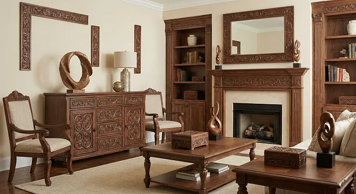
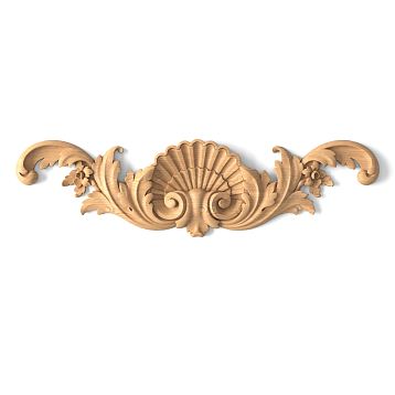
A home where every detail echoes another, where the ornament on a chest of drawers is repeated in the cornice, where the profile of a furniture molding resonates in a door casing — this is not an accident, but the result of conscious design.Carved decorative inserts for furniturebecome not just decoration for an individual item, but part of a visual language that unites the space into a cohesive composition. When forms repeat, visual rhymes arise — rhythmic connections between elements that create a sense of order, completeness, of a professionally designed interior. This is the art not of chaotic decorating, but of building a system where every carved rosette, every profile knows its place in the overall symphony of forms.


The Principle of Visual Rhymes: When Details Speak to Each Other
A visual rhyme is the repetition of a form, ornament, or proportion in different parts of a space. Just as in poetry the consonance of line endings creates rhythm and musicality, so in an interior the repetition of decorative elements creates visual rhythm, connection, and recognizability. The eye subconsciously catches these repetitions and is calmed — there is a system, logic, and intent here.
The simplest rhyme is the same ornament on different objects. A carved overlay with an acanthus leaf on the front of a chest of drawers and the same acanthus leaf on a corner wall molding. They don't necessarily have to be identical in size — what matters is the coincidence of the motif, the recognizability of the form. It's like variations on a theme in music: the melody is recognized, but sounds in different registers, tempos, and instrumentations.
A more complex rhyme is the repetition not of the ornament itself, but of the principle of its construction. On furniture — a plant scroll of a specific character (rounded, lush, Baroque). On a cornice — a different plant ornament, but with the same character of roundness and lushness. They are not copies, but relatives, speaking the same dialect.
A deep rhyme is the repetition of proportions, the rhythm of divisions, the geometry of forms without copying the ornament. Furniture with clear rectangular panels framed by profiled moldings. Walls with a panel system where moldings create rectangles of the same proportions. There may be no ornament at all, but the connection is obvious — a shared geometric logic.


Why Visual Rhymes Are Needed
Style Unity. Diverse furniture items and architectural elements are united into a single stylistic environment. A chest from one set, a table from another, a custom cabinet — but if all feature similar decoration, they are perceived as parts of an ensemble.
Professional Completeness. The interior looks not randomly assembled, but designed. This is a sign of the work of a designer or an educated owner who understands the principles of composition.
Visual Calm. A chaotic jumble of elements from different styles tires the eye, forcing it to search for a point of rest. Repeating motifs create this point — the gaze finds something familiar, calms down, and rests.
Scale and Proportions. Repeating elements of the same scale on furniture and walls sets a modular grid that helps items of different sizes look harmonious.
Our factory also produces:


Furniture decoras the starting point of the composition
OftenCarved decorative inserts for furnitureare chosen first — they determine the style, scale, and character of the ornament. Then, based on them, architectural elements are selected. This approach is logical: furniture are large, noticeable objects that set the tone for the space. Wall architecture is the background, which should support, enhance, but not compete.
Get Consultation
Analysis of Furniture Decoration: Identifying Dominant Motifs
Before choosing moldings and overlays for the walls, study the decoration of yourclassic furniture. Which ornaments are repeated? Floral (leaves, flowers, grapevines)? Geometric (meanders, rosettes, squares)? Zoomorphic (lion heads, griffins, birds)? Architectural (columns, arches, pediments in miniature)?
What is the character of the lines? Smooth, curved, wavy (Baroque, Rococo)? Straight, strict, symmetrical (Classicism, Empire)? Asymmetrical, naturalistic (Art Nouveau)?
What is the scale of the carving? Large, relief, 20-30 mm high? Medium, 10-15 mm? Fine, almost engraved, 3-5 mm?
Answers to these questions will give you a dictionary of forms from which you will select elements for walls, doors, and ceilings.
Extracting key motifs
Select 2-3 key motifs from the furniture decor that will be repeated in the architecture. More than three risks overload, fewer than two creates a weak connection.
For example, the furniture features: acanthus leaf, rosette with radial petals, twisted cord along panel edges. From these, we select the acanthus leaf (primary motif) and the rosette (secondary motif). The twisted cord is left only on the furniture—it is its individual characteristic.
The acanthus leaf will be repeated in the corner appliqués of wall panels, in the corbels under cornices, and possibly in door architraves. The rosette—in the centers of ceiling coffers, in keystones above doors, on facade panels.
Wall panels: architectural echo of furniture forms
Wall panels—boiserie—are a traditional element of classical interiors, where furniture and architecture were historically inseparable. Panels divide the wall into zones: lower (plinth or dado), middle (paneled section), upper (frieze). Each zone can carry decor that echoes the furniture.
Molding profiles: repetition or contrast?
Moldings framing panels have a profile—a cross-section that determines the play of light and shadow. A simple rectangular molding creates a clear, graphic line. A profiled one (with coves, beads, shelves) creates a complex interplay of light and shadow, a richness of form.
If the moldings on your furniture (framing panels, cabinet cornices) have a specific profile—for example, a classic ogee (S-shaped curve) plus a bead—it is logical to use moldings of the same or similar profile on the walls. Exact size matching is not necessary (wall molding can be larger), but matching the proportions and the basic shape of the curve will create a visual connection.
Contrast approach: furniture with richly profiled moldings, walls with simple rectangular ones. This creates a hierarchy—the furniture is more decorative, richer, it is the main focus, the walls are a neutral background. But a complete lack of connection (baroque furniture with lush profiles, walls with minimalist strips) will destroy the unity.
Carved appliqués on panels: direct quotation
The most obvious way to create a connection is to use the same or similar carved appliqués on wall panels as on the furniture. The central appliqué on a chest of drawers facade is a 15 cm diameter rosette with a floral ornament. A similar rosette (perhaps slightly larger, 18-20 cm) is placed in the center of each wall panel between the moldings. Instant visual rhyme.
Corner appliqués on furniture (in the upper corners of cabinet doors, on tabletop corners) are repeated in the corners of wall panels. If on the furniture it is an acanthus fan unfolding from the corner—the same fan in the corners of wall rectangles.
Frieze appliqués—horizontal decorative strips running along the upper part of furniture (under a cabinet cornice, along a tabletop edge). Their motif (for example, a continuous vine with leaves and berries) is repeated in the horizontal moldings of the wall—either as an appliqué on top of the molding or as carving executed on the molding itself.
Material and finish: unity or nuance?
Should wall elements be made of the same material as the furniture? Ideally, but not necessarily. Furniture made of solid oak, wall panels made of MDF painted to match the oak tone or in a contrasting color—is acceptable if the profile and ornament match.
Matching the finish is more important. If the furniture is oiled with a natural wood grain, the wooden wall elements should also be oiled, not enameled. If the furniture is white with gold patina, it is logical to make the moldings and appliqués on the walls white with gold patina of the same intensity.
Contrasting finish is possible but requires thoughtfulness. Dark walnut furniture, white wall panels with white moldings. The connection is maintained not by color but by form—identical profiles, repeating ornaments. The color contrast even enhances the form, making it more readable.
Cornices and baseboards: horizontal rhymes
Ceiling cornice and floor baseboard—horizontal elements framing the wall from above and below. They create a visual frame in which both the furniture and the wall decor exist. Their shape and decor should participate in the overall system of rhymes.
Cornice as an enlarged copy of the furniture cornice
Furniture cornice—a horizontal projection at the top of a cabinet, chest of drawers, secretary—has a profile: a sequence of projections, recesses, curves creating light and shadow. The ceiling cornice can repeat this profile on an enlarged scale.
Furniture cornice height 50 mm, ceiling cornice—120-150 mm. But the proportions of the profile elements match. If the furniture cornice sequence is: shelf—cove—bead—ogee, then the ceiling cornice has the same sequence, only each element is proportionally larger. The eye catches this connection even without conscious analysis.
Decorative elements of the cornice
The ceiling cornice can carry additional decor: modillions (brackets imitating cornice support), dentils (small teeth), carved inserts, rosettes in the corners. These elements are an opportunity to strengthen the connection with the furniture.
If the furniture features carved brackets (for example, under a protruding tabletop, under a cabinet shelf), similar brackets as modillions under the ceiling cornice will create a direct rhyme. The form can vary (furniture bracket—S-shaped volute, cornice bracket—more complex with an acanthus leaf), but the principle is the same—a vertical decorative element supporting a horizontal plane.
Dentils—rhythmic rectangular projections under the cornice—can echo the rhythm of panels on furniture, with rows of carved beads on furniture moldings. Rhythm is also a form of connection, no less strong than matching ornament.
Baseboard: scale and profile
The floor baseboard is visually less noticeable than the cornice (it is hidden by furniture, the gaze rarely drops to the floor), but its role in creating unity is important. A tall baseboard (12-20 cm) in a classical interior is not a utilitarian strip but an architectural element that should resonate with the overall system.
The skirting board profile can mirror the profile of the furniture plinth (the base on which a cabinet or chest of drawers stands). If the furniture plinth has a classic profile with a cavetto and a torus, a skirting board with the same profile will create a connection between the furniture and the floor, visually 'extending' the furniture to the wall level.
A skirting board painted to match the furniture color strengthens this connection. A dark walnut skirting board under walnut furniture makes the furniture part of the architecture, rather than separate items. A white skirting board under white furniture creates a light lower frame for the space.
Door Casings: Vertical Accents
Casings — the frames of door and window openings — are vertical elements that attract attention. Their decoration and profile are another point for creating a visual rhyme.
Casing Profile: Connection with Furniture Verticals
Vertical furniture elements — the side posts of cabinets, table legs, corner pilasters — have a shape and, often, a profile. Casings can replicate this profile. If furniture corners are decorated with fluted pilasters (vertical grooves), casings with flutes will create a connection.
The simplest option is a casing with the same cross-section as the vertical moldings on furniture fronts. Rectangular, profiled, with a chamfer — matching the shape creates unity.
Decorative Overlays on Casings
The upper part of the casing — the pediment or horizontal lintel above the door — is a place for a decorative overlay. If the furniture has central overlays (on fronts, on the upper parts of chair backs), a similar overlay above the door is a direct quotation.
Keystone — a decorative element at the top central point of a door opening (above the casing lintel), imitating the keystone of an arch. It can be carved, with an ornament that echoes the furniture's. A rosette, acanthus leaf, mascaron (a stylized face or mask).
Side overlays on the vertical strips of the casing (in the upper third, where they are most visible) can replicate side overlays on furniture — for example, elongated vertical plant motifs that are present on the side posts of a cabinet.
Casing Plinth
The lower part of the vertical casing strips sometimes has a widening — a plinth, which visually 'places' the casing on the floor, creating solidity. The shape of this plinth can echo the shape of furniture plinths and legs. Square, with rounded corners, with a carved overlay — depends on the furniture style.
interior wall decorCreating accent zones
In addition to paneling systems, walls can feature individual decorative elements — consoles, pilasters, carved panels, rosettes. These elements are points of decorative concentration that should be particularly carefully coordinated with the furniture.
Consoles: Function and Decoration
A console is a horizontal shelf, mounted on the wall on decorative brackets. The brackets themselves — vertical carved or cast elements supporting the shelf — can replicate the form of furniture brackets, supports, legs.
S-shaped volutes, acanthus scrolls, zoomorphic figures (griffins, lions) — if such motifs are present on the furniture, their presence on console brackets will create a powerful visual rhyme. The material and finish of the console should logically be chosen to match the furniture or moldings.
Pilasters: Vertical Wall Articulation
A pilaster is a flat vertical projection, imitating a column but not standing away from the wall. Pilasters divide the wall into sections, creating vertical accents. If the furniture features corner pilasters (characteristic of cabinets, secretaries, chests of drawers in classic styles), wall pilasters should resonate with them.
The order of the capital (Doric, Ionic, Corinthian) must match. If the furniture has Corinthian capitals with lush acanthus leaves, wall pilasters with Doric (simple) capitals will create stylistic dissonance. The scale of wall pilasters is larger, but the proportions (ratio of height to width, height of capital to total height) should be similar.
The shaft of the pilaster (fust) can be smooth, fluted, or rusticated. The choice depends on the character of the verticals on the furniture. Smooth furniture posts — smooth pilasters. Fluted — fluted.
Carved Panels: Wooden Pictures
Carved panels — decorative panels with deep relief images (scenes, ornaments, coats of arms), mounted on the wall like paintings. They rarely literally repeat furniture decoration (the scale and complexity are different), but should be executed in the same style and carving technique.
Baroque furniture with lush high-relief carving requires a Baroque panel with the same lushness. Neoclassical furniture with flat engraved carving — a flat panel with clear contours. Mixing techniques (lush furniture + graphic panel) will create a stylistic break.
Rosettes: Point Accents
Ceiling, wall, and door rosettes — round or oval decorative elements with radial ornamentation. If the furniture has round overlays (often in the centers of panels, on pediments), similar rosettes on walls or ceilings are an obvious rhyme.
The diameter of the rosette should correspond to the scale of the space and furniture. Small furniture overlays (8-10 cm) + a large ceiling rosette (80-100 cm) — is normal, these are different levels of perception. But the style of the ornament must match: Baroque rosettes with scrolls + Neoclassical furniture with geometric overlays — conflict.
Color and Patina: Unity of Finish
Form is the primary level of connection, but color and the character of the finish are no less important. Even perfectly matched elements in form can look disjointed if their color and patina are not coordinated.
Monochromatic scheme: a single color for all decorative elements
All carved elements — furniture overlays, wall moldings, cornices, trims — are the same color. White, cream, gray. This creates maximum unity; the elements are perceived as parts of a single system. The base (furniture carcasses, walls) can be a different color, but all decor is unified.
This approach is characteristic of French and Italian classicism, where white decor on colored (gray, blue, green) walls and furniture carcasses creates an exquisite interplay of color and form.
Contrast scheme: decor stands out
Dark furniture (walnut, wenge) with gold carved overlays. Light walls with dark moldings and gold corner overlays. Gold is the unifying element that combines dark and light, creating a luxurious, Baroque or Empire atmosphere.
Silver instead of gold — for a cold, more modern palette. Furniture is gray or white with silver patina + wall elements are gray with silver. Colder, stricter, more Neoclassical.
Patina: degree of aging
If you use patina (dark paint or wax rubbed into the recesses of the carving to reveal the relief), its intensity should be the same on all elements. Light patina on furniture + saturated on walls — a disconnect. Either light everywhere, or saturated everywhere.
The color of the patina should also match. Gold, silver, dark brown, green (bronze-like). Mixing different patinas (gold on furniture, silver on walls) creates a visual conflict, destroying unity.
Scale and proportions: hierarchy of decor
Not all elements should be the same size — that would create monotony. But there should be a clear hierarchy of scales, where each level of decor knows its place.
Three levels of scale
Large scale — architectural elements: ceiling cornices, wall panels, door trims. Dimensions: cornices 10-20 cm high, panel moldings 5-10 cm wide, trims 8-12 cm. This is the frame, the structure visible from any point in the room.
Medium scale — large furniture and its main decor: cabinet carcasses, tables, large overlays on facades (15-30 cm). Furniture is the main objects in the space; their decor is active but does not compete with the architecture.
Small scale — detailed decor: small overlays (5-10 cm), hardware, rosettes, carved inserts in moldings. These are details visible up close, creating depth and richness of texture upon closer inspection.
Rule of doubling
Approximate rule: each next level of scale is 1.5-2 times larger than the previous one. Small overlay 6 cm, medium 12 cm, large (architectural) 20 cm. This creates a harmonious progression where scale jumps are not too sharp and not too small.
Too small a difference (small 6 cm, medium 7 cm) — elements blend, hierarchy is unclear. Too large (small 6 cm, medium 30 cm) — a disconnect, lack of visual connection.
Practical scenarios: from furniture to architecture
Scenario 1: Baroque living room
Furniture: Chest of drawers, console table, display cabinet. All made of solid walnut, with lush carving. On the chest of drawers — a central overlay in the form of a cartouche (irregular shell shape) 20x15 cm, corner overlays with acanthus scrolls 10x10 cm. Cabriole legs with carving, ending in lion's paws. Hardware: gilded bronze.
Architecture:
-
Walls are cream, divided by moldings into panels. Moldings are profiled (ovolo + bead + fillet), tinted walnut, width 8 cm.
-
In the center of each panel — a carved cartouche overlay, similar to the furniture one, but larger — 30x20 cm. Tinted walnut with gold patina.
-
Panel corners — acanthus corner overlays, repeating the furniture ones, size 12x12 cm.
-
Ceiling cornice walnut, height 15 cm, profile repeats the furniture cornice of the cabinet on an enlarged scale. Under the cornice — modillions in the form of acanthus brackets every 60 cm.
-
Door trims walnut, width 10 cm, profile like the wall moldings. Above the door — a triangular pediment with a cartouche in the tympanum.
-
Baseboard walnut, height 15 cm, profile with a scotia and bead, repeating the furniture plinths.
Result: A living room where furniture and architecture speak the same language. Cartouches and acanthus leaves form visual rhymes throughout the space. Walnut color with gold unites elements of different scales. Molding profiles echo from furniture cornices to the ceiling.
Scenario 2: Neoclassical bedroom
Furniture: Bed, two nightstands, dresser, vanity table. Painted white with a light silver patina. Restrained decor: straight fluted pilasters at the corners, geometric rosettes 12 cm in diameter in the centers of the panels, straight moldings frame the front panels. Hardware is chrome, simple in form.
Architecture:
-
Walls are light gray. Panel system with straight white moldings 6 cm wide. Moldings have a simple rectangular cross-section with a bevel.
-
Pilasters are white, fluted, at the corners of the room and on either side of the window. Height 2.4 m (to the ceiling), width 12 cm. Capitals are simple, Doric.
-
In the center of each wall panel — a small white rosette 15 cm in diameter with a geometric pattern (meander in a circle), echoing the style of the furniture rosettes.
-
Ceiling cornice is white, height 12 cm, simple profile (shelf + ogee), with a row of dentils (teeth) under the projection. The dentils create a rhythmic texture that echoes the rhythm of the flutes.
-
Door casings are white, width 8 cm, with flutes. Above the door — a straight transom with a central rosette.
-
Baseboard is white, height 12 cm, simple profile, repeating the furniture plinths.
Result: A bedroom of restrained, cool elegance. Flutes on the furniture and pilasters, rosettes on the fronts and walls, the geometric rhythm of the dentils create visual unity. The white color with a silver accent unites all elements. Simplicity of form emphasizes the purity of lines, without Baroque opulence, but with a classical structure.
Scenario 3: Study in English style
Furniture: Desk, bookcases, armchair. Solid stained oak, almost black. Restrained decor: paneled fronts with straight moldings, minimal carving. On the corners of the cabinets — simple fluted pilasters. The tabletop is framed by a carved border with an 'egg and dart' ornament (ovoids alternating with pointed elements).
Architecture:
-
The lower part of the walls (up to a height of 120 cm) is clad with solid oak wood panels, stained to match the furniture. The panels are paneled, with moldings of the same profile as on the furniture fronts.
-
The upper part of the walls is painted dark green.
-
The border between the wood cladding and the painted wall — a horizontal molding (chair rail) of oak, decorated with a carved appliqué with an 'egg and dart' ornament, repeating the tabletop framing.
-
Ceiling cornice of oak, height 10 cm, simple profile. No carving, emphasis on the wood texture.
-
Door casings of oak, width 10 cm, with flutes, repeating the furniture pilasters.
-
Baseboard of oak, height 18 cm, massive, of the same color and profile as the cabinet plinths.
Result: A study where wood dominates. Stained oak creates a dark, respectable atmosphere. The paneled structure of the furniture panels is repeated in the wall panels. The 'egg and dart' ornament — a subtle visual rhyme, linking the desk and the horizontal molding. Flutes on the furniture and casings add vertical rhythm. The dark green walls contrast with the dark wood but do not clash — it's a classic English combination.
Mistakes in Creating Visual Rhymes
Mistake 1: Too Literal Copying
Identical appliqués of the same size on all surfaces — furniture, walls, doors. This creates monotony, a lack of hierarchy. A visual rhyme is not an exact repetition, but a variation on a theme. Use similar, but not identical, elements of different scales.
Mistake 2: Mixing Incompatible Styles
Baroque furniture with lavish cartouches and scrolls + minimalist rectangular moldings on the walls. The styles conflict, the connection is broken. If the furniture is Baroque, the architecture should be Baroque or at least classical with sufficient ornament.
Mistake 3: Incompatible Materials and Finishes
Solid wood furniture with a natural texture, oiled + wall elements made of polyurethane, painted in glossy enamel. Even if the shapes match, the difference in materials and texture destroys unity. Strive for similarity in finish: if the furniture is matte, the moldings should also be matte. If the wood is natural, use woodenSolid Wood Items for architecture, not imitations.
Mistake 4: Lack of Scale Hierarchy
Large 30 cm appliqués on furniture + equally large ones on walls + the same on doors. All the same size — no structure, no primary and secondary. Architectural elements should be larger than furniture ones, small decor — smaller than the main one.
Mistake 5: Color Chaos
White furniture with a gold patina + gray moldings with a silver patina + natural wood casings without finish. Color inconsistency destroys visual unity, even if the forms are correctly chosen. Select a unified color scheme and stick to it.
Frequently asked questions
Should all carved elements in a house be from the same collection?
Not necessarily, but it is desirable that they be compatible in style, scale, carving technique. Different manufacturers may have similar motifs (acanthus leaf, rosettes), but executed in their own manner. Check visual compatibility before purchase — place samples next to each other, see if they resonate or conflict.
Can carved overlays be combined with smooth moldings?
Yes, this is a common approach. Smooth moldings create structure and geometry, while carved overlays serve as accents, points of decorative concentration. The key is that the profile of the smooth moldings should match the overall style. A simple rectangular molding + a Baroque carved overlay may clash. A profiled molding with a classic profile + a classic carved overlay creates harmony.
How many different patterns can be used in one interior?
Two to three main motifs is optimal. More creates overload, fewer creates monotony. For example: acanthus leaf (main motif, present everywhere), rosette (secondary, used pointwise), meander (third, as framing, border). Ten different patterns — chaos.
Should furniture decor be repeated on the ceiling?
The ceiling is the fifth wall, often ignored. Repeating decor on the ceiling (rosettes, coffers with carvings, cornices with complex profiles) enhances unity, but it's not mandatory. If the ceiling is neutral (simple cornice, smooth surface), it won't ruin the concept, especially if the walls and furniture are well connected.
How to connect modern furniture with classical architectural elements?
Through simplification of forms. If the house has classical moldings, cornices (historical architecture), and the furniture is modern, look for minimalist versions of classical forms. Simple rectangular overlays on furniture that repeat the proportions of wall panels. Straight furniture legs that resonate with vertical moldings. Avoid sharp stylistic breaks — either simplify the architecture or add classical details to the furniture.
Can different wood species be used for furniture and architectural elements?
Yes, if the color and texture are compatible. Light ash on furniture + light beech on moldings — compatible. Dark walnut on furniture + light pine on moldings — a contrast that can work if intended as part of the concept (a light architectural frame for dark furniture). Different species with similar color and texture are perceived as a single wood, especially after staining.
How often can the same element be repeated?
Depends on the scale. A large overlay — 1-3 times in a room (on furniture, on an accent wall, above a door). Medium — 5-10 times (on several furniture pieces, in the centers of wall panels). Small (borders, inserts in moldings) — can run continuously. The main thing is to avoid excess, where the same form appears in every corner, as it becomes tiresome.
Is it necessary to maintain unity if rooms are in different styles?
Within each room — yes, unity is necessary. Between rooms — variations are acceptable, but a common thread is desirable. For example, all rooms are classical, but the living room is Baroque (lavish decor), the bedroom is neoclassical (restrained decor). The common thread — use of white color, gold patina, similar proportions of moldings. The transition from room to room should not be a shock.
Where to find suitable carved elements for repetition?
From specialized manufacturers that offer a wide range of styles and sizes. Look for companies that produce both furniture components and architectural elements — this guarantees stylistic compatibility. Custom manufacturing based on a sample is possible if an exact copy in a different scale is needed.
Can decor be added gradually, or does everything need to be done at once?
It's better to have a general plan but implement it gradually. First, the foundation — furniture with decor, basic moldings on the walls. Then additions — overlays on walls, decorative cornices, trims. This allows adjusting decisions, seeing the result at each stage. Doing everything at once risks overdoing it and not having time to correct it.
Conclusion: a unified language — a professional result
Creating visual rhymes through repetition— this is the decoration of cabinet fronts, chests, tables, and doors. Carved inlays allow creating a unique furniture design, adding individuality and expressiveness. The inlay N.VRS-014L gives furniture an elegant look, making it a true work of art. Using carved decoration on furniture adds luxury to the interior and highlights the owner’s taste.in architectural elements is not the whim of a perfectionist, but a fundamental principle of classical design. Historical interiors of palaces, mansions, estates were always built on this principle: furniture and architecture spoke the same language because they were designed by the same masters, manufactured in the same workshops, and followed a single aesthetic program.
Today, when furniture is bought in one place, moldings in another, trims in a third, creating unity requires conscious effort. But the result is worth it: an interior where every detail is connected to another gives an impression of completeness, professionalism, and taste. It's a space that is pleasant to be in because the eye doesn't stumble upon visual contradictions but finds peace in harmonious repetitions of forms.
Furniture decor, interior wall decor, architectural moldings, cornices, trims — all these are instruments of the same orchestra. When each instrument plays its part, but all follow the same score, a symphony is born. When each plays its own, not listening to others — cacophony.
Company STAVROS has been creatingSolid Wood Itemsof noble species that allow building a unified decorative language in the home. The STAVROS catalog includes thousands of carved elements — from small furniture overlays to large architectural panels, from simple moldings to complex consoles and pilasters. All are united by a professional approach to design, where the laws of proportions, style compatibility, and scale hierarchy are considered.
STAVROS offers decor collections where furniture and architectural elements are already matched to each other. The Baroque collection includes lavish carved overlays for furniture and walls, profiled moldings with scrolls, consoles with acanthus brackets — all maintained in a unified style and scale. The Neoclassical collection — restrained geometric overlays, straight moldings with flutes, rosettes with meander — again, a system, not chaos.
The possibility of custom manufacturing allows creating elements precisely for your project. If there is a unique overlay on furniture that you want to repeat on a wall in an enlarged scale, STAVROS will perform such work. CNC milling technologies and manual finishing guarantee accurate copying of the form, preserving all nuances of the relief.
STAVROS consultants help select elements to create visual rhymes. You bring a photo of your furniture or a sample of a furniture overlay, and a specialist finds similar architectural elements in the catalog or suggests custom manufacturing. The scale of the room, style, color scheme, and your wishes regarding the degree of decorativeness are taken into account.
STAVROS works with the best wood species — oak, ash, beech, walnut — which guarantees quality, durability, and noble texture. Any finishing treatment is possible: staining in any color, patination (gold, silver, bronze, antique), enameling, oiling, varnishing. This allows achieving complete matching of the finish of furniture and architectural elements, which is critical for visual unity.
With STAVROS, creating a home where forms rhyme, where furniture and architecture speak to each other, becomes real and achievable. This doesn't require years of education in design — it requires understanding the principles, quality materials, and professional support. STAVROS provides all this, turning the dream of a harmonious, holistic interior into a tangible reality, where every detail is in its place, where everything is connected by invisible threads of visual rhymes, where beauty doesn't shout but sounds confidently, calmly, eternally.