Article Contents:
- Why paint-ready solutions offer genuine freedom
- Which panels are suitable for such a scenario
- How polyurethane moldings integrate into a painted interior
- Tone-on-tone schemes and contrasting solutions: interior direction
- Where this works especially convincingly
- Mistakes in painting and composition that ruin the idea
- An interior where color gains architecture
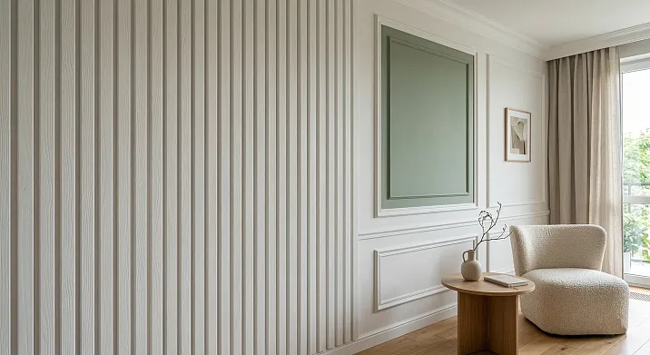
There are interiors that look put-together at first glance. They have nothing superfluous, nothing accidental—every surface is in its place, the color sounds even and confident, the relief works not as decoration but as architecture. And almost always, the same solution is behind this: the wall received its form before it received its color. It is at this point that slatted wall panels for interior finishing for painting cease to be just a finishing material and become the basis of an authorial interior. Not a background. Not a way to cover a wall. But a system that determines how color will be read in the space, how light will glide across the surface, and what feeling the room will create at any time of day.
A painted finish interior is always a territory of both freedom and risk simultaneously. The freedom here is obvious: any shade, any mood, any precise color adjustment according to the RAL or NCS catalog. The risk is less obvious but far more serious. A smooth plane without rhythm or texture is less forgiving than it seems at the color selection stage. A complex shade on a bare wall looks dull. White without texture is sterile. A saturated tone without support is heavy and random. That is why the most convincing painted interiors are built not around the choice of paint, but around the choice of the surface to be painted. AndRafter panelsin this context, it is not one of the options, but the best argument.


Why painted finish solutions offer genuine freedom
Most finishing materials fix the color at the production stage. Factory veneer, laminate, film coating — all of this is beautiful but static. You make a color decision once, and it stays with you for the entire lifespan of the finish. The room's concept has changed, the lighting has become different, furniture of a different tone has appeared nearby — and the interior begins to conflict with itself because its finish cannot adapt.
Wall slatted panels for paintingwork fundamentally differently. The surface remains neutral until the very last step — until the moment when the interior concept is fully built: furniture is chosen, lighting is thought out, textiles are selected. Only then does color appear on the surface — precisely, consciously, as a final adjustment, not as a starting point. This changes the logic of working with space. Instead of adapting the interior to the wall color, you adapt the wall color to the interior.
But the freedom to choose a shade is only one side. The second, no less important one: painted finish solutions create the possibility to change the concept without demolition. After a few years, the surface is repainted. A different shade, a different scheme, a different mood — while the structure, rhythm, and architectural logic of the wall remain. This makesslatted panels for paintingan investment with a long horizon: a correctly built surface once serves for decades, changing only the color depending on the evolution of the interior.
And finally — texture. This is precisely where slatted panels win over any other painted finish solutions. Paint on a smooth surface is one-dimensional: it reads as a colored spot, flat and static. Paint on a slatted surface comes alive: light glides over the slats, each slat gets its own chiaroscuro, the shade changes depending on the angle of the light rays. One tone in the morning, another at noon, a third under artificial evening light. This is the depth that cannot be achieved on an ordinary plastered wall.


Which panels are suitable for such a scenario
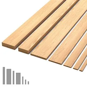
Materials with a homogeneous, predictable surface work for painting — one that accepts paint evenly, without unexpected absorption spots, without visual variations. MDF with a density from 750 to 850 kg/m³ is the classic and most manageable choice. No natural texture variations, no knots or pores, absolutely clean geometry.Slatted wall panelsMDF panels for painting provide precisely the accuracy of shape and surface necessary for working with complex color schemes: nuanced gray-greens, dusty pinks, deep anthracites, earthy terracottas. Where the color is complex, the surface must be impeccable.
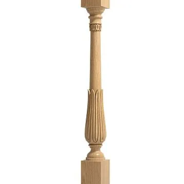
Solid wood is a different scenario. Here, the natural fiber texture remains alive under the layer of paint: pores, annual rings, tactile heterogeneity do not disappear anywhere, they are only muted and become a subtext.Rafter panelsBuying natural wood panels for painting means choosing a surface with character: paint lays on a living material, and the warmth of wood always reads through it. This is a solution for those who want not a perfectly even color module, but a painted surface with a sense of nature.
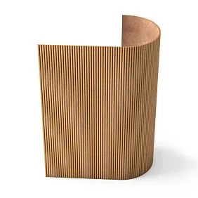
The key parameter for a painting scenario is the ratio of slat width and spacing between battens. Narrow slats with frequent spacing create a dense, almost fabric-like relief:decorative slatted panelsPanels with such a profile give the surface depth without rigid geometry — the shade seems multi-layered, airy, rich in nuances even with monochrome painting. Wide slats with large spacing give something else: a more graphic, architectural rhythm, where each slat reads as a separate element. Here color works in planes, and the contrast between the slat and the groove depth is maximum.
Both solutions are correct, but for different interior situations. Dense slat rhythm — for intimate, tonal spaces: bedrooms, studies, lounge areas, where an enveloping atmosphere is important. Large graphic rhythm — for living rooms, halls, accent walls, whereSlatted wall panelthe wall should read as an architectural statement. The choice should be made not based on personal preferences for slat width, but on what role the wall plays in the overall composition of the room.
Our factory also produces:


How polyurethane moldings fit into a painted interior
Molding in a painted interior is not decoration in the traditional sense. It is a tool for color discipline. Without it, even the most precise shade dissolves into formlessness: there is a wall, there is texture, there is paint—but no sense of completion. A color field without a boundary loses clarity, begins to 'spill' beyond the intended zone, and blurs the architectural idea.polyurethane wall moldingsThey do exactly what a frame does in painting: they contain the field, define its proportions, and create a deliberate boundary between the painted area and the rest of the space.
In a painted slatted interiorMoldings made of polyurethaneThey serve several specific architectural functions. The first is finishing the upper edge of the slatted panel. When the slats run from the floor to a certain height, it is the molding at the top trim that transforms this area from an 'unfinished' section of wall into a deliberate panel zone. Without molding, the boundary looks accidental. With molding—intentional and precise. The second function is horizontal wall articulation: the lower part in one shade, the upper in another, with a clear profile band between them instead of a blurred joint of two paints. The third is framing accent zones: TV walls, bed headboards, work niches.
Ceiling molding made of polyurethaneIn a painted slatted interior, it solves a problem often not considered in advance: it finishes the transition from a saturated or dark wall to the ceiling. Without this transition, a large color 'weighs down' the space—especially in rooms with standard ceiling heights. The molding introduces a pause, visually raises the junction line, and gives the space air. Polyurethane is chosen for this task also because it takes paint as evenly as MDF: no difference in texture at the joint of the two materials, no absorption stains, no edge defects.
Get Consultation
Tone-on-tone and contrasting schemes: interior direction
Tone-on-tone is the strictest and richest color scheme for a painted slatted interior. Here, the panels, moldings, and wall surface are painted in a single shade. It might seem that if everything is the same color—why have texture? But it is precisely in a monochrome scheme that the texture reveals its full potential: the eye is not distracted by color contrast and begins to read the volume, depth, and play of shadows between the slats. The surface ceases to be a plane and becomes a sculpture. This is why tone-on-tone is particularly convincing onwooden slatted panelswith a live texture—natural variations in the wood under paint of one color create a depth that cannot be reproduced by any factory-made decor.
But tone-on-tone, executed without considering lighting, turns into a monochrome trap. If the shade is too cool for the specific lighting or too saturated for the room's volume, the monolithic surface begins to feel oppressive. Here, molding becomes a rescue tool: it introduces a minimal textural accent of a different scale into the monochrome scheme, without breaking the color unity but relieving the sense of confinement. Molding of the same shade, but with a deeper profile than the slats, creates a hierarchy of textures—and the space breathes.
The contrast scheme operates on a different logic. The slatted panels get one color, the moldings another, the ceiling a third. The goal here is not to clash colors, but to establish a hierarchy. Dark panels at the bottom, a light molding as an architectural belt at the boundary of zones, a white or light beige ceiling—and the space is perceived as taller, more structured, more convincing. Forslatted wall panelsin the living room, this technique works especially powerfully: the dark slatted wall behind the sofa turns into an architectural backdrop, the perimeter molding prevents it from feeling oppressive, and the light ceiling returns air to the room.
Nuanced schemes are the most modern and the most complex. Two close shades from the same group: dark olive slats and a slightly lighter gray-olive molding. Or a deep blue-gray on the slatted part and a rich taupe on the transitional belt. Such solutions create what professional designers call living color tension: the eye catches the difference but cannot immediately name it. The relief of the slats here acts as a mediator—it smoothly transitions one shade into another through the play of shadows, and the boundary between the two paints ceases to be read as a clear line.
Where it works especially convincingly
In the bedroomSlatted panels in interior designbehind a painted bed headboard—this is not just an accent, but the semantic center of the entire space. A deep warm color on a textured surface creates a cocoon-like feeling: the room becomes intimate and protected without losing architectural rigor. The molding around the perimeter of this zone clearly separates the 'stage' from the rest of the room's volume—and the headboard turns into a built-in architectural element, not just a piece of furniture accidentally standing against the wall. Forslatted panels in the bedroomdeep earthy, dusty pink, and restrained green tones work best—they are not tiring but create an expressive atmosphere.
In the living roomSlatted panels in the living room interiorfor painting form what truly unifies the space: a compositional center. The TV wall with slatted panels ceases to be a place 'where they hung the TV' and becomes a full-fledged architectural plane around which the entire furniture group is arranged. The moldings frame this plane, preventing it from dissolving into the overall volume of the hall. A contrast or nuanced painting scheme here creates a visual weight that the sofa area perceives as a reference point.
In the study, the painted slatted rhythm on the walls removes office dryness—that specific blandness that arises when a workspace is made functional but without an architectural idea. A wall with slats in a restrained mid-tone—taupe, graphite with a warm undertone, muted pine green—turns the study into a living environment, not just a place for work.slatted modular wall panelhere it is especially convenient: it allows for forming a precise zone format without affecting adjacent walls.
In the hallway, where space is narrow and every centimeter counts,Slatted panels in the hallway interiorvertical orientation for painting visually elongates the volume. Molding along the upper edge of the slatted zone marks the transition to the ceiling—and the hallway begins to look more structured, taller, and, paradoxically, more spacious. It is in the hallway that painting in two or three horizontal tones—with molding as a divider—delivers maximum architectural effect with minimal cost: a dark panel at the bottom, a light top, and an expressive profile line between them.
In the kitchenSlatted panels in the kitchenpainting opens up possibilities that other materials do not offer: the color of the fronts and the color of the slatted wall can be synchronized down to the shade. The same paint on MDF slats and kitchen fronts creates absolute unity in the kitchen space—wooden panels and furniture merge into a single architectural system.
Mistakes in painting and composition that ruin the idea
The first and most common is paint without relief. When a complex designer color is applied to a smooth wall without texture, it invariably looks dull and flat. The relief of the slats is what transforms paint from a colored spot into a living surface. Removing the slats means removing half of the visual effect for which the shade was chosen. The rule is simple: the more complex the color, the more important the texture of the surface beneath it.
The second mistake is moldings of inappropriate scale. A thin molding on a large wall with wide slats gets lost and fails to hold the composition—it looks random, unnecessary. An overly massive profile on a delicate slatted surface with narrow slats feels oppressive and creates a conflict of scales. A working principle: the height of the molding profile should correspond to the rhythm of the slatted pattern. A molding that, in proportion, 'does not hear' the panel destroys the entire system.
The third is a conflict between vertical slatted rhythm and horizontal small-scale decor. A wall with vertical slats and horizontal moldings with a frequent step begin to visually clash: two rhythms in one plane create tension that reads as chaos, not complexity. The solution: either a large horizontal molding perceived as an architectural belt, not as a pattern, or a frame scheme that outlines the entire slatted zone without competing with its internal rhythm.
The fourth is a dirty white next to a cold shade. A warm ceiling white against a wall in a cold greenish-gray or deep blue-steel color creates a persistent visual discomfort: the shades are not formally clashing, but the space looks disjointed, random. For cold walls, a cold or strictly neutral ceiling is needed. A transition throughCeiling molding made of polyurethanein an intermediate neutral tone softens the contrast without losing the color concept.
The fifth mistake is an active color on weak geometry. If the slatted relief is barely expressed—slats too narrow, spacing too tight, shadows almost invisible—a saturated or dark color lacks support. The surface looks simply painted in an expensive shade, not like a painted architectural plane. For strong color statements, expressive relief is needed:slatted panels for wallswith wide slats and deep grooves, where shadows are visible even in diffused lighting.
Sixth — unsynchronized surfaces. Walls and ceilings that argue instead of supporting each other. Warm slats below and a cold ceiling above, or a rich color on the panels and a bland technical white on the ceiling — all of this creates a sense of incompleteness, as if the interior is assembled from different projects. Solution: ceiling molding as a mediator between the two surfaces, and a conscious decision about the ceiling tone as part of the color system, not as a residual choice.
An interior where color gains architecture
A well-made paintable interior is not the result of a successfully chosen shade. It is the result of a properly prepared surface for color.slatted panels for interior wall finishinggive this surface rhythm, depth, and the ability for chiaroscuro.Moldings made of polyurethanegive it shape, boundary, and compositional awareness. Together they form a system in which color receives not just a base — but an architectural stage.
A paintable interior is good not because of freedom itself — but because of freedom supported by form. WhenBuy slatted panels for wallsand selecting moldings for them is not just a finishing solution. It is an architectural solution: a conscious choice of rhythm, scale, relief, and a color scenario that will live in the space for a long time. And that is why those who want to control the result, not just fill the walls, invariably come to this combination — slatted rhythm and molding discipline under an exact author's color.
FAQ
Can MDF slatted panels be painted with regular interior paint?
Yes, provided that mandatory preliminary priming in one or two layers is applied. MDF absorbs paint more actively than drywall or plaster, so the primer evens out the surface's absorbency and ensures an even, uniform finish color without stains. The optimal choice is acrylic paint with a matte or satin finish.
Should moldings be painted separately or together with the panels?
With a tone-on-tone scheme, moldings and panels are painted simultaneously — this is more convenient and provides a perfectly uniform shade without color discrepancies. With a contrasting scheme, moldings are painted separately, after completing the painting of the main surface, to prevent accidental application of the contrasting color onto the slatted surface.
How to choose the scale of molding for slatted panels intended for painting?
The profile height of the molding should be proportionate to the rhythm step of the slats. For panels with slat widths of 80–120 mm, moldings with heights from 30 to 60 mm work well — depending on the room height and the overall scale of the interior. A molding that is proportionally smaller than one slat gets lost in the composition.
Which material for slatted panels accepts paint better — MDF or wood?
MDF provides a smoother, more predictable surface for painting: its homogeneous, pore-free structure ensures even paint application.MDF Slatted Wall Panel— the choice for those working with complex nuanced shades. Solid wood provides a more tactile, lively result but requires more thorough preparation and priming due to its open wood fiber pores.
Can slatted panels for painting be combined with acoustic functions?
Yes.acoustic slat panelswith felt or acoustic backing can also be painted, provided the correct paint is chosen — one that does not clog the pores of the acoustic material. This solution is particularly in demand for offices, meeting rooms, and home theaters, where both aesthetics and acoustic comfort are important.