


Article Contents:
- Why a light classic living room doesn't have to be a 'museum'
- What creates the 'museum' effect
- Why light shades actually reduce formality
- Which light shades are best for a classic living room
- Pure white: when it's justified and when it's not
- Milky and warm white: a universal choice
- Ivory and light beige: warmth without saturation
- Pearl and light gray with a warm undertone
- When white furniture is a classic solution for the living room
- A small living room requires light colors
- When you need freshness without abandoning classic style
- Conditions under which white furniture works at full capacity
- When it's better to choose light-colored classic furniture instead of white
- Apartment with insufficient natural light
- When layering of shades is important
- When you need to emphasize the character of the furniture, not the color
- How to choose furniture for a classic living room to make the interior look more expensive
- Less is more expensive
- Proportions matter more than decor
- Quality of details is the first thing that registers
- How to avoid the 'museum' effect: 7 mistakes in a light classical living room
- Mistake 1. Too much white without warm accents
- Mistake 2. Excess gilding
- Mistake 3. Heavy symmetrical furniture set without breathing room
- Mistake 4. Too many display cases and decorative elements
- Mistake 5. Shiny surfaces without soft textures
- Mistake 6. Lack of natural light and soft textures
- Mistake 7. 'Expensive' is created by quantity, not quality
- What makes a bright classic living room lively and cozy
- Soft textiles as the main 'livening' element
- Warm light as the foundation of atmosphere
- Wood as a tactile and tonal partner
- Subtle decor instead of a 'showcase'
- The feeling that someone truly lives here
- How to combine light classic furniture with walls, floors, and textiles
- White furniture + walls
- Floor: the foundation of the entire tonal system
- Curtains: volume and material
- Rug: an anchor for the entire sofa zone
- Which light classic furniture is better suited for an apartment rather than a formal interior
- Lighter silhouettes: not 'palace-style'
- Fewer massive display cabinets and sideboards
- Soft symmetry instead of strict
- One main accent instead of 'everything at once'
- Practical checklist before buying furniture for a light classic living room
- FAQ: answers to the most popular questions about light classic living rooms
- Conclusion
This fear is understandable. But it is solvable. And—what's important—it is solved not by abandoning classic style, but by properly understanding its mechanics.
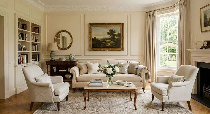
Classic FurnitureA classic living room does not oblige you to have gilded cornices, heavy display cabinets, and strict symmetry that feels oppressive even to the eye. It obliges you to have proportionality, noble details, and the ability to work with space. It is this principle that transforms a bright classic living room from a "formal hall" into a living, soft, and truly beautiful place.
This article is not just theory about classic style. It is an analysis of specific mistakes, shades, techniques, and solutions that determine whether a classic living room will be your pride or a source of constant worry: 'Why does everything look so formal?'


Why a bright classic living room is not necessarily a 'museum'
To address the main fear, you need to understand its source. Where does this 'museum effect' even come from?
It does not arise from the classic style itself. It arises from a set of specific decisions: too much gilding, too strict symmetry, too shiny surfaces, too 'untouched' cushions that are clearly not meant to be sat on. When a space looks untouchable—it ceases to be alive. That's the whole secret of the museum effect.


What creates the 'museum' effect
-
Excessive formality: everything is on display, nothing is hidden, everything is symmetrical to the point of feeling artificial
-
Heavy glossy surfaces that reflect light but do not absorb heat
-
Complete uniformity of furniture in the set — sofa and armchairs like display pieces
-
Absence of tactile materials: only hard, only shiny, only cold
-
Gold as the only metal, everywhere and in large quantities
Our factory also produces:


Why light shades actually reduce formality
This is a counterintuitive thought, but it works. Dark classic — dark walnut, burgundy velvet, heavy floor-length curtains — creates more of a 'palace' feeling than light colors. White, cream, pearl palette lightens the visual weight of furniture. It makes classic feel more modern, airier, more suitable for an apartment rather than a reception hall.
The problem is not with the light palette. The problem is how to apply it. And this is exactly what the entire further conversation is about.
A classic living room without a museum effect is a matter of dosage: dosage of shine, dosage of symmetry, dosage of decor, dosage of heaviness of forms. When each of these components is exactly as much as needed — classic becomes alive and expensive, not frozen.
Read more about howClassical furniture in interior designcombines stylistic principles with residential comfort — in an expanded analytical material.
Get Consultation
Which light shades are best suited for a classic living room
The first and very common mistake is thinking that 'light classic' necessarily means white. In fact, the spectrum of the light palette for a classic living room is much broader. And it's precisely in the nuances that the fundamental difference between 'expensive' and 'sterile' lies.
Pure White: When It's Justified and When It's Not
Pure white is the most demanding shade in light classic style. It provides maximum brightness and clarity, reflects light well, and visually expands the space. But it has a serious drawback: it easily turns into a 'clinic' in the absence of supporting warm textures.
A white classic living room works when there is: a warm wooden or stone floor, soft linen or wool curtains, pillows, a rug with a pronounced texture. Without this environment, white furniture fronts and white walls produce too sterile a result.
Optimal conditions for pure white classic style:
-
A room with good natural lighting (south or east orientation)
-
Warm floor: parquet, engineered wood, a rug with a warm tone
-
Presence of several tactile textures: textiles, wood, live plants
-
Warm (2700–3000 K) primary and secondary lighting
Milky and warm white: a universal choice
Milk shade is a slightly yellowish, creamy white. It most often creates the impression of 'expensive classic' in real interiors. Why? Because it doesn't contrast harshly with walls, floors, and textiles, but transitions into them smoothly.
Milk-colored furniture for a classic living room pairs with warm beige walls, natural wood, and textiles in flesh and sand tones. The result is a space where everything is connected into a unified tonal system. This creates the feeling of 'expensive', not just 'light'.
Ivory and light beige: warmth without saturation
Ivory is a shade with a slightly brownish or yellowish 'patina'. It's warm, somewhat antique in character, very soft. For a classic living room in an apartment, it's one of the best choices: it doesn't feel cold, doesn't scream with whiteness, and doesn't require particularly precise control over light sources.
Light beige works in a similar way: it's a neutral-warm tone that doesn't dominate but doesn't disappear either. Against its background, golden handles and stucco details look especially organic.
Pearl and light gray with a warm undertone
Pearl is a shade with a slight silvery quality that gives furniture a cool nobility. It works well in large rooms with high ceilings where you need to 'cool down' an excessively warm floor palette. But in small apartments with artificial lighting, it may appear cold.
Light gray with a warm undertone (not bluish, but beige-gray) is one of the current trends in classic living room furniture in recent years. It looks modern, easily 'breathes' alongside wood and metal, and creates a sense of neutral luxury without excessive mannerism.
A detailed breakdown of how colors of classic furniture works in space and why the shade changes everything — in a comprehensive guide to classic style.
When white classic furniture for the living room is a successful solution
White furniture in classic style is not just a fashionable choice. It is a functional and aesthetic solution that, when applied correctly, yields a very strong result.
A small living room requires light colors
In a room up to 16–18 sq. m, dark classic furniture absorbs space. Dark walnut, burgundy upholstery, rich wallpapers — this is classic style that works in large halls. In a standard apartment, such solutions can create a beautiful but oppressive interior.
White classic furniture for the living room does the opposite: it reflects light, visually expands the space, and eliminates the feeling of clutter. In a small living room, preciselyLiving room furniture in classic stylein a light execution — is the first choice for those who want both classic style and spaciousness.
When freshness is needed without giving up classic style
Classic style is perceived as heavy and outdated precisely because, in the mass consciousness, it is associated with a dark, rich palette. White classic style breaks this stereotype. It retains all the silhouette and decorative features of classic style — moldings, curved legs, stucco details — but makes them feel modern.
This is that rare case where 'old form' and 'new feeling' work together, rather than contradict each other.
Conditions under which white furniture works to its full potential
-
Walls are not pure white, but in warm tones (cream, light beige, soft gray). The contrast between white furniture and slightly warm walls creates depth.
-
Flooring is warm: parquet, wood-look laminate, natural stone in warm tones.
-
Curtains are voluminous, with good folds, made of linen, cotton, or velvet, in milk or light sand tones.
-
Furniture metal details are matte (matte gold, matte nickel, aged bronze). Not mirror chrome or polished gold.
-
Textiles are warm, with pronounced texture: linen or wool pillows, cotton throws.
About howWhite classic furnitureinteracts with the interior color palette and how to avoid sterility — a separate detailed article on this topic.
When it's better to choose light classic furniture instead of white
White is not the only and far from always the best shade for a light classic living room. In a number of situations, warm light tones work more convincingly and give a more noble result.
Apartment with a lack of natural light
Rooms with northern orientation or small windows have a bluish natural light. Pure white furniture in such a space starts to look cold and gray. Milk, cream, or light beige are the correct answer: they neutralize the cold and create a feeling of warmth even with insufficient lighting.
When layering of shades matters
Light classic style, built on several close shades — cream, milk, light beige, gold — looks significantly deeper and more expensive than a monochrome white interior. This is the principle of tonal layering: each element differs slightly from the neighboring one, and this creates richness of impression.
White furniture on white walls with white curtains is beautiful, but flat. Cream furniture on warm whitish-beige walls with milk curtains and warm parquet is a living, warm, voluminous space.
When you need to emphasize the character of furniture, not the color
Light classic furniture in milk or cream shade allows carving, moldings and leg shape to 'speak' more clearly than a pure white background. White neutralizes relief — too bright, too flat. Warm light shade — emphasizes volume and gives details expressiveness.
How to choose furniture for a classic living room to make the interior look more expensive
This is a practical question asked by everyone who chooses classic style. How to make the space look not just 'decorated', but truly status-worthy?
Less means more expensive
The most common mistake in a classic living room — buying a complete heavy set: sofa plus two armchairs plus coffee table plus display cabinet plus chest of drawers plus TV stand plus a pair of chairs by the window. All from one set, one wood, one upholstery.
Result — pressure. The room is 'occupied' by furniture, there's no air, nothing for the eye to catch on, because everything is the same.
The rule of expensive interiors: fewer items, more precise choices. One accent sofa, one or two armchairs. A coffee table doesn't have to match the set; a slight contrast works. A display cabinet or vitrine only if you have something to show. Use a chest of drawers instead of a TV stand, with an open shelf on top.
Proportions are more important than decor.
Classical living room furniture should be proportionate to the room. High-back armchairs only in rooms with ceilings above 2.7 m. Massive display cabinets only in spaces from 20 sq. m. Heavy sofas with carved legs only if the rest of the space is light and neutral.
Check proportions on paper: draw a room plan and arrange furniture to scale. See how much 'free' floor space remains. If less than 40%, there's too much furniture.
The quality of details is the first thing noticed.
Furniture with smooth-polished fronts, clear moldings, and well-fitted doors instantly signal quality—even before you touch the surface. Uniform gaps between fronts, smoothly closing drawers, handles in matching metal throughout the set.
This—not carving or the number of details—creates the feeling of 'expensive classic'.
How to avoid the 'museum' effect: 7 mistakes in a light classical living room
Let's break it down honestly: what exactly makes a classical interior feel unlived-in and how to fix it.
Mistake 1. Too much white without warm accents
White walls + white furniture + white curtains = sterility. Contrast is essential: warm flooring, beige or cream details, textured textiles. At least one element should 'warm up' the space.
Mistake 2. Excess of gilding
Gilding in classic style is an appropriate accent. But when gold is present on all handles, all frames, the ceiling cornice, lighting fixtures, and decor simultaneously—it's no longer elegance, but theatricality. One or two accents of gold metal against a neutral background work excellently. Everywhere at once—it's overkill.
Mistake 3. Heavy symmetrical furniture set without breathing room
When everything is arranged mirror-symmetrically and nothing disrupts the strict symmetry—the interior 'freezes'. A slight disruption of order enlivens the space: one armchair of a slightly different character, a couple of books in different positions on a shelf, a vase not centered but slightly shifted. This creates a feeling of 'people live here', not 'this is an exhibition'.
Mistake 4. Too many display cabinets and decorative elements
Classic style loves display cabinets and whatnots, but when there are several and all are filled—it creates an 'antique shop' effect. In a modern light classic living room, one open shelving unit or one small display cabinet with selected items—is enough.
Mistake 5. Shiny surfaces without soft textures
Lacquered fronts + glossy upholstery fabrics + parquet with a mirror shine—this is a combination without 'breath'. Matte or semi-matte surfaces are needed in at least 60% of the space. Silky linen on a sofa next to a matte front of a whatnot—this is a contrast that works in favor of coziness.
Mistake 6. Lack of living light and soft textures
One chandelier in the center of the ceiling is functional lighting, but not interior lighting. A classic living room requires layers: main light + sconces by the sofa + table lamp by the armchair + candles or decorative lighting. Warm multi-point lighting completely changes the perception of space.
Mistake 7. 'Expensive' is created by quantity, not quality
Four mediocre pieces of furniture will not create a sense of luxury. One truly well-made sofa, one proper chest of drawers, and a few carefully selected details — will. The quality of surfaces, precision of details, weight, and stability — that's what is perceived as 'expensive'.
What makes a light classic living room lively and cozy
Let's move from mistakes to tools. What exactly 'enlivens' light classic style?
Soft textiles as the main 'enlivener'
Textiles are the first remedy against museum-like sterility. Voluminous curtains with good folds, soft linen or wool pillows, a carpet with pronounced pile or pattern — all this makes the space tactile and alive.
Important: textiles should be in warm shades and natural materials. Synthetic fabrics with artificial shine only enhance the feeling of an 'exhibition'. Linen, cotton, wool, velvet — are the right allies for a classic living room.
Warm light as the foundation of atmosphere
Already mentioned, but here — in more detail. For a classic living room, the optimal color temperature is 2700–2800 K (very warm yellowish light). This light visually 'warms' any surface: a milky facade begins to glow, beige walls — softly glow from within, wood — plays with depth.
4000K lamps turn a classic living room into an office. 2700K lamps make it a living room with character.
Wood as a tactile and tonal partner
Natural wood in small quantities is absolutely appropriate in a light classic living room. Parquet, a coffee table with wooden legs, a wooden mirror frame, a wooden tray on a chest of drawers — small touches of natural texture create a sense of organic harmony.
Classic without wood is a cold, 'mineral' elegance. Classic with the right dose of wood is alive and warm.
Subtle decor instead of a 'showcase'
A few large decorative items instead of many small ones. One large vase instead of ten small figurines. One live or artificial branch in an interesting vessel. Two or three books on the coffee table. That's enough — and it's precisely this amount of decor that speaks of taste, not a desire to 'fill' space.
The feeling that someone actually lives here
A light throw on the arm of the sofa. A book on a stand. A glass with pencils on the console. Live flowers or greenery — even if small, but alive. These are things that photographers specifically 'arrange' before an interior shoot, because they are what turn a space from an 'exhibition' into a home.
About aestheticswhite beautiful furniture— about how to work with white and cream without losing elegance — a separate article with specific examples.
How to combine light classic furniture with walls, flooring, and textiles
This is one of the most practical questions—and one of the most underrated. The right background makes furniture look more expensive. The wrong one can ruin even a good piece.
White furniture + walls
Do not make walls the same tone as the furniture. White fronts on white walls cause the furniture to blend into the space and create monotony. The best solution:
-
White furniture → walls in cream, off-white, or light beige
-
Cream furniture → walls in warm light beige or light with a subtle gray undertone
-
Ivory furniture → walls in neutral tones: soft white, creamy gray, light basalt
The difference between walls and furniture should be: not contrasting, but distinguishable. This creates the necessary depth.
Flooring: the foundation of the entire tonal system
The floor in a classic living room is the most substantial element that 'holds' the entire light palette. The rules:
| Furniture color | Optimal floor | Why |
|---|---|---|
| White, milky | Warm light parquet (oak, natural ash) | Warmth of wood balances the coldness of white |
| Ivory, cream | Medium-tone parquet or warm beige stone | Similar tonal range, rich unity |
| Pearl, gray-white | Marble, light stone, light parquet | Noble coolness of the entire palette |
Avoid dark flooring with very light furniture in a small room: the contrast will be too strong, a 'heavy bottom' will visually compress the space.
Curtains: volume and material
For a classic living room in light tones — only fabrics with good volumetric drape. No synthetic roller blinds, no Roman shades in a 'business' style.
Optimal solutions:
-
Linen: milky, light beige, natural — the most organic option for soft, light classic style
-
Cotton with a light texture: light, airy, creates volume
-
Velvet: in small amounts — one heavy velvet element (a curtain or sofa cushion) adds luxury without overloading
Curtain length — only to the floor or slightly below. Curtains 'to the windowsill' in a classic living room look cut off and spoil the proportions.
Rug: an anchor for the entire sofa area
In a light classic living room, a rug is a mandatory element. It 'grounds' the sofa area, adds warmth and texture, and connects the floor and furniture into a single composition.
Suitable options:
-
A solid-colored rug in a warm tone (cream, light beige, warm gray) — universal and luxurious
-
A rug with a classic pattern (medallion, meander, floral pattern) — accent, adds character
-
Wool or linen rug with a soft pile — tactilely rich, well 'enlivens' the space
Rug size: the front legs of the sofa and armchairs should be on the rug. A small rug in the middle of a large room is a typical mistake that makes the furniture group disjointed.
Which light classic furniture is better suited for an apartment, not for a formal interior
Classic for an apartment is not a scaled-down copy of a palace interior. It's a different scale, different proportions, a different level of 'theatricality'. And understanding this difference is fundamentally important.
Lighter silhouettes: not 'palace-like'
Sofa with elegant legs — yes. Sofa on a massive rectangular plinth — no (that's for large halls). Armchair with soft rounded details — yes. Armchair with a heavy carved back at ear level — no.
For an apartment, classic should have 'air' in the silhouette: thin legs, facades not overloaded with decor, moderate back heights.
Fewer massive display cabinets and sideboards
In a standard apartment, a sideboard with lighting 2.2 m high takes up an entire wall and creates a 'furniture showroom' feeling. Alternative: one small open shelf with well-chosen items, or a chest of drawers with a mirror above it, or even without closed storage in the living room if it's not critical.
Soft symmetry instead of strict
One sofa + two symmetrical armchairs is a classic. But if one chair is slightly moved away, and one table is not exactly centered — it doesn't break anything, but adds life. Strict geometric symmetry should be visible in the overall structure, but doesn't require absolute precision in details.
One main accent instead of 'everything at once'
In apartment classic style, there should be one semantic center: either a sofa area with a rug and lighting, or a fireplace or fireplace imitation, or a large mirror with a beautiful frame. One accent that organizes the space. Several competing 'main points' is chaos, not classic.
The concept ofModern classicprecisely describes this principle: strictness and elegance do not contradict each other, but help create an interior that is both noble and comfortable.
Practical checklist before buying furniture for a light classic living room
Use these questions before opening a catalog or going to a store. The right answers will save time, money, and nerves.
1. What is the room size?
Up to 16 sq. m — only light silhouettes, light shades, minimum items. 16–25 sq. m — full classic arrangement with a rug and furniture group. More than 25 sq. m — you can add a display cabinet or a second accent volume.
2. How much natural light?
A lot (south, east side) — you can use pure white and pearl. Little (north, west) — only warm shades: milky, cream, ivory.
3. Do you need pure white or is warm light better?
White requires a warm environment. Milky — universal. Cream — the most 'lively'.
4. Do you need a full set or just key pieces?
A full set is appropriate in rooms from 20 sq. m. In smaller ones — it's better to buy a sofa, one chest of drawers, and a good rug. Everything else — as needed.
5. Do you need a display cabinet?
Only if you have something to show: beautiful dishes, books, decorative items. An empty display cabinet is extra volume without meaning.
6. How strict or soft should the interior be?
Strict symmetry + pronounced details = a more solemn result. Soft symmetry + laconic details = a more residential and modern result.
7. Is there a risk of overload?
Count the number of wooden elements, large volumes, and decorative details. If there are 'too many' of each, you need to reduce them.
8. How will the furniture combine with the floor, walls, and curtains?
Check the tonal balance: furniture, walls, and floor should be in the same tonal range (warm or neutral), but not the exact same color.
Light classic living room furniturewith the right answers to these questions, buying means eliminating disappointment from mismatched expectations and results in advance.
FAQ: answers to the most popular questions about a light classic living room
Is white furniture suitable for a classic living room?
Yes, and it is one of the relevant modern versions of classic style. White furniture makes classic style fresher and lighter, but requires a warm environment: warm floor, soft textiles, wooden details. Without the support of warm textures, white gives a sterile result.
How to make a light classic living room cozy?
Three key components: warm light (2700–2800 K), natural textiles (linen, cotton, velvet), and one or two wooden elements. It's also important not to overload the space with a symmetrical furniture set—less is more, but more precise.
How to avoid a museum-like effect in a classic interior?
Reduce the amount of gilding. Remove excess decorative items. Add tactile textures. Allow yourself a slight break in symmetry. Place a throw blanket on the sofa. Put fresh flowers.
Which light-colored furniture for a classic-style living room looks more expensive?
Milk, cream, and ivory with a matte or semi-matte finish look more expensive than pure white. Pure white with a glossy finish feels cheaper. Warm shade + matte surface + good detailing = the most expensive look.
White or milk-colored classic furniture is better for an apartment?
Milk is more versatile. It's softer, warmer, less demanding on lighting quality and surroundings. White is more beautiful under the right conditions but stricter about mistakes in background and lighting selection.
Is it necessary to buy a full furniture set for a classic living room?
No. In an apartment, a full matching set often overloads the space. It's better to buy a good sofa, one proper chest of drawers, and choose the remaining items based on tonal and stylistic affinity, not complete identity.
Which colors pair best with light-colored classic furniture?
Beige and cream on the walls. Warm parquet or light stone on the floor. Milk or warm curtains. Gold and matte bronze as metal. One or two contrasting accents — muted green, terracotta, warm blue — in textiles or decor.
How to choose classic furniture for a small living room?
Priority — light silhouettes with thin legs. Light shades are mandatory. Minimal closed storage. One sofa, maximum two armchairs, a coffee table, a rug. A display cabinet or showcase — only if there is a free wall at least 1.5 m wide without windows and doors.
Conclusion
A classic living room in light tones can be warm, lively, and truly noble — without the slightest hint of formality or museum-like feel. The difference between a 'palace-showcase' and a 'beautiful home' is not in the style. It lies in how much gilding, how much symmetry, how much shine, and how much 'untouchability' you allowed yourself in this space.
Light classic style works through subtlety. Milk tones instead of pure white. Matte surfaces instead of gloss. A few precise pieces instead of a full set. Warm light and natural textures instead of 'exhibition' order.
It is then that a classic living room becomes not a demonstration of style, but a place you want to return to.
STAVROS creates furniture and decorative elements for classic and modern interiors with an emphasis on material quality, precision of details, and nobility of forms. The STAVROS catalog features classic living room furniture in light, warm, and neutral shades, wooden products, and hardware that make the interior cohesive and lively.
STAVROS works for those who understand: a beautiful interior is built not on the quantity of items, but on the precision of each choice. If you want to create a light classic living room that looks expensive but feels like home — STAVROS will help you find exactly the solution that makes it possible.


