


Article Contents:
- Black as the visual skeleton of the interior
- When a dark baseboard makes sense
- High ceilings and light walls
- Light or neutral floor coverings
- Open layouts and studio spaces
- Mirrors in black frames: vertical graphic accent
- Frame shape: geometry as style
- Size and scale: when bigger is better
- Profile thickness: from thin line to massive construction
- Balancing black in the interior: how to avoid falling into darkness
- Three-point rule
- Ratio of black and white
- Black texture: matte vs glossy
- Best combinations of black graphics with materials
- Black and wood
- Black and stone
- Black and textiles
- For which rooms black graphics are especially good
- Living room: graphics as style
- Bedroom: restrained graphics
- Hallway: functional graphics
- Bathroom: graphics and hygiene
- Kitchen: practicality and style
- Psychology of black in living space
- Black as an anchor
- Black as a frame of reality
- Black as a contrast enhancer
- When there is too much black
- Installation of black baseboard: technical nuances
- Wall and floor preparation
- Mounting methods
- Corner processing
- Finishing
- Care for black interior elements
- Daily cleaning
- Weekly Cleaning
- Removing stains and scratches
- Mistakes when using black graphic elements
- Mistake #1: Black baseboard in a room with low ceilings and dark walls
- Mistake #2: Too wide black baseboard in a small room
- Mistake #3: Black baseboard and black floor
- Mistake #4: A single black element in the interior
- Mistake #5: Glossy black in a minimalist interior
- Frequently Asked Questions
- Can black baseboard be combined with colored walls?
- What width of black baseboard to choose for an apartment with 2.7-meter ceilings?
- Should black baseboard be painted before installation or can it be done after?
- How to choose the size of a mirror in a black frame for an entryway?
- Does black baseboard visually expand or narrow the space?
- Can black baseboard be used in a children's room?
- How to care for matte black baseboard to keep it looking good?
- Should a mirror in a black frame be hung vertically or horizontally?
- How many mirrors in black frames can be hung in one room?
- Can black baseboard be combined with white trim?
- Conclusion: graphics as a philosophy of space

Black in interior design is not mourning or gloom. It is architectural rigor, a visual framework of space, a tool for managing attention. When it comes to graphics in light-colored rooms, it is the dark elements that become the lines that structure the volume, making it clear, cohesive, and meaningful.Wooden baseboardblack color andmirrors in black framesare two key tools capable of transforming a banal room into a space with character.
But how do you understand when it makes sense to introduce this graphic quality, and when a dark outline can steal height, weigh down the atmosphere, and turn a room into a box? Why in some interiors does a black baseboard make the space taller and clearer, while in others it creates a oppressive feeling? Let's understand the mechanics of how dark elements work, learn to dose black, and build a balance between contrast and harmony.


Black as the visual skeleton of an interior
Why do white walls, light floors, and black baseboards work flawlessly? Because the human eye is designed to seek boundaries, structures, and reference lines. In a monochrome light interior, these lines are blurred—the walls seem to flow into the floor, the ceiling appears undefined. Add a dark outline along the bottom of the wall—and the space immediately gains a readable geometry.
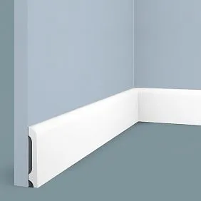
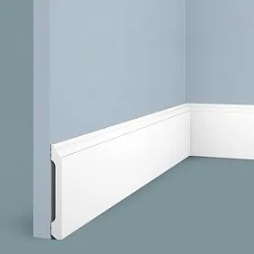
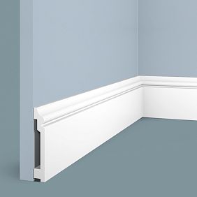
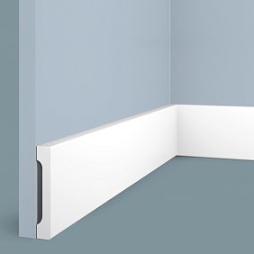
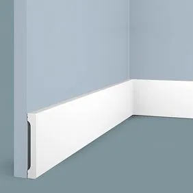
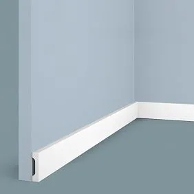
A dark baseboard serves as an architectural pencil. It outlines the perimeter of the room, makes the corners visible, and emphasizes proportions. In minimalist interiors, where furniture is often elevated above the floor or barely noticeable, it is the baseboard that becomes the main graphic accent. It is like a frame for a painting—it defines the boundaries of the composition.
Mirror in a black framecontinues this logic vertically. If the baseboard sets the horizontal, the mirror frame lifts the gaze upward, creating a vertical accent. The result is a graphic grid: dark lines along the bottom and dark rectangles on the walls. Such a structure makes the space orderly but not boring—black is strong enough to work even in small quantities.
This scheme has been used in Scandinavian interiors for years. White walls, bleached oak flooring, black skirting boards 80–100 mm high, and a round mirror in a thin black frame above the console. Minimal means, maximum visual impact. The space is not overloaded, yet it possesses a clear structure that prevents it from dissolving into a featureless whiteness.


When a Dark Skirting Board Makes Sense
A dark skirting board won't work equally well in every space. There are situations where it performs at its best, and cases where a light-colored solution is preferable. Let's examine specific scenarios.
Our factory also produces:


High Ceilings and Light Walls
If the ceiling height is 2.8 meters or higher, and the walls are painted white, light gray, or cream, a black skirting board becomes almost a mandatory element. It visually 'grounds' the space, making it cozier and preventing the volume from appearing empty and cold. At the same time, the height doesn't disappear—it simply gains a reference point from which the eye begins its upward movement.
Important: the higher the ceiling, the wider the skirting board can be. For rooms with ceilings of 3–3.5 meters, wide profiles of 100–120 mm are suitable. They don't 'eat up' the height; on the contrary, they emphasize the scale of the room by creating a clear lower boundary.Wooden baseboardA skirting board of such width looks solid and prestigious, especially if made of oak or beech and painted in a deep matte black color.
Get Consultation
Light or Neutral Floor Coverings
A black skirting board works flawlessly with floors made of bleached oak, light ash, gray porcelain stoneware, or white laminate. The contrast is maximal, and that's precisely what makes it effective. The floor is separated from the wall by a graphic line that simultaneously protects the wall from dirt and serves as a decorative element.
The story is different with dark floors. If you have wenge, stained oak, or dark brown parquet, a black skirting board blends with the floor. The visual boundary disappears, resulting in a uniform dark stripe at the bottom of the wall instead of a graphic element. This isn't always bad, but the contrast effect is lost. In such cases, it makes sense to either choose a skirting board that matches the floor tone or, conversely, opt for a light-colored version for contrast.
Open-Plan and Studio Spaces
In large, partition-free rooms, a dark skirting board helps visually zone the space. A black outline along the entire perimeter of the studio creates a sense of unity while simultaneously emphasizing the room's dimensions. If you add severalmirrors in black frameson different walls, you'll achieve a recurring graphic theme that ties all zones together.
In small rooms with low ceilings, black skirting boards should be used cautiously. If the ceiling is below 2.6 meters and the walls are painted in medium or dark tones, a black outline can visually 'weigh down' the space. In such cases, it's better to choose a narrow profile of 60–70 mm and pair it with the lightest possible walls. Or, forgo a dark skirting board altogether in favor of a white one or one that matches the wall color.
Mirrors in Black Frames: A Vertical Graphic Accent
If the skirting board works horizontally, then mirrors in black frames establish vertical axes. They lift the gaze, create focal points, and structure the wall. Moreover, a mirror in a black frame is not just a functional item for reflection. It's a full-fledged art object capable of setting the tone for the entire interior.
Frame Shape: Geometry as Style
Round mirrors in black frames are a classic of minimalism and Scandinavian style. They are softer than rectangular ones, creating contrast with the straight lines of furniture, skirting boards, and doorways. A round shape always attracts attention because it stands out against the angular architecture of the room. Such a mirror can be hung above a console in the hallway, above a dresser in the bedroom, or in the bathroom.
Rectangular and square mirrors in black frames are a choice for more austere interiors. They emphasize geometry and enhance the sense of order. If you want maximum graphic impact, choose a mirror with a wide black frame and place it vertically—this will visually elongate the wall and make the ceiling appear higher.
Oval and arched shapes are good in neoclassical and eclectic interiors. They soften the severity of the black color and add elegance. Such frames are often combined with textured carving, decorative elements, and patina.
Size and Scale: When Bigger is Better
Small mirrors in black frames work as decorative accents. They are good in compositions of several mirrors, on shelves, or in gallery-style arrangements. But if you need the mirror to be the central element of a wall, choose large formats—from 80 cm in diameter for round mirrors, from 100×150 cm for rectangular ones.
A large mirror in a black frame becomes a dominant feature. It doesn't just hang on the wall—it shapes the composition around it. A console can stand beneath it, lamps on the sides, and a decorative cornice or molding above. All these elements align relative to the mirror, with the black frame serving as the visual anchor.
Profile Thickness: From a Thin Line to a Massive Structure
Thin profile (2–4 cm) — minimalism, lightness, modernity. Such a frame is almost unnoticeable; it merely emphasizes the mirror's border without drawing attention to itself. Suitable for interiors where airiness and simplicity are important.
Medium profile (5–8 cm) — a universal solution. The frame is visible but not dominant. It is expressive enough to work as a graphic accent but not so massive as to weigh down the wall. Most interiors work with such frames.
Wide profile (10–15 cm and more) — classic, neoclassical, art deco. Here, the frame becomes a full-fledged decorative element, often with carving, bevels, and three-dimensional details. Such a mirror requires space and high ceilings. But it can turn an ordinary wall into a theatrical set.
Balancing Black in the Interior: How to Avoid Plunging into Darkness
Black is a powerful color. But power requires control. Too much black—and the interior becomes heavy, oppressive, and uncomfortable. Too little—and the entire point of the graphic accent is lost. How do you find the golden mean?
The Three-Point Rule
In any room, there should be at least three black elements for the color to be perceived as intentional, not accidental. For example: a black baseboard, a black mirror frame, black door handles. Or: a black baseboard, a black frame, black light fixtures. These three points create a visual connection, turning disparate elements into a system.
If there is one black element — it looks like a random spot. If there are two — there is a feeling of incompleteness. Three or more — this is already a conscious composition, a graphic theme.
Ratio of black and white
The classic proportion for graphic interiors is 10% black, 70% white, 20% neutral tones (gray, beige, wood shades). This means black is present in points: baseboard, frames, several pieces of furniture or decor. White dominates on walls, ceiling, partially in furniture. Neutral tones fill the remaining space — floor, textiles, finishes.
If you increase the proportion of black to 20–30%, the interior will become more dramatic, theatrical. This can be justified in living rooms, studies, bathrooms. But in bedrooms and children's rooms, such a ratio is often perceived as heavy.
Texture of black: matte vs glossy
Matte black — restraint, nobility, modernity. It absorbs light, does not produce glare, looks calm and confident. Ideal for baseboards, frames, furniture in minimalist and Scandinavian interiors.
Glossy black — luxury, depth, drama. It reflects light, creates highlights, makes the surface visually more voluminous. Suitable for classic and art deco interiors, but requires perfect lighting and impeccable cleanliness — every speck of dust is visible on gloss.
Semi-matte (satin) black — a compromise between matte and glossy. A slight silky sheen, minimal glare. A universal option for most interiors.
Best combinations of black graphics with materials
Black baseboard andmirrors in black frames— it's always about context. They do not exist on their own, but interact with other materials in the room. Let's analyze the most successful combinations.
Black and wood
Warm wood tones — oak, walnut, ash — combine perfectly with black. Wood softens the severity of black, makes the interior more cozy and lively. Classic scheme: light walls, natural oak floor, black baseboard, black mirror frame, wooden furniture.
If you use dark wood (wenge, stained oak), add more light surfaces, otherwise black and dark wood will merge into a single dark spot. Or choose a black baseboard with a slight gloss to distinguish it from matte wood.
Whitewashed wood (white oak, bleached ash) and black — this is Scandinavian classic. Maximum contrast, maximum graphic quality. This combination works in living rooms, bedrooms, kitchens. Add a few textile accents (pillows, throws) and you get a finished look.
Black and stone
Natural marble, travertine, granite — materials that coexist excellently with black. Marble countertops, stone floors, stone-look porcelain tile — all of this harmonizes with black baseboards and frames.
Especially effective is white marble with black veins paired with a black baseboard. The stone pattern and the baseboard color resonate with each other, creating a unified graphic theme.
Gray concrete and black — an industrial combination, characteristic of lofts. Concrete walls, black metal baseboard, black mirror frames and light fixtures. Add warm light and soft textiles — and the brutality of concrete will be balanced.
Black and textiles
Textiles soften the graphic quality of black. Light linen curtains, white cotton furniture covers, beige carpets — all of this makes an interior with black accents more lived-in and comfortable.
If you want to enhance the drama, add black textiles — velvet pillows, wool throws, dark drapes. But don't overdo it — black textiles should not exceed 20% of the total volume.
Graphic black and white prints (stripes, checks, geometry) on textiles perfectly support the graphic theme in the interior. They create additional visual rhythms that echo the lines of baseboards and frames.
For which rooms black graphics are especially good
Not all rooms are equally suitable for black graphics. In some places it unfolds fully, in others it works with limitations.
Living room: graphics as style
The living room is the perfect place to experiment with black. Here you can afford wide baseboards, large mirrors in black frames, black furniture. The space is usually large enough to accommodate graphic accents without compromising comfort.
Scheme for a living room with black graphics: white or light gray walls, light floor (whitewashed oak, light gray porcelain tile),Wooden baseboard black baseboard 80–100 mm high, a large rectangularMirror in a black frameabove the sofa or fireplace, black light fixtures, black coffee table or console.
If the living room is combined with the kitchen, a black baseboard can run along the entire perimeter, unifying the zones. A mirror in a black frame acts as a visual center for the living room area, separating it from the kitchen.
Bedroom: restrained graphics
There should be less black in the bedroom than in the living room. This is a space for rest, and overly contrasting graphics can hinder relaxation. But you shouldn't completely abandon black — small accents add character to the bedroom.
The optimal option: light-colored walls (white, cream, light gray), a wooden floor in warm tones, a narrow black baseboard 60–70 mm, a medium-sized mirror in a thin black frame above a chest of drawers or dressing table, black bedside lamps.
Avoid large black elements and dark walls — the bedroom should remain light and airy. Black here works as an accent, not a dominant.
Hallway: functional graphics
The hallway is a place where a black baseboard is especially practical. It gets dirty less than a light one, hides minor stains and damage. AndMirror in a black framein the hallway — it's not only a functional element but also a way to visually expand a narrow space.
Scheme for the hallway: light-colored walls, a dark or medium-toned floor (it's more practical than a light one), a black baseboard 80–100 mm high, a large vertical or horizontal mirror in a black frame, black hooks or a coat rack, a black console under the mirror.
If the hallway is narrow, it's better to place the mirror on the long wall — this will visually expand the space. A black frame will emphasize the mirror's boundaries and prevent it from 'dissolving' on the wall.
Bathroom: graphics and hygiene
The bathroom is a room where black graphics work especially effectively. White plumbing, light-colored tiles, black accents — a classic scheme that never goes out of style.
Use a black baseboard made of moisture-resistant materials (MDF with protective coating, ceramic border).Mirror in a black frameabove the sink will become the compositional center of the bathroom. Complement it with black faucets, black hardware, black towel warmers — you'll get a cohesive graphic theme.
If the bathroom is small, choose thin black frames and a narrow baseboard to avoid overloading the space. In spacious bathrooms, you can afford more massive elements.
Kitchen: practicality and style
In the kitchen, a black baseboard solves two tasks: it protects the walls from stains and creates a graphic accent. Black is especially good in kitchens with white or light-colored cabinets — the contrast makes the interior crisp and memorable.
Mirrors are rarely used in kitchens, but if you have a kitchen-dining room or kitchen-living room, a mirror in a black frame can be placed in the dining area, above a sideboard or cabinet. This will add light and visually expand the space.
A black baseboard in the kitchen should be moisture-resistant and easy to clean. It's better to choose MDF with a protective coating or a ceramic option.
The psychology of black in living space
Why in some interiors is black perceived as stylish and elegant, while in others it's seen as gloomy and heavy? It's about quantity, distribution, and context.
Black as an anchor
In a light interior, black works as a visual anchor — a point to which the gaze is drawn. This calms, creates a sense of stability. Without such anchors, a light space seems blurry, undefined. Black baseboards and black mirror frames are those very anchors that structure the volume.
Black as a frame of reality
Dark borders along the perimeter of a room work like a picture frame — they separate the interior from the rest of the world, making it enclosed, complete. This creates a sense of security, especially in bedrooms and studies.
Black as a contrast enhancer
Black makes light colors appear even lighter. Next to a black baseboard, white walls seem dazzlingly white. Next to a black frame, the mirror reflection becomes brighter and sharper. This is the effect of simultaneous contrast — our brain enhances the difference between adjacent colors.
When there's too much black
If black makes up more than 30% of an interior, it begins to dominate. The space becomes dark, oppressive, uncomfortable. This can be justified in bars, restaurants, showrooms, but in residential spaces, this approach is risky.
The exception is large rooms with high ceilings and abundant natural light. There, black doesn't have time to 'overwhelm' the space because it is balanced by volume and light.
Installing Black Baseboards: Technical Nuances
For a black baseboard to look flawless, not only aesthetics but also installation quality is important. Black is merciless — it highlights any flaws, unevenness, or gaps.
Preparing Walls and Floor
Before installing a black baseboard, walls must be perfectly leveled and painted. If a wall is uneven, gaps will appear between the baseboard and the wall, which will be especially noticeable against a black background.
The floor must also be level. If there are height differences, the baseboard will follow them, creating a wavy line. This is less noticeable on white or light baseboards, but on black, it stands out.
Methods of mounting
Wooden baseboardA baseboard of black color is attached with screws, glue, or clips. For a perfect result, it's better to use hidden fasteners — clips or glue. If attaching with screws, countersink the heads and fill them with putty matching the baseboard color.
Adhesive mounting is suitable for level walls and lightweight MDF baseboards. Use mounting adhesive or liquid nails, apply in a zigzag pattern, press the baseboard against the wall for 10–15 seconds.
Corner processing
Corners are the most challenging part of installing a black baseboard. The cut must be perfect, without gaps or mismatches. Use a miter saw with fine teeth to avoid chipping.
Internal corners are cut at 45 degrees, external corners also at 45 degrees, but in the opposite direction. If the room corner is not exactly 90 degrees, measure the actual angle and divide it in half — this will give the correct cutting angle.
Joints can be additionally filled with acrylic sealant matching the baseboard color. Remove excess immediately with a damp sponge.
Final finishing
If the baseboard is not factory-painted, paint it before installation. Apply black paint in two to three coats, allowing each to dry completely. Use matte or semi-matte wood paint — it gives a more noble result than glossy.
After installation, check all joints, and if necessary, touch up the fastening points and corners. The black baseboard should look like a single continuous line, without spots or tone variations.
Caring for Black Interior Elements
Black requires attention. Dust, fingerprints, and streaks are visible on it. But if you know the care rules, maintaining black surfaces in perfect condition is not difficult.
Daily Cleaning
Wipe black baseboards and mirror frames with a dry or slightly damp microfiber cloth. This removes dust and prevents dirt buildup. Do not use overly wet cloths — water can leave streaks.
For mirrors, use special glass cleaners or a water and vinegar solution (1:1). Spray onto the mirror, wipe with a dry microfiber cloth. Avoid getting the cleaner on the black frame — it may leave stains.
Weekly Cleaning
Once a week, perform a more thorough cleaning. Wipe the black baseboard with a damp cloth and mild detergent, then dry it thoroughly. Pay attention to corners and joints — that's where the most dust accumulates.
Wipe mirror frames with special wood cleaners or simply with a damp cloth. If the frame is varnished, use furniture polish — it will add shine and protect the surface.
Removing Stains and Scratches
If stains appear on a black baseboard, try removing them with a weak soap solution. Do not use abrasive cleaners — they will scratch the surface.
Minor scratches on black wood can be concealed with special markers or furniture wax pencils. Choose a shade as close as possible to the baseboard color.
Deep damage requires local touch-up. Sand the damaged area with fine sandpaper, apply a thin layer of black paint, let it dry. Repeat if necessary.
Mistakes When Using Black Accents
Even experienced designers sometimes make mistakes with black. Let's examine the most common errors and how to avoid them.
Mistake #1: Black Baseboard in a Room with Low Ceilings and Dark Walls
If the ceiling is lower than 2.6 meters and the walls are painted in gray, blue, green, or other medium tones, a black baseboard will create a boxed-in feeling. The space will seem even lower and more cramped.
Solution: either lighten the walls, or choose a baseboard matching the wall color or 1–2 shades darker. Reserve black for other elements — frames, light fixtures, furniture.
Mistake #2: Too wide black baseboard in a small room
A baseboard 100–120 mm high in a room of 10–12 sq.m. will look bulky. It will 'eat up' visual space and make the room appear even smaller.
Solution: in small rooms, use narrow baseboards of 60–70 mm. They will provide the desired graphic effect without overwhelming the space.
Mistake #3: Black baseboard and black floor
If the floor is dark (wenge, stained oak, dark brown laminate) and the baseboard is also black, they blend together. The visual boundary between the floor and wall disappears, and the graphic effect is lost.
Solution: either choose a baseboard that matches the floor tone (not black, but dark brown), or make the floor lighter so the black baseboard contrasts with it.
Mistake #4: A single black element in the interior
If the room has only a black baseboard while everything else is light, it looks like a random spot that isn't supported by other elements.
Solution: add at least two more black accents — a mirror frame, light fixtures, a vase, cushions, furniture handles. This will create a visual connection.
Mistake #5: Glossy black in a minimalist interior
Glossy black surfaces are for classic and art deco styles, not minimalism. In minimalist interiors, they look out of place, too dressy.
Solution: in minimalism, use only matte or semi-matte black. It's more restrained and modern.
Frequently asked questions
Can you combine a black baseboard with colored walls?
Yes, but with caution. Black pairs well with cool shades — gray, blue, green. With warm shades (yellow, orange, red) it's more challenging — visual dissonance may occur. If the walls are colored, it's better to keep them not too bright so the black baseboard doesn't compete with them for attention.
What width should you choose for a black baseboard in an apartment with 2.7-meter ceilings?
For ceilings of 2.6–2.8 meters, the optimal baseboard height is 70–80 mm. This is a universal size that won't 'eat up' the height but will create a clear graphic line. If you want a more noticeable accent, you can go for 100 mm, but only if the walls are very light.
Should you paint a black baseboard before installation or after?
Better before installation. This way you'll avoid getting paint on the walls and floor and achieve a more even coating. If painting after installation, protect the walls and floor with painter's tape and use a brush with soft bristles.
How to choose the size of a mirror in a black frame for an entryway?
Depends on the size of the entryway. For narrow entryways (width 1–1.5 meters), a vertical mirror 120–150 cm high and 50–70 cm wide is suitable. For wide entryways, you can choose a horizontal mirror 100–120 cm wide. The main thing is that the mirror should hang at a height convenient for use (bottom edge at 80–100 cm from the floor).
Does a black baseboard visually expand or narrow the space?
Depends on the context. If the walls are light and the floor is also light, a black baseboard creates a clear horizontal line that can visually expand a narrow room. However, if the walls are dark or medium-toned, a black baseboard can create a sense of confinement.
Can you use a black baseboard in a children's room?
Yes, but in moderation. A light, cheerful atmosphere is important in a child's room, so there shouldn't be too much black. A narrow 60 mm black baseboard paired with light walls and bright decor will be appropriate. However, it's better to leave massive black elements for other rooms.
How to care for a matte black baseboard to keep it looking good?
Wipe with a dry microfiber cloth every few days to remove dust. Once a week — with a damp cloth and mild detergent, then dry thoroughly. Do not use abrasives or aggressive chemicals. If stains appear, remove them immediately before they set in.
Is it better to hang a mirror in a black frame vertically or horizontally?
Depends on the goal. A vertical mirror visually elongates the wall, making the ceiling appear higher. Suitable for narrow wall sections, for placement above dressers and consoles. A horizontal mirror visually widens the wall, suitable for placement above sofas, fireplaces, in long hallways.
How many mirrors in black frames can you hang in one room?
Depends on the size of the room and the size of the mirrors. In a living room of 20 sq.m., you can place one large mirror (main accent) and 2–3 small ones (additional accents). In a bedroom, one medium-sized mirror is enough. In an entryway — one large mirror or a composition of several small ones. The main thing is not to overdo it so the mirrors don't compete with each other.
Can black baseboards be combined with white door trims?
Yes, this is a classic combination. Black baseboards and white door trims create a clear graphic structure. The door leaf can be either white (for maximum contrast with the black baseboard) or wooden (for a softer, warmer look).
Conclusion: graphics as a philosophy of space
Black graphics in interior design is not about fashion, but about understanding how visual perception of space works.Wooden baseboardblack color andmirrors in black frames— tools that structure volume, create clear boundaries, and set visual rhythms.
When black is used wisely — in measured doses, combined with light surfaces, and considering room proportions — it transforms ordinary space into a thoughtful composition. It makes the interior cohesive, confident, and stylish. It doesn't overpower other elements but supports them, creating a visual framework.
Working with black requires courage, but even more so — a sense of proportion. Too much black — and the interior becomes heavy. Too little — and the entire meaning of the graphic accent is lost. The golden mean is 10–20% black of the total room volume, distributed among baseboards, mirror frames, lighting fixtures, furniture, and decor.
If you want to create an interior that won't lose relevance in five, ten, or fifteen years — choose black graphics. It's a universal tool that works in minimalism and neoclassicism, in Scandinavian style and loft. The main thing is to understand the logic of black, respect its power, and not be afraid of contrast.
STAVROS has been creating wooden products for 24 years for those who value quality, durability, and refined aesthetics. Our oak and beech baseboards, handmade mirror frames — these are not just finishing elements, but tools for creating spaces with character. We understand that every interior is unique and offer solutions that adapt to your needs. From narrow minimalist baseboards to wide classic profiles, from thin graphic frames to massive carved frames — STAVROS's assortment has everything to realize your idea of a graphic interior. Russian production, European quality standards, nationwide delivery — we create the foundation for interiors that last for decades.


