Article Contents:
- Why a slat panel catalog is more than just a price list
- What the parameters in the catalog mean
- How to navigate the categories of the polyurethane molding store
- Cornices and ceiling skirting boards: horizontal spatial division
- Moldings and wall rails: vertical and horizontal wall division
- Architraves and window framing: how to give weight to openings
- Rosettes and medallions: central ceiling accent
- What to choose for walls, ceilings, facades, and furniture: a systematic matrix
- Walls: From Accent to System
- Ceiling: Where Slatted Panels Complement Molding, and Vice Versa
- Facade: The Catalog Works Differently
- How to Build a Project Through Element Compatibility: Step-by-Step Logic
- Step One: Define the Architectural Language of the Space
- Step Two: Create a Matrix of Zones and Needs
- Step Three: Choose a Base Element and Build the System from It
- Step Four: Check Compatibility Across Three Parameters
- Step Five: Count Systematically
- Why You Shouldn't Buy Decor Based on a Single Picture: Analyzing the Error Mechanism
- Catalog photos are staged shots of ideal conditions
- Tone incompatibility is the main hidden trap of the catalog
- The catalog does not show transitions and joints
- How to build logic 'from the room', not 'from the product': a detailed scenario
- Stage 1: Room Analysis
- Stage 2: selecting the dominant element
- Stage 3: forming a system from the dominant
- Stage 4: calculation using the catalog
- Special cases: hallway, kitchen, bedroom, children's room
- Entry Hall
- Kitchen
- Bedroom
- Children's room
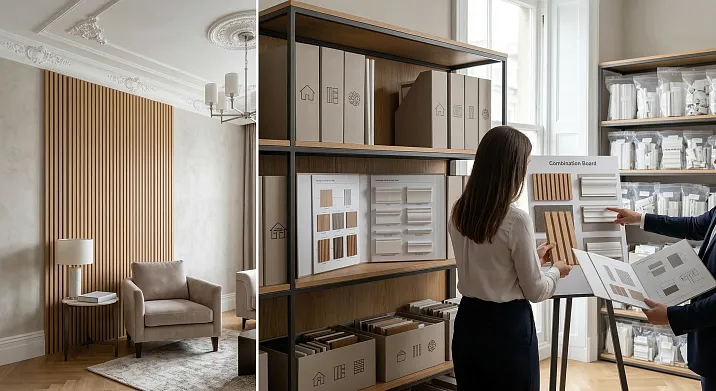
- Digital and physical catalogs: how to work with both
- STAVROS: a catalog that works as a system
- FAQ: Answers to Popular Questions About Choosing Panel Molding and Decorative Molding from the Catalog
There are two fundamentally different ways to approach renovation. The first is to buy what you like: you see a panel in the catalog, you buy it; you come across a beautiful cornice online, you order it; you find a discount on moldings — you stock up. The result of this approach is predictable: a room where each element is good on its own, but together they don't speak. They don't conflict — they just remain silent. And this silence comes at a high cost.
The second way is systematic. First, you understand the logic of the space, then you work with the catalog of panel molding andthe polyurethane decorative molding storeas a tool for implementing decisions already made. Here, every item is purchased not because you liked it, but because it is needed — in a specific place, at a specific scale, in a specific tone. The difference in the result is colossal.
This article is about how to move from the first method to the second. How to read a panel catalog like a professional. How to navigate polyurethane decorative categories not blindly. How to build a project from the room, not from the product.


Why the Panel Molding Catalog is Not Just a Price List
When an inexperienced person opens a panel molding catalog, they see lines: species, size, color, price. They choose based on the principle of 'like it — don't like it' and place an order. When a designer with experience opens the same catalog, they see something completely different: an architectural system where each parameter is a tool for managing space.
A panel molding catalog is not a set of products. It is a library of solutions. And you need to know how to read it.


What the Parameters in the Catalog Mean
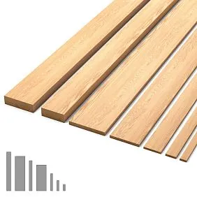
Slat width. Not just 'thin' or 'wide'. It's the scale of texture: a fine rhythm at 40–50 mm creates a sense of woven surface, airiness, nuance. A large step at 100–150 mm — monumentality, graphic quality, confidence. The slat width should correspond to the room size and viewing distance. In a 4 m long hallway, a 120 mm slat will look bold and expressive — the same slat in a small 12 m² bedroom will feel 'oppressive'.
Inter-slat gap. This is the ratio of wood to the space between slats. A closed gap (10–15 mm) — a dense, warm surface. An open gap (30–50 mm) — airiness, lightness, a sense of structure. In thecatalogue of slatted panelsthe gap is often not explicitly specified — it's a matter of installation, not production. But it is precisely this that determines the final look. Discuss the required gap with the craftsman before starting work.
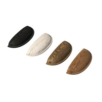
Wood species or material type. Each material tells its own story:
-
Oak: solidity, status, durability.Wooden slat panelsSolid oak — for living rooms, studies, representative spaces.
-
Ash: light tone, pronounced texture, slightly softer than oak. A Scandinavian note.
-
MDF: geometrically precise, technological, affordable. The best choice forslatted wall panelsin modern minimalism — especially in white or light finishes.
-
WPC: the outdoor and moisture specialist. Kitchens, bathrooms, facades — its territory.
Element length. In the slat panel catalog, length is a practical parameter. The standard 2.4–2.7 m covers most residential spaces. For tall spaces or long corridors, non-standard lengths are needed — check with the supplier in advance. Joints on panels look worse than solid runs — and their number is determined precisely by the ratio of the element length and the wall length.
Coating and finish. Oil, varnish, paint, untreated surface — this is not only aesthetics but also performance properties.paintable slatted wall panelsopen up unlimited color possibilities — especially in MDF execution. Pre-tinted panels — convenience and speed. The choice depends on your readiness for color work.
Our factory also produces:
How to navigate the categories of a polyurethane molding store
Online store of polyurethane molding— a space where it's easy to get lost without a system. Cornices, moldings, rosettes, pilasters, architraves, overlays, coffers, balustrades — each category is designed for a specific task. And if you don't understand these tasks, you can pick up beautiful details that will interfere with each other.
Get Consultation
Cornices and ceiling skirting boards: horizontal division of space
Cornice is a basic element of any classic interior. It is a horizontal line that decorates the transition from wall to ceiling. Its task is to create a 'frame' for the ceiling, add a shadow accent, and visually raise the height of the room.
In the catalog of polyurethane cornices, there are dozens of profiles: from minimalist rectangular moldings to complex multi-element cornice systems with egg-and-dart, ogee, and fillets. How to choose? Based on the principle of matching height and style:
-
Ceiling up to 2.6 m — cornice height no more than 60–70 mm.
-
Ceiling 2.7–3 m — 80–120 mm.
-
Ceiling 3–3.5 m and above — 130–200 mm or more.
-
Modern style — straight profile without ornament.
-
Classic, neoclassical — profile with molded pattern.
Along with the cornice, it is worth consideringBatten panels for ceilings— in the right combination, the cornice frames the paneling zone, creating a complete ceiling 'scenario'.
Moldings and wall moldings: vertical and horizontal wall articulation
A molding is a profile used to finish wall sections, panels, and transitions between finishing zones. If paneling occupies the lower third of the wall, a molding along the top edge of the panel serves as a boundary, completing the zone. Without it, the transition looks unfinished.
Polyurethane appliqués— a separate category for decorative accentuation. Wall rosettes, corner blocks, decorative inserts — all of these transform a standard wall with slatted panels into an architecturally refined space.
Architraves and window framing: how to give weight to openings
An architrave is the framing of a door or window opening. Its presence literally 'closes' the opening architecturally: an opening with an architrave is an architectural element, without an architrave — just a hole.
inplaster decoration salonArchitraves are chosen based on the width of the telescope and the height of the profile. The rule: the architrave should be slightly wider than standard (from 60 mm) — otherwise it 'gets lost' on the wall. If the walls are finished withslatted wall panels for interior finishing, architraves should overlap the ends of the panels — this creates a clean, finished joint.
Rosettes and medallions: the central accent of the ceiling
A ceiling rosette is the most noticeable element of ceiling decor. It organizes the center of the ceiling, creates symmetry, 'gathers' the space around itself. In the catalog, rosettes are classified by diameter and complexity of the pattern.
How to choose from the catalog: the diameter of the rosette should not exceed 1/7–1/8 of the minimum side of the room. For a room 4×5 m — maximum 50–55 cm. For 5×7 m — 60–80 cm. This is not a matter of taste — it's spatial mathematics.
What to choose for walls, ceilings, facades, and furniture: a systemic matrix
To avoid aimless browsing through the catalog, you need a working matrix: which material for which task.
| Application area | Slat panels | Polyurethane decor |
|---|---|---|
| Accent wall in the living room | Solid oak/ash, colored MDF | Frame moldings, overlays |
| Living room ceiling | White MDF, solid wood in warm tones | Perimeter cornice, rosette |
| Hallway/corridor | MDF or solid wood along the axis | Cornices, door trims |
| Kitchen (work area) | WPC, moisture-resistant MDF | Moisture-resistant cornices |
| Bedroom | Solid wood in warm tones, MDF | Delicate cornice, rosette |
| Facade | WPC, thermowood | Facade profiles, sandriks |
| Children's room | White/colored MDF | Simple cornices without molding |
This matrix is not a rigid rule, but a working guideline. It helps you quickly navigate the catalog and immediately filter out irrelevant items.
Walls: from accent to system
The most common mistake when working with a catalog of slatted wall panels is choosing an 'accent wall' in isolation. One wall in wood, three in plaster without any transitional elements — this is not an accent, it's an unfinished renovation.
Wall finishing with slatted panelsworks systematically: slatted wall + molding along the top and bottom edge + color unity with walls without panels — that's the minimum system. You can add polyurethane frames on other walls — then the 'wooden' accent and 'classical' decor become one architectural language.
Slatted panels in interior designliving room, bedroom, or hallway yield the best results precisely when paired with framing elements. DecorativeSlatted wall panelscombined with polyurethane molding-frames is one of the most expressive and yet affordable techniques in modern interior design.
Ceiling: where slatted panels complement molding, and vice versa
Ceiling solutions are the most complex area for systematic selection from a catalog. Three scenarios are possible here:
Scenario 'slats only'. The entire ceiling or central zone — slatted panels without decor. Suitable for Scandinavian style, minimalism, loft. Cornice — only a strict geometric profile, if used at all.
Scenario "Only Molding". Smooth ceiling, cornice around the perimeter, rosette in the center. Classic, neoclassical, art deco.Slatted panels on the ceilingNo — only the plasticity of molding.
Scenario "Slats + Framing". Central zone — slatted panels, perimeter — polyurethane cornice. This is a working modern combination with proper color unity. The cornice creates a "frame" for the slatted insert. This technique is especially good in high rooms from 2.8 m.
When working with the catalog for the third scenario — choose slats and cornice simultaneously. Compare their tones. Make sure the cornice profile matches the scale of the slat.
Facade: the catalog works differently
Facade slatted panels — a separate section of the catalog with completely different material requirements. Here, there is no MDF without moisture-resistant treatment. Here — thermowood, WPC, aluminum.Slatted Façade Panelsare selected according to the climatic zone, facade orientation, building style.
When choosing facade slats in the catalog, be sure to check: for outdoor use — is this clearly stated? Is there information about the weather resistance class? What is the coating intended for — interior or exterior? Using interior material on the facade is a mistake that reveals itself after the first winter.
Slatted panel on the facadeDCP combined with polyurethane facade decor — cornices, architraves, horizontal moldings — is a complete facade system selected from the catalog as a single whole, not as separate items.
How to assemble a project through element compatibility: step-by-step logic
Here is the practical sequence a professional designer follows when working with catalogs.
Step one: define the architectural language of the space
Before opening the catalog — answer the question: what is the language of this space? Modern minimalism, Scandinavian, neoclassical, classic, loft, Provence? This is not a matter of taste — it's a matter of system. Each style dictates a specific set of materials, profiles, tones.
If the style is not defined — the catalog turns into a bazaar. Everything seems beautiful, nothing comes together as a whole. Spend an hour defining the style — save days of chaos.
Step two: create a matrix of zones and needs
Walk through each room and write down:
-
Which surfaces require finishing (walls, ceiling, slopes, niches)?
-
Which material is appropriate from an operational standpoint (humidity, mechanical loads, lighting)?
-
What decorative element is needed to complete each zone?
Only with such a matrix go to the catalogslatted wall panels and in Online store of polyurethane molding. You will know what to look for — and not be distracted by beautiful but unnecessary things.
Step three: choose a base element and build the system from it
Every project has one dominant element — the one around which everything else is built. It could be a slatted panel of a specific tone (and then everything else is selected to match its tonality). Or it could be a cornice of a certain profile (and then all other molded elements should be from the same series).
Never assemble a project from several 'dominants' at once. One system — one voice. The rest is accompaniment.
Step four: check compatibility by three parameters
Before approving a position from the catalog — check it against three criteria:
-
Tone. The slat and decor should be in the same tonal range or a deliberate contrast.
-
Scale. The size of the element corresponds to the size of the room and the viewing distance.
-
Style. The decorative profile matches the chosen architectural language.
If you have any doubt about even one parameter—look for another option.
Step five: count systematically
One of the most common sources of problems is incorrect quantity calculation. Ordered too little—no matching trim in the right shade from the same batch (color varies from batch to batch). Ordered too much—overpaid.
Calculationslatted wall panelsis based on the surface area, taking into account gaps and waste for cutting (standard allowance—10–15%). Cornice calculation—from the room perimeter, considering corners. Rosette calculation—one piece for the center of the ceiling. Casing calculation—number of openings × perimeter of the opening.
All of this is calculated before ordering—not during installation.
Why you can't buy decor based on a single picture: breaking down the mechanics of the mistake
This section is about the nature of the most common mistake when working with catalogs. A person sees one beautiful photo in a slat panel catalog or on a molding store's website. They like the picture. They click 'buy.' And that is exactly when the path to disappointment begins.
The photo in the catalog is a staged shot of ideal conditions.
The slats in the photo are shot in a perfectly lit, properly selected space. The cornice is photographed in a room with a 3.5 m ceiling and side directional lighting. The decorative overlay is shown on a smooth plastered wall of a neutral tone. Everything looks perfect — because it is perfectly selected.
Your room is different. Your lighting is different. Your adjacent surfaces are different. When the same element enters your reality — it may look different. Not worse in quality — different in effect.
What to do about it? Don't buy based on a single picture. Buy based on principle — based on parameters you've understood from several sources, with an understanding of how the element works in your context.
Tonal incompatibility is the main hidden trap of the catalog.
In the catalog of slatted panels, the 'natural oak' color slat looks like warm amber. In the moldings catalog, the cornice is listed as 'white'. In reality, 'white' comes in dozens of shades: warm milky, cold porcelain, grayish, with a creamy undertone. And warm oak next to a cold white cornice is a conflict that is not visible in separate photos, but is very visible in real space.
Professional approach: request samples and compare them in person under your lighting — both daylight and artificial. This is the only way to check tonal unity before installation.
The catalog does not show transitions and joints.
The catalog of slatted panels has no photos of how the slats join with the ceiling. How they meet in a corner. How they end at a doorway. These are 'border zones' — the most technically complex and the most visually noticeable. It is here that installation requires the greatest skill. And it is precisely these zones that need to be thought through before ordering.
installation of slatted panels— is not just 'screwing to the wall'. It is a system of starter profiles, corner elements, and trim strips that ensure completeness around the entire perimeter. If, when working with the catalog, you forgot to account for the trim elements — you can expect surprises during installation.
How to build logic 'from the room', not 'from the product': a detailed scenario
Let's analyze a systematic approach using a specific example — a living room of 28 m², ceiling height 2.7 m, 'modern classic' style.
Stage 1: Room analysis
A 28 m² living room with a 2.7 m ceiling is a space where:
-
The slatted panel should not be too dark (the ceiling is not high — the wood should not feel 'oppressive').
-
Cornice — moderate, 80–100 mm, with a simple profile.
-
Rosette — if needed, up to 55–60 cm in diameter.
-
Slatted zone — not the entire wall, but an accent area, preferably with framing.
Stage 2: choosing the dominant element
Solution: accent wall behind the sofa —Slatted panels in the living room interiormade of oak tinted in warm gray-brown. This is the dominant element. Everything else is arranged around it.
Stage 3: forming the system from the dominant
-
Dominant tone: warm gray-brown oak.
-
Main wall tone: light gray with a slight beige.
-
Stucco decor tone: warm white (creamy).
-
Cornice: select from the catalog a 90 mm profile with a simple design — no egg-and-dart, no ornament, geometrically clean.
-
Molding along the top edge of the slatted zone: rectangular 45 mm profile — boundary between slats and wall.
-
Door trims: straight, 70 mm, warm white.
Stage 4: calculation according to the catalog
-
Slatted wall: 4 m × 2.5 m = 10 m². With slat width 80 mm and gap 20 mm, fill factor 0.8 — requires 12.5 linear meters of slats (including 15% cutting allowance).
-
Cornice: living room perimeter 4+7+4+7 = 22 m + 15% allowance = 25.3 linear meters.
-
Molding for the slat zone: 4 m (top) + 4 m (bottom) = 8 m + 10% = 8.8 m.
-
Door casings: 2 door openings × perimeter ≈ 10 m × 2 = 20 m.
All of this is ordered simultaneously, from a single supplier, with verification of tonal unity of samples. This is exactly how the systematic approach works.
Special cases: hallway, kitchen, bedroom, children's room
Entryway
Slatted panels in the hallway interior— a special case because the hallway is perceived in motion. The rhythm of slats along the corridor axis creates a 'tunnel effect,' accelerating the perception of space. In the catalog for the hallway, choose:
-
Medium pitch slats: 70–90 mm.
-
Cladding height: either the full wall height or the lower third with molding.
-
Cornice: mandatory — without it, the ceiling 'settles' onto the walls.
-
Door casings: already in the hallway, the framing of the entire space begins.
Kitchen
Slatted panels in the kitchen— a zone of increased requirements. In the catalog for the kitchen, look only for moisture-resistant and heat-resistant options. Polyurethane cornice for the kitchen — choose with a smooth profile without complex ornamentation: horizontal protrusions collect grease.
Above the work area — only DPK or aluminum, no natural wood. Above the dining area — solid wood or MDF are acceptable if there is sufficient distance from the stove. This is not a whim — it's a durability requirement that the catalog won't tell you, but an experienced craftsman knows.
Bedroom
Forslatted panels in the bedroomIn the catalog, look for warm tones — milky, nutty, smoky gray-brown. Cold gray tones in the bedroom create tension instead of relaxation. Cornice — delicate, 60–80 mm, without ornament. Socket — only if height allows and style requires.
Slatted accent in the bedroom — the wall behind the headboard. This is the area you see every morning and every evening. It is what shapes the mood of the room. Choose the material for it with special care — hold the sample in your hands, look at it in different lighting, imagine the texture at real scale.
Children's room
In the children's room, the catalog of slatted panels opens up an opportunity that is often not used:Painted MDF plank panelsIn the lower zone of the wall — it's an inexpensive, practical, beautiful solution. The slats are painted white or a light tone — they are hygienic, easy to repaint if you want to change the interior.
Polyurethane decor in the children's room — only the simplest. Straight cornice, no complex ornament. The child grows — the style changes. Decor should be a neutral background, not a point of no return.
Digital and physical catalogs: how to work with both
Today most purchases start online. The catalog of slatted panels online — convenience, accessibility, huge selection. But it has a fundamental drawback: the color and texture on the screen of monitors differ significantly from the real material. A calibrated professional monitor in a designer's studio is one thing. Your laptop or phone is quite another.
Rule: order samples physically. Any serious supplier of slatted panels and molded decor provides samples — either free of charge or with a refund upon order. Hold the sample in your hands. Look at it in your daylight and your artificial light. Compare it with the sample of the neighboring element of the system.
This is the only way to ensure that the tonal unity you see in the catalog will be preserved in the reality of your space.
STAVROS: a catalog that works as a system
STAVROS is not just a list of items in a price list. It's a thoughtfully designed ecosystem of materials whereRafter panelsandpolyurethane decorare created with an understanding of how they work together.
STAVROSSlatted wall panelsare presented in a wide range of species, formats, and finishes: from minimalist white MDF to rich solid oak, from narrow accent strips to large modular constructions. Each item is accompanied by clear application data.
a polyurethane molding storeSTAVROS includes cornices, moldings, rosettes, trims, and overlays, designed within unified tonal and scale systems. You can choose a cornice and molding from the same series—and be confident they will create a cohesive architectural language in your space.
Trims and finishing elementsSTAVROS is complemented by slat systems—baseboards, trims, extension strips. Everything needed for a finished interior—in one place, in one system, with one quality standard.
STAVROS is a partner in creating an interior that reads as a unified statement. Because that's how a good home should look: not like an exhibition of liked items, but as a space with character and logic.
FAQ: answers to popular questions about choosing slat panels and moldings from the catalog
Can I independently assemble a project from the catalog without a designer?
Yes — if you follow the systematic logic: first determine the style and parameters of the room, then form a list of items based on the matrix of zones and needs. The STAVROS catalog is structured to help even without professional education.
How to tell if a cornice matches the tone of the slatted panels?
Only through physical samples. Request a sample of the panel and a sample of the cornice, place them side by side under your lighting. If both are in a warm register — they will work. If one is warm, the other is cold — look for a replacement.
What margin of slatted panels should be included when ordering?
Standard — 10–15% above the calculated area. For complex rooms with niches, protrusions, diagonal walls — 15–20%. The margin is needed for trimming, possible defects, and additional pieces in case of calculation errors.
Is it worth combining different wood species in one room?
Yes — with color unity. Oak and ash of the same tone on different surfaces — interesting and rich. Oak and pine of different tones in the same room — visual conflict.
Are additional elements needed wheninstalling slatted panels on a wall?
Absolutely — a starter profile along the bottom edge, a finishing profile along the top, corner elements. Without trims, the joint with the floor, ceiling, and corners looks unfinished.
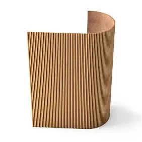
How to choose betweenflexible slatted panelsand rigid ones for non-standard surfaces?
For curved surfaces (arches, columns, radius walls) — only flexible systems. For straight walls and ceilings — rigid ones, they provide cleaner geometry.