Article Contents:
- Philosophy of Accent Walls: Why Start with One Surface
- Psychology of space perception
- Economy of Effort and Resources
- Flexibility of Changes
- Composition Base: Panels and Boards as Rhythm Framework
- Choosing Between Panels and Boards
- Vertical, Horizontal, Diagonal: The Language of Lines
- Rhythm and Step: The Mathematics of Beauty
- Materials: From Natural Wood to MDF
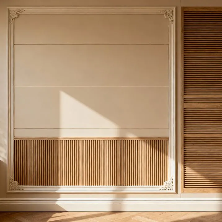
- Relief and Architecture: Moldings as a Quick Path to Volume
- Molding Frames: Imitating Bouclé
- Vertical and Horizontal Divisions
- Molding Profiles: From Simple to Complex
- Corner Elements: Solving Complex Joints
- Trim and Finishing: Baseboards and Door Frames as Picture Frames
- Baseboard: The Boundary Between Wall and Floor
- Door Frames: Framing Openings
- Unity of Framing Systems
- Color and Light: How to Make Shadows Work for the Composition
- Monochrome: Play of Relief and Shadows
- Contrast: Accentuating Elements
- Light as a Tool for Revealing Form
- Painting: Technology for Flawless Results
- Step-by-Step Implementation: From Idea to Realization
- Stage One: Drawing and Visualization
- Stage Two: Wall Marking
- Stage Three: Calculating Material and Purchasing
- Stage Four: Installing the Base
- Stage Five: Layering Moldings
- Stage 6: Installing the trim
- Stage 7: Final finishing
- Stylistic variations: compositions for different aesthetics
- Classic: symmetry and proportions
- Neoclassical: light elegance
- Scandinavian style: minimalism with warmth
- Loft: industrial aesthetics
- Minimalism: geometric purity
- Conclusion
Creating an expressive interior begins with understanding that a wall is not merely a vertical surface dividing space, but a canvas for architectural painting.Interior compositionPanels, planks, moldings, and baseboards transform a blank surface into a multi-layered artwork, where each element plays its part in the symphony of forms, textures, and shadows. A well-constructed accent wall can radically change the perception of a room, create depth, establish rhythm, and emphasize style. Yet, such a project is accessible not only to professional designers — a systematic approach, understanding of compositional principles, and proper material selection allow you to build your dream wall by hand over the weekend.


Philosophy of accent walls: why start with one surface
A common mistake in decorating is attempting to transform all walls of a room simultaneously, which leads to visual overload and loss of focus.Interior designIt is based on the principle of hierarchy — one surface dominates, the others support it. The accent wall becomes the compositional center, drawing the eye and organizing the space around it.


Psychology of space perception
The human brain is structured to seek a point of focus in any space. In the absence of a clear accent, the gaze wanders restlessly, unable to find rest, creating subconscious discomfort. An accent wall provides the eye with something to focus on, around which to mentally map the space.
Choosing a wall for accenting follows the logic of perception. The wall opposite the entrance — the first thing seen by an incoming person — is a natural candidate for the main role. The wall behind the sofa in the living room, behind the headboard in the bedroom — surfaces frequently viewed. A wall with a fireplace or TV — already possessing a functional focus, enhanced by decorative treatment.
The size of the room dictates the scale of decorative intervention. In compact rooms, complex compositions on all walls create claustrophobia; one accent wall adds interest without overload. In spacious halls, a single decorated wall may fade into the background — here, larger-scale solutions are appropriate — two adjacent walls or all walls with varying degrees of detail.
Our factory also produces:


Economics of effort and resources
Concentrating decorative elements on one wall significantly reduces budget and labor costs compared to decorating the entire room. You can afford higher-quality materials, more complex compositions, and professional help for critical stages — all of this fits within reasonable limits when working with a single surface.
Logistics also simplify — fewer materials for transport and storage, a more compact work zone, a shorter period of renovation inconvenience. For a family living in an apartment, the ability to transform the interior over the weekend without moving everything or enduring prolonged chaos — a strong argument in favor of localized intervention.
Psychologically, it’s easier to start with one project, see the result, gain experience, and then, if desired, expand the transformation to other areas. A successfully executed accent wall inspires further experiments; an unsuccessful attempt to decorate the entire room demotivates and leaves a sense of disappointment.
Get Consultation
Flexibility of changes
Interior preferences change — what delighted three years ago may bore you today. An accent wall easily transforms — moldings are dismantled, planks are replaced, colors change. A complete overhaul of one wall — a weekend project; a total refresh of all walls — a multi-week epic.
Seasonal changes are also easier to implement on a single surface. Light tones and airy compositions in summer, richer colors and denser decor in winter. Such flexibility turns the interior from a static picture into a living organism, evolving alongside its inhabitants.
Testing new ideas is safer locally. Unsure if a dark plank wall suits a light overall palette? Implement it on one surface, live with the result for a month. If you like it — expand it; if not — revert to the original state with minimal losses.
Composition base: panels and planks as rhythm framework
Any complex structure begins with a framework, defining geometry, rhythm, scale. Ininterior compositionthe role of the framework is played by panels and planks — linear elements creating the main structure, upon which other details are layered.
Choice between panels and battens
Panels - solid sheet elements with batten-like structure - provide fast installation and predictable results. The manufacturer has already calculated the optimal rhythm, element width, and spacing. Installation reduces to mounting pre-assembled blocks to the wall and joining them together. In a few hours, an effect is achieved that would take days using individual battens.
Lack of panels - limited options. Choosing from the manufacturer's catalog, inability to change the spacing of the boards, combining different directions in one composition. For those who value uniqueness, willing to invest time in implementation, individual boards open up boundless possibilities.
Individual boards require careful planning - calculating the quantity, determining the spacing, marking each board. Installation is labor-intensive - each board is mounted individually, requiring control of vertical or horizontal alignment, even spacing. But the result - a fully customized composition, precisely matching the concept, irreproducible in other interiors.
Vertical, horizontal, diagonal: the language of lines
The direction of the boards significantly affects the perception of space. Vertical boards create an illusion of height, visually raising the ceiling, adding grandeur. This is a choice for rooms with low ceilings, where every centimeter of visual height is valuable. Verticals are associated with growth, aspiration upward, dynamism.
Horizontal boards expand space, making narrow rooms appear wider, creating a sense of calm and stability. Horizontals - the horizon line, peace, relaxation. In bedrooms and relaxation zones, horizontal orientation contributes to creating a soothing atmosphere.
Diagonal boards introduce dynamism, modernity, surprise. Diagonal - the most energetic line, creating movement in a static space. This is a bold solution for modern interiors ready for experimentation. The angle of inclination determines the degree of dynamism - 30 degrees create a gentle movement, 60 degrees - a sharp diagonal.
Combinations of directions create complex patterns. Vertical and horizontal boards forming a grid create a graphic, clear structure. Alternating vertical and diagonal sections form a rhythmic composition with varying tempo. Possibilities are limited only by imagination and sense of measure.
Rhythm and spacing: the mathematics of beauty
The distance between boards determines the character of the composition. Frequent spacing of 3-5 centimeters creates a dense, almost solid surface with fine shadow lines. Medium spacing of 8-15 centimeters - a balance of mass and void, a classic option for most interiors. Wide spacing of 20-40 centimeters - emphasis on gaps, boards as accent lines against the wall background.
Uniform rhythm - equal gaps across the entire surface - creates a calm, meditative atmosphere. The eye glides over the rhythmic structure, encountering no obstacles, no strain. This is a choice for minimalist interiors, relaxation spaces, background solutions.
Variable rhythm - alternating different gaps according to a certain rule - adds interest, creates visual tension. Progression with gradual increase or decrease in spacing forms direction, guiding the gaze. Chaotic rhythm with irregular gaps creates a dynamic, modern composition.
Accenting individual boards by changing width, color, relief highlights them from the general row. Every fifth board twice as wide as the others - creates a regular accent rhythm. Central board of contrasting color - forms a symmetrical composition with a clear axis. Such techniques complicate perception, making the composition multi-layered.
Materials: from natural wood to MDF
Interior Wood- classic choice for board compositions, ensuring authenticity of material, warmth of texture, nobility of natural tones. Oak with pronounced ring pattern, ash with contrasting texture, walnut with warm chocolate tone - each species creates its own atmosphere.
Solid wood requires proper processing - drying to 8-12 percent humidity prevents deformation, oil or wax impregnation protects against moisture and dirt. The price of natural wood is significant, but durability, restorability, and eco-friendliness justify the investment.
MDF - medium-density fiberboard - an affordable alternative to solid wood. Stability to humidity changes, uniform structure, absence of knots and cracks, possibility of creating complex profiles - advantages of MDF. Laminate MDF is visually indistinguishable from solid wood, film MDF imitates wood texture at minimal cost.
Painted MDF boards - popular choice for modern interiors. White color creates Scandinavian freshness, gray - modern neutrality, black - graphic clarity. Factory painting ensures perfectly even coverage, impossible with handwork.
Relief and architecture: moldings as a quick way to volume
If boards create the main structure of the composition, moldings add architectural complexity, relief depth, classical grandeur. Polyurethane moldings - revolutionary solution, allowing to create an effect that took weeks in the era of plaster molding within hours.
Molding frames: imitation of boiserie
Boiserie - traditional French technique of wall covering with wooden panels, moldings, and carving - the pinnacle of classical decoration, symbol of luxury and taste. Authentic boiserie costs tens of thousands of dollars, requires work from master carpenters, months of production. Molding imitation of boiserie provides visually comparable results at a fraction of the cost and weekend work.
The principle of imitation is simple - moldings are glued to the wall, forming rectangular frames, imitating the panels of classical designs. The inner space of the frames is painted in contrasting colors, covered with patterned wallpaper, filled with fabric. Moldings create relief borders, form volume, imitate the three-dimensionality of real panels.
Frame proportions follow classical canons. Vertical orientation - height 1.5-2 times greater than width - creates elegance, upward direction. Odd number of frames ensures a central axis of symmetry. Distances between frames and from frames to corners are equal - symmetry is critical for classical harmony.
The height of frame placement on the wall follows the rule of thirds. Lower third of the wall - plinth zone, often darker or with different finish. Middle third - main field with molding frames. Upper third - frieze zone under the ceiling. Horizontal moldings at the boundaries of zones create a three-part division, characteristic of classical architecture.
Vertical and horizontal divisions
Vertical moldings imitating pilasters create rhythmic division of the wall, visually increasing the height of the room. Distance between pilasters corresponds to classical proportions - three to five widths of the pilaster. Too frequent placement creates visual crowding, too sparse - loss of rhythm.
Bases and capitals of pilasters are formed by horizontal moldings or special overlay elements. Base at the bottom, 10-20 centimeters from the floor, creates a foundation. Capital at the top, under the ceiling cornice, forms a finish. Proportions of the base and capital relate to the height of the pilaster - usually 1/8-1/10 of the height.
Horizontal moldings divide the wall vertically, creating friezes, dado, panel zones. Lower molding at 70-100 centimeters height separates the plinth section, traditionally darker and more resistant to dirt. Upper molding 30-50 centimeters below the ceiling creates a frieze zone. Between them - main wall field with or without frames.
Molding profiles: from simple to complex
Molding profiles: from simple to complex
The choice of molding profile determines the composition's style. Simple, smooth moldings 3-5 cm wide with one or two scrolls are a universal option for modern and neoclassical interiors. Sufficient relief for creating shadows, sufficient simplicity for maintaining minimalism.
Moldings of medium complexity, 7-12 cm wide, with alternating protrusions and recesses, simple geometric or plant ornamentation — suitable for classic interiors without excessive ornamentation. A balance between expressiveness and restraint, appropriate for city apartments where one desires classicism without museum heaviness.
Complex relief moldings 15-25 cm wide with plant motifs, rosettes, acanthus leaves, multi-level ornamentation — for luxurious classic and baroque interiors. Such elements become independent works of decorative art, requiring appropriate context — high ceilings, spacious rooms, rich surroundings.
Combining different profiles within one composition creates an element hierarchy. Wide relief molding along the wall perimeter as the main frame, medium moldings for internal divisions, narrow ones for small details. This gradation of scales creates visual organization, guiding the eye from general to specific.
Corner elements: solution for complex nodes
Moldings cut at 45 degrees for corner joints — technically simple but requiring precision. The slightest error in the cut angle results in a visible gap at the joint. Pre-made corner elements solve the problem radically — instead of cutting, special parts are used that fit perfectly with linear molding sections.
Corner elements often feature richer decoration compared to linear parts — rosettes, ornamental compositions, three-dimensional motifs. The technical corner node transforms into a decorative accent that attracts attention. Four corners of the frame with expressive elements create a rhythm framing the central field.
Internal and external corners require different elements. An internal corner is concave, formed by two walls meeting at 90 degrees. An external corner is convex, formed by a projecting structural element. Molding sets include both types of corner elements for complete solutions.
Central elements — inserts placed in the centers of horizontal or vertical sections of molding — add decorative value to long straight segments. They break monotony, create additional accents, enhance symmetry. A central element above a door opening, at the top of a wall frame — a classic approach.
Trim and finishing: baseboard and casing as picture frame
Any composition requires framing, defining boundaries, separating from surroundings, creating completeness. Ininterior compositionwalls, the role of framing is performed by baseboards and casings — elements easily perceived as utilitarian, yet critical for harmony.
Baseboard: boundary between wall and floor
Baseboard conceals the technological gap between wall and floor covering, protects the lower part of the wall from dirt and mechanical damage, creates visual completion of the vertical plane. But in the context of decorative walls, the baseboard — the lower boundary of the composition, the foundation on which it rests.
Baseboard height affects the perception of the entire composition. Low baseboard 5-7 cm is practically invisible, does not interfere with the decorative scheme, suitable for minimalist solutions. Medium baseboard 8-12 cm — noticeable but non-dominant element, creating a confident foundation. High baseboard 15-25 cm — powerful architectural framing, characteristic of classic interiors.
Baseboard profile should match wall molding profiles to create a unified system. Simple moldings require a minimalist baseboard; complex relief elements harmonize with decorative baseboards. Complete profile matching is not necessary and even undesirable — slight differences create variety while preserving stylistic unity.
Baseboard color solution determines its role. Baseboard in wall tone blends in, does not attract attention, leaving the scene to decorative elements above. Contrasting baseboard — white on dark walls or dark on light walls — clearly defines the boundary, becoming an active compositional element. Baseboard in floor tone links horizontal and vertical planes.
Casing: framing openings
Door and window openings in decorated walls require special attention. They break the plane, create functional boundaries, introduce asymmetry. Casings integrate openings into the overall composition, turning potential problems into elements of solution.
Casing width should correspond to wall molding width. Too narrow casings with heavy moldings look awkward; too wide casings with thin moldings appear bulky. Usually, casing width is 20-30% wider than main molding width, creating hierarchy while maintaining proportionality.
Framing openings with moldings creates architectural expressiveness, transforming utilitarian elements into decorative accents. Molding runs around the opening, forming a frame. The top may be supplemented with a horizontal element protruding beyond vertical posts — imitating a pediment. Consoles under the horizontal element enhance the illusion of load-bearing structure.
Integrating openings into wall molding grid requires planning during marking. Vertical moldings may fit closely to openings, framing them from the sides. Horizontal moldings may be interrupted by openings or pass above them at a certain height. Symmetrical placement of openings relative to molding grid creates harmony; asymmetrical placement — dynamism.
Unity of framing system
Baseboards, casings, moldings form a framing system organizing the interior. Their stylistic and color unity is critical for harmony. All elements in one material and color — classic solution creating monolithic effect. All elements in natural wood of one species — ecological, warm option.
Contrasting system — dark baseboards and casings with light moldings or vice versa — more complex, modern solution. It is important that contrast be intentional, not random. Dark outline from baseboards and casings on light walls with white moldings creates clear graphic effect. White framing on dark walls with dark moldings — inversion, working in industrial aesthetics.
Transition elements connect baseboard with vertical moldings at room corners. Vertical molding from baseboard to ceiling, imitating a pilaster or engaged column, creates architectural logic, connecting lower and upper parts. Corner inserts at junction of baseboard and vertical molding — decorative accent emphasizing the node.
Color and light: how to make shadows work for the composition
Even a perfectly designed and installed composition of panels, rails, and moldings fully reveals itself only with proper color solution and thoughtful lighting. Color determines emotional tone, light creates volume, shadows transform relief into living, breathing surface.
Monochrome: play of relief and shadows
Monochrome solution — wall, rails, moldings, baseboards in one color — emphasizes relief, volume, play of light and shadow. Absence of color contrasts forces the eye to perceive form rather than color. This approach is characteristic of classic interiors, where architectural complexity matters more than color effects.
White monochrome creates freshness, lightness, and visual expansion of space. A white wall with white rails and moldings — seemingly lacking contrast, but shadows cast by relief elements under side lighting produce gray gradations that reveal form. In the morning, shadows are one way; in the evening, another — the composition lives throughout the day.
Gray monochrome — a modern alternative to white, more restrained, urban. Various shades of gray — from light pearl to dark graphite — create a tonal composition without bright accents. Matte surfaces enhance the effect, absorbing light and creating a velvet texture. Semi-matte adds a slight sheen, enlivening the plane.
Dark monochrome — black, dark blue, deep green — a dramatic solution for spacious rooms with good lighting. A dark wall with dark moldings requires precise lighting scenarios — directional light highlights relief, creates contrasting shadows, reveals architecture. In insufficient light, a dark composition turns into a gloomy patch.
Contrast: Accentuating elements
Contrast solution — a wall of one color, decorative elements of another — clearly highlights architecture, making it the main hero of the composition. White moldings on a dark wall, black rails on a white wall — graphic, impactful, modern. This approach works well in minimalist and Scandinavian interiors.
The degree of contrast determines the intensity of impact. Maximum contrast — black on white or white on black — sharp, attention-grabbing, requiring neutral elements to soften. Medium contrast — gray on white, beige on brown — softer, calmer, suitable for living spaces. Minimal contrast — light gray on white — delicate, almost imperceptible, for those avoiding sharp accents.
Inverting contrast within a single composition creates complexity. Moldings are white, but some frames are filled with dark color, creating an alternation of light and dark. Rails alternate — white, black, white, black — forming a striped rhythm. Such techniques require precise balance calculation; otherwise, the composition breaks into conflicting parts.
Accent color — introducing a bright hue into a neutral composition — creates a focal point, enlivens the space. One molding frame is filled with saturated blue, the rest are white. Several rails are painted gold, creating vertical accents. A brightly colored skirting board against a neutral wall. Such accents are carefully dosed — excess disrupts harmony.
Light as a tool for revealing form
Diffuse general lighting — flat light from a ceiling chandelier — makes the composition flat, eliminates shadows, neutralizes relief. To reveal volume, directional light is needed, creating shadows that highlight forms. Side lighting — wall sconces, floor lamps — produces long shadows from vertical elements, emphasizing texture.
Light from above at an angle — from ceiling spotlights directed at the wall — creates shadows from horizontal moldings, revealing the depth of relief. Several light sources from different points form a complex lighting picture, where shadows from various elements overlap, creating a layered effect.
Hidden backlighting — LED strip behind rails, in niches of molding frames — creates glowing from within the composition. Rails cast shadows on the wall, while light shines through between them. A molding frame with backlighting around its perimeter creates a floating effect. Such solutions require planning during installation — hidden wiring, locations for strip placement.
Light color temperature affects the perception of colors in the composition. Warm light (2700–3000K) adds yellow tones, makes white surfaces cream-colored, enhances warm wood tones. Neutral light (4000–4500K) does not distort colors, suitable for modern interiors. Cool light (5000–6500K) adds blue tones, makes white surfaces snow-white, emphasizes cool gray tones.
Painting: Technology for flawless results
Paint quality determines the final impression of the composition. Uneven coverage, spots, uncoated areas, drips — technical defects that destroy aesthetics. Surface preparation — spackling joints, sanding irregularities, priming — is critical for the result.
Paint selection depends on the desired effect. Matte paint hides minor defects, creates a noble velvet texture, does not reflect light. Its downside — difficulty in maintenance, stains and dirt penetrate porous surfaces. Semi-matte paint — a compromise, slight sheen while retaining the ability to mask imperfections, more practical in use.
Application technique determines coating uniformity. A roller provides quick application on flat surfaces, but poorly coats relief indentations. A brush allows detailed work, but leaves brush marks. Combination — roller for main planes, brush for relief areas — is optimal. Spray gun provides perfectly even coating, but requires skill and protection of surrounding surfaces from overspray.
Number of coats determines color saturation and coating durability. One coat rarely provides sufficient coverage, revealing the base. Two coats — standard for most paints and surfaces, ensuring uniform color. Three coats — for dark, saturated shades, for painting contrasting surfaces. Intermediate drying between coats is critical — applying the next coat on an un-dried previous one creates defects.
Step-by-step implementation: from idea to realization
Successful implementationinterior compositionrequires a systematic approach, where each stage is executed sequentially, with control of the result before moving to the next. Rushing or skipping preparatory stages inevitably leads to problems, rework, and disappointment.
Stage one: Drawing and visualization
Any composition begins on paper or in a graphic editor. An accurate wall plan with dimensions, window, door, outlet, and switch placement — the foundation of design. A scaled drawing allows experimenting with options, avoiding material and time waste on physical trials.
Rail placement begins with determining spacing and direction. Vertical rails spaced 10 cm apart on a 3-meter-wide wall require 30 elements. Is a central rail strictly in the middle or symmetrically positioned relative to the edge? How do rails connect with doorways — interrupted or bypassed? All these questions are resolved on the drawing.
Molding frames are also designed with precision to the centimeter. Number of frames, their dimensions, positioning relative to each other and wall boundaries, intervals — each parameter affects harmony. Several variants are composed in parallel, the best is chosen after comparison. The ability to quickly modify the configuration digitally saves weeks of real work.
Three-dimensional visualization, even the simplest, vastly exceeds flat drawings in informativeness. Seeing the composition in volume, assessing light and shadow play, feeling scale within the room context — this is a qualitatively different level of understanding. Free online services allow even beginners to create basic visualization in just a few hours.
Stage two: Wall marking
Transferring the project from paper to the real wall requires precision and patience. A laser level — an indispensable tool — projects perfectly horizontal and vertical lines onto any surface. Verticals for rails, horizontals for moldings, diagonals for complex compositions — all are marked using projections and a tape measure.
Rail marking begins with determining the extreme elements. From which wall edge to start — from the corner or from the center? If from the corner, the first rail runs flush to the corner, the rest are spaced at the given interval. If from the center, the wall’s midpoint is found, and rails are symmetrically placed left and right. The second option yields a symmetrical composition; the first is simpler to implement.
Molding frame marking requires determining all four corners of each frame. Vertical lines are drawn using a laser level, horizontal lines are measured from the floor or ceiling with a tape measure. Points of intersection — future frame corners — are marked with a pencil. Checking diagonals of the rectangle ensures the corners are truly 90 degrees — diagonals are equal only in a rectangle.
Photographing the layout before starting installation creates a backup - if lines are erased or confused during work, the photo will remind you of the original plan. Measuring control points and recording them in a notebook duplicates the information. It's better to spend an extra 15 minutes securing the layout than hours recovering from an error.
Stage three: material calculation and purchase
Accurate calculation of required materials saves money and avoids shortages during work. Battens are counted individually, considering their standard length. If a wall is 2.7 meters high and the standard batten length is 3 meters, one batten suffices for one vertical element. For 30 vertical elements, you need 30 battens plus 3-4 spares for defects or errors.
Moldings are calculated in linear meters. The perimeter of one frame measuring 80x120 centimeters is 4 meters. For five such frames on a wall, you need 20 meters of molding. The standard molding length is 2.4 meters, so you need 9 pieces (21.6 meters). An additional 10-15% allowance for cutting angles results in 10-11 pieces. Corner elements, if used, are counted individually - 4 corners per frame, 5 frames, 20 corners.
Baseboard is calculated by the room's perimeter minus door openings. A 4x5 meter room has a perimeter of 18 meters. Subtracting a 0.9-meter wide door opening gives 17.1 meters. With a standard baseboard length of 2.5 meters, you need 7 pieces (17.5 meters). A 5-10% allowance results in 8 pieces. Corners are counted - 4 internal corners in a rectangular room.
Consumables - glue, spackle, primer, paint - are calculated by area or volume according to manufacturer recommendations. Glue for moldings - approximately 1 can per 4-5 linear meters. Spackle - 1 kg per 30-40 meter joints. Paint - 1 liter per 8-10 square meters in two coats. Fasteners for battens - screws every 40-50 centimeters.
Stage four: installing the base
Installation begins with base elements - battens or panels, creating the main structure. Wall preparation - cleaning, priming - ensures adhesion. For panel systems, a frame of battens is mounted to the wall, to which panels are attached. For individual battens, installation can be directly on the wall using glue, screws, or a combination.
The first batten is a critical element; its verticality determines the entire composition. It is aligned with the layout, checked with a level, and secured. If using screws, pre-drill holes in the batten to prevent splitting. The screw is not driven all the way in, leaving room for micro-adjustments.
Subsequent battens are installed with controlled spacing. A template made from a piece of plywood or plastic, equal in width to the gap between battens, speeds up work and ensures uniformity. The template is placed against the secured batten, the next batten is installed flush against the template and secured. The template is moved, and the process is repeated. In one day, you can install an entire batten wall of average size.
Vertical joints between battens, if wall height exceeds batten length, should be as inconspicuous as possible. Cutting battens at a 45-degree angle for staggered joints creates a less noticeable seam compared to straight cuts. Spackling and sanding the joint after installation makes it practically invisible after painting.
Stage five: installing moldings
After the glue dries or the fasteners of the batten base are tightened, proceed with installing moldings. Preparing moldings - cutting angles, dry fitting - is done before applying glue. A miter box ensures precise 45-degree cuts necessary for perfect corner joints.
Glue is applied to the back of the molding in a zigzag or dot pattern depending on the element's width. The molding is placed against the layout, pressed firmly, and aligned. Excess glue squeezed out along the edges is immediately wiped away with a damp cloth. Heavy moldings are additionally secured with painter's tape or thin nails until the glue sets.
Installing a frame begins with the bottom horizontal element, then the side verticals, and ends with the top horizontal. This sequence simplifies corner joints. When using pre-made corner elements, corners are glued first, then straight molding sections are fitted to them. Checking horizontal and vertical alignment at each stage is critical.
Spackling joints is done after the glue is fully dry - usually after 24 hours. Acrylic spackle is applied with a rubber spatula, filling gaps flush with the molding surface. After the spackle dries, joints are sanded with fine sandpaper until smooth. The goal is complete invisibility of joints after painting.
Stage six: installing baseboard
Baseboard is installed after wall work is complete but before final painting of the entire composition. Baseboard corners are cut at 45 degrees for interior corners; length joints are also angled for invisibility. Lightweight baseboards can be glued; heavy wooden ones require plastic anchors and screws.
Door and window casing is installed with precise vertical alignment and symmetry. Distance from the edge of the frame to the inner edge of the casing is equal on both sides. The top horizontal casing may be flush with verticals or protrude 2-3 centimeters, creating a capital-like effect.
Joining baseboard with vertical moldings at corners requires attention. The molding may extend to the floor, then the baseboard is cut and butted against it. The molding may end at the baseboard height, forming a visual base. A decorative overlay at the baseboard-molding joint emphasizes the joint, transforming it from technical to decorative.
Stage seven: final finishing
Priming the entire composition before painting ensures even paint absorption, improves adhesion, and reduces material usage. Primer is applied with a roller on flat areas and a brush on textured areas. After primer dries (2-4 hours for most formulations), the surface is lightly sanded to remove raised fibers.
Painting moldings and battens requires care. Textured areas are painted with a brush, carefully working all recesses and protrusions. Flat areas are painted with a roller for speed and evenness. Roller movement starts vertically, then horizontally, with a final vertical pass to even out texture.
Protecting surrounding surfaces with painter's tape is mandatory when painting contrasting elements. Tape is applied along the edge of the painted area, and paint is applied slightly over the tape. Removing tape before paint fully dries (while still slightly elastic) yields a clean edge without peeling. Any drips or mistakes are immediately corrected with a damp cloth.
Protecting surrounding surfaces with painter's tape is mandatory when painting contrasting elements. The tape is applied along the edge of the painting area, and paint is applied slightly over the tape. Removing the tape before the paint is fully dry (while it is still slightly elastic) ensures a clean edge without peeling. Any drips or mistakes are immediately corrected with a damp cloth.
Stylistic variations: compositions for different aesthetics
Interior compositionWalls have no universal recipe - each style dictates its own rules, proportions, materials. Understanding stylistic specifics allows creating authentic solutions, not an eclectic mix of incompatible elements.
Classic: symmetry and proportions
The classical approach is based on strict proportions, symmetry, and hierarchy of elements. The wall is divided into three horizontal zones - plinth (lower third), main (middle third), frieze (upper third). Horizontal moldings at the boundaries of zones create clear divisions. Vertical moldings at corners and at equal intervals form a vertical rhythm.
The main zone is filled with rectangular vertical-profile moldings. The number of frames is odd - three or five - to ensure a central axis of symmetry. All frames have identical dimensions, and the distances between them are equal. The interior space of the frames is painted in a contrasting color, covered with classic-patterned wallpaper, or filled with fabric.
Moldings are chosen with complex relief profiles - coves, astragals, Ionic motifs. A width of 10-15 centimeters creates sufficient monumentality for classical aesthetics. Color - white or ivory on light walls, gilded or patinated for luxurious interiors. The baseboard is high, 15-20 centimeters, with a profile matching the moldings.
The plinth zone is usually darker than the main zone - if the main field is light beige, the plinth may be brown. The frieze zone near the ceiling is often decorated with additional ornamentation - small rosettes, ornamental appliqués.Interior ceilingsSurrounded by a massive cornice, visually connecting the walls and the horizontal plane.
Neoclassicism: light elegance
The neoclassical style preserves the principles of classicism, but lightens them, making them airier and more modern. The three-part division of the wall remains, but the boundaries become less pronounced. Moldings are thinner, 5-8 centimeters, profiles simpler, ornamentation more restrained. Colors are light - white, gray, pale blue, soft pink.
Molding frames retain symmetry but can be larger and fewer in number - two or three large frames instead of five small ones. The internal filling is often left in the base wall color, with emphasis on the relief of the frame rather than contrast. Asymmetry in the placement of frames relative to openings is permitted, but the overall composition remains balanced.
Combining moldings with modern materials is one of the signs of neoclassicism. White molding frames on walls with decorative plaster, moldings over geometric-patterned wallpaper, combinations of smooth moldings and textured panels. The baseboard is of medium height, 10-12 centimeters, simple profile, always white or matching the wall color.
Scandinavian style: minimalism with warmth.
The Scandinavian approach to wall compositions is maximally minimalist. Light-colored wood strips - pine, birch, bleached oak - preserving natural texture. Vertical or horizontal orientation, uniform spacing, absence of complex patterns. Painting in white or light gray while preserving visible wood texture - typical solution.
Moldings are used rarely and only the simplest ones - thin smooth strips without relief. If moldings are present, they create minimalist large frames surrounding large zones. Internal filling of frames - contrasting color, wallpaper with simple geometric pattern, wooden panels.
The baseboard is low, 5-7 centimeters, smooth, white. Moldings are thin, often absent - openings remain unframed or painted in contrasting color. Overall palette - white, gray, light beige with accents of natural wood. No gilding, patina, complex ornamentation - purity, light, functionality.
Loft: industrial aesthetics
Loft interiors use strips as an architectural element emphasizing the geometry of space. Rough wooden strips from untreated wood preserving natural defects, knots, irregularities. Dark tones - wenge, stained oak, almost black wood. Painting is undesirable, preference is given to natural oils and waxes.
Moldings are absent in pure lofts - they are elements of classicism, alien to industrial aesthetics. If necessary to structure the wall, metal profiles, rough wooden beams, exposed utilities are used. It is permissible to imitate boiserie using old barn boards without molding framing - boards themselves form frames due to different orientations.
The baseboard either is absent or consists of a rough wooden plank attached to the wall without finishing. Moldings - wide boards from old wood, possibly contrasting with the wall. Color palette - gray concrete, red brick, dark wood, black metal. No symmetry, exact proportions, classical canons - freedom, brutality, honesty of materials.
Minimalism: geometric purity
The minimalist approach to wall composition is based on ideal geometry, absence of decorative excesses, purity of lines. Strips - only smooth, painted in one color, installed with mathematical precision. Spacing is absolutely uniform, width of all strips identical, color uniform across the entire surface.
Moldings, if used, are maximally simple - smooth thin strips 3-4 centimeters wide without any relief. Frames are strictly rectangular, proportions exact - square, rectangle with side ratio 1:2 or golden section. Internal filling of frames - monochromatic, minimal contrast possible.
Baseboard is hidden or minimalist, 3-5 centimeters, level with the wall. Moldings often absent, openings inset flush with the wall. Colors - white, gray, black, one accent color in small quantity possible. Complete absence of ornamentation, textures, geometric violations. Perfection of form as an end in itself.
Conclusion
Creationinterior compositionFrom panels, strips, moldings, and baseboards - the path from an empty wall to an architectural work transforming space. Systematic approach, understanding of compositional principles, proper use of materials turn a complex task into a sequence of achievable stages.
Accent wall philosophy saves resources, concentrates attention, creates flexibility for future changes. One expressive surface works more effectively than four mediocre ones. Strips form a rhythmic frame setting the composition's geometry. Moldings add architectural complexity and classical grandeur. Baseboards and moldings create framing, completing the picture.
Color and light transform a static structure into a living dynamic surface. Monochromatic solutions emphasize relief and shadows, contrasting ones highlight architecture. Directional lighting reveals volume, hidden backlighting creates a floating effect. Quality painting ensures flawless final impression.
Step-by-step implementation - from drawing through marking and installation to final finishing - guarantees the result. Each stage is controlled, errors are corrected before moving to the next. Precise material calculation saves budget, careful marking ensures symmetry, neat installation ensures longevity.
Stylistic variations from classicism to minimalism demonstrate the universality of basic principles. The same elements - strips, moldings, baseboards - create radically different images depending on proportions, colors, and ways of combining.Interior solutionsSTAVROS offers a full range of materials to realize any concept.
The dream wall is not an abstract fantasy, but a concrete project, achievable within weekends by your own hands or with professionals. The key is clear vision of the desired result, understanding of compositional principles, and correct choice of materials.Interior designInterior composition is no longer a privilege of the chosen few, but an accessible tool for creating space reflecting individuality, taste, and pursuit of beauty. Every wall is a canvas, every element a brushstroke, every composition a work making the home truly a home.