


Article Contents:
- Modern View: flat profiles as new aesthetics
- From Volume to Flatness: Evolution of Form
- Rectangular Section: Geometry as Decoration
- Minimalist Molding for Walls
- No Ornament: The Power of Pure Form
- Wall Frames: Structuring Without Excess
- One Frame Principle
- Symmetry and Rhythm
- Functional Frames
- Horizontal Divisions
- Vertical accents
- Color and Texture of Wood: Naturalness in Minimalism
- Light Woods: Scandinavian Palette
- Mid Tones: Balance of Warmth and Neutrality
- Dark Woods: Graphic Accents
- Stained Wood: When Texture Is Not Needed
- Combining Wood and Polyurethane
- Light and Shadow Graphics: Decoration Without Decoration
- Natural Lighting and Shadow Play
- Artificial Lighting: Controlled Light and Shadow
- Contrast of Light and Shadow as a Compositional Tool
- Material and Its Interaction with Light
- Implementation Examples: Scandinavian and Minimalist Styles
- Scandinavian Living Room: Light Wood and White Walls
- Minimalist Bedroom: Monochromatic Graphics
- Modern Kitchen-Living Room: Wood and Concrete
- Japanese Minimalism: Emptiness as an Element
- Practical aspects of implementation
- Material selection
- Installation: Precision Above All
- Painting: Flawless Surface
- Maintenance and Durability
- Conclusion

Less is more. This manifesto of minimalism, proclaimed by architect Ludwig Mies van der Rohe nearly a century ago, remains as relevant today as ever. In an era of information overload and visual noise, people increasingly turn to the aesthetics of clean lines, open spaces, and concise forms. Minimalism in interior design is not poverty or asceticism, but deliberate elegance, where every element is carefully considered and carries meaningful weight.
Flat wooden balustersand minimalistPolyurethane wall decor— ideal tools for creating interiors in the philosophy of 'clean lines'. They reject baroque excess and classical ornamentation, yet do not become faceless. On the contrary, the simplicity of their forms highlights the beauty of the material, the geometry of space, and the play of light and shadow.
In this article, we explore the aesthetics of minimalist decor — from flat wooden balusters creating graphic verticals in stair railings, to concise polyurethane frames on walls that structure space without overloading it with details. You will learn how wood color and texture function within a minimalist context, how light-and-shadow graphics become the primary decorative element, and you will encounter specific examples of implementing the 'clean line' concept in Scandinavian and minimalist interiors.


Modern perspective: flat profiles as a new aesthetic
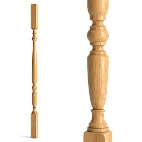
Traditional balusters — turned, with smooth curves, swellings, and grips — are beautiful, but they belong to the past. Modern architecture leans toward geometric clarity and concise forms. Flat balusters and straight moldings — the hallmark of this new aesthetic.


From volume to flatness: evolution of form
A classical baluster — a volumetric element with circular or square cross-section, richly profiled. It creates a plastic, sculptural form, appeals to tactile sensation, inviting the hand to trace its surface. This is the aesthetics of Baroque and Classicism, where materiality, weight, and volume are paramount.
A flat baluster is radically different. Its thickness is only 20–30 mm, with a width of 80–150 mm. It is almost two-dimensional, like a sheet of paper standing on its edge. But it is precisely this flatness that creates a new quality — graphic quality. A flat baluster does not define space through volume, but through lines.
When installed closely together, flat balusters form not a row of individual posts, but a single vertically striped plane. This acts as a screen that structures space without fully blocking it. Light passes through narrow gaps between balusters, the background is visible, but the clear rhythm of verticals creates a visual boundary.
Such a construction fits perfectly into minimalist aesthetics, where the accumulation of details is not valued, but clarity of structure is.wooden balusters for terraceFlat profiles create rhythmic graphics that are decoration in themselves.
Our factory also produces:


Rectangular cross-section: geometry as decoration
A flat baluster has a rectangular cross-section with a side ratio of approximately 1:4 or 1:5. This is not a random proportion, but a carefully calibrated geometry. Too thin elements (1:6 and more) appear fragile, too thick elements (1:3) lose their graphic quality.
Edges can be sharp at 90 degrees or slightly rounded with a radius of 2–3 mm. Sharp edges provide the most precise, graphic line — the choice for strict minimalism. Rounded edges are slightly softer and more pleasant to the touch — the option for Scandinavian style, where minimalism combines with coziness.
The ends of balusters are also important. They can be straight, beveled at an angle, or have a decorative cutout. A straight end is the most concise option. A beveled end adds dynamism and creates an interesting interplay of light and shadow. A decorative cutout — a compromise between minimalism and tradition — can be geometric (triangle, trapezoid) or smooth (wave, arch).
Get Consultation
Minimalist wall moldings
The same trend toward flat profiles is observed in wall decor.Polyurethane decorative molding for wallsIn minimalist interiors, complex ornaments, scrolls, and rosettes are abandoned. Straight strips with rectangular or square cross-sections take center stage.
A molding 20–40 mm wide and 10–15 mm thick (projection from the wall) — a typical minimalist profile. It creates a clear line, a light shadow, structures the wall plane, but does not overload it. It is a tool for creating frames, panels, and horizontal and vertical divisions.
Wide flat moldings 60–100 mm wide with minimal relief of 5–8 mm are especially effective. They create delicate graphics, almost like a drawing on the wall. Under proper lighting, such a molding casts barely noticeable shadows that emphasize geometry without drawing attention to itself.
Rejection of ornamentation: the power of pure form
Minimalism does not tolerate decoration for decoration’s sake. Every element must have a function or meaning. Flat balusters perform the function of railing while simultaneously creating a visual rhythm. Wall moldings structure the plane and define the proportions of the room.
Ornament, carving, and relief details are either completely excluded or reduced to an absolute minimum. Beauty here lies in proportions, in the relationship of masses, in material quality, and in the play of light.Ceiling molding made of polyurethaneFor minimalist interiors — a simple rectangular strip, without gussets, beads, or fluting.
Such an approach demands flawless execution. When there is no ornament to distract attention, any defect becomes noticeable. Curvature of lines, uneven joints, rough surfaces — all of this is glaringly obvious. Therefore, minimalist decor imposes the highest requirements on material quality and installation precision.
Wall frames: structuring without excess
An empty white wall — this is not minimalism, it is incompleteness. Minimalism is the deliberate organization of space, where every plane has structure. Wall frames made of moldings — a classic technique that works in minimalist interiors, but with special rules.
The principle of one frame
In Baroque or classical interiors, walls may be covered with numerous frames of different sizes, forming complex compositions. In minimalism, the rule applies: one wall — one frame (or one system of frames, if there are several, they must be strictly symmetrical and identical).
The frame occupies the central part of the wall, leaving significant margins on the sides — at least 20-30 cm from corners and ceiling/baseboard. This creates an "air" effect, space for breathing. The frame does not aim to fill the entire wall; it structures it, establishing a compositional center.
Frame proportions are critical. The golden ratio (1:1.618) works reliably. A square frame is also good — it is static and balanced. Horizontally elongated frames (1:2, 1:3) create a sense of spaciousness, while vertically elongated ones convey upward movement.
Symmetry and Rhythm
Minimalism loves symmetry. If there are several frames on a wall, they are placed strictly symmetrically relative to the central axis. Three vertical frames of equal size with equal spacing — a classic minimalist composition. Or one large central frame with two smaller ones on either side in mirrored reflection.
Rhythm is equally important. If frames repeat on different walls in a room, they must be identical in size and proportions. This creates spatial unity, visually unifying the room.installation of polyurethane moldingSuch compositions require precision — millimeter errors will destroy symmetry.
Functionality of Frames
Frames in minimalism are not merely decorative — they are functional. Inside the frame may be:
Another wall color — a light gray frame on a white wall or vice versa. A barely noticeable contrast creates structure without sharpness.
Another texture — a smooth wall and a textured plaster frame inside. Tactile difference complements the visual.
Lighting — an LED strip behind the frame molding creates perimeter glow. This is not only beautiful but also functional — an additional source of soft light.
A painting or photograph — a molding frame surrounds the artwork. In minimalism, preference is given to large single images rather than galleries of many small pictures.
A mirror — the frame creates a boundary for the mirror surface, integrating it into the wall rather than simply hanging it on it.
A television — a modern interpretation where a molding frame surrounds a flat-screen TV, transforming it into an architectural element.
Horizontal Divisions
An alternative to frames — horizontal moldings dividing the wall into sections. A classic option — a panel 90-120 cm high from the floor, separated by a horizontal molding. The upper part of the wall is one color, the lower part — another (usually slightly darker).
In a minimalist execution, the panel should be concise.wooden baseboardHeight of 10-15 cm, horizontal molding width of 30-40 mm — and that’s it. No additional protrusions, outlets, decorative inserts.
A bolder option — dividing the wall into three horizontal sections. The lower third, middle, upper — each separated by a thin molding. Three shades of one color (light gray, gray, dark gray) create a gradient, visually altering the room’s proportions.
Vertical Accents
Vertical moldings are used less often but can be very effective. They visually raise the ceiling, creating a sense of height. A typical solution — wide vertical molding strips from floor to ceiling with a 60-80 cm spacing.
Such strips may be purely decorative or functional — hiding panel joints, masking wall imperfections, marking zones (in studio layouts, a vertical molding may visually separate the kitchen from the living room without a physical partition).
Combining verticals and horizontals creates a grid that clearly structures the wall. But here it’s important not to overdo it — too fine a grid will turn minimalism into ornament. The optimal grid cell size — no less than 60 by 80 cm.
Color and texture of wood: naturalness in minimalism
Minimalism is often associated with monochromaticity — white, gray, black. But this is only one option. Natural wood fits beautifully into minimalist aesthetics, adding warmth, tactility, and a connection to nature.
Light wood species: Scandinavian palette
Scandinavian minimalism — primarily light wood. Birch, beech, white oak, maple — species with gentle, almost white tones. They create a bright, airy space, not competing with white walls but complementing them.
Flat spindles made of light wood, coated with transparent oil or matte lacquer, preserve the visibility of texture. Thin lines of annual rings, barely noticeable color differences between early and late wood — this is delicate decoration that doesn’t shout but is present.
For wall decoration, light wood is used in the form of overlays, panels, lath structures. Thin wooden strips 20-30 mm wide with 10-15 mm gaps create a rhythmic texture that enlivens a white wall without overloading it.
Medium tones: balance of warmth and neutrality
Natural color oak, walnut, cherry - medium warm tones. They create more contrast against light walls, work as focal points drawing attention. In minimalist interiors, such wood is used sparingly - a staircase with flat balusters of oak against white walls, a wooden panel behind the TV, a walnut molding frame.
Avoid reddish-orange tones - intense shades often given by cheap lacquer on pine. Minimalism prefers noble brown-gray tones provided by natural oak or walnut with oil finish.Wooden ceiling baseboardSuch species create a subtle boundary between wall and ceiling, working structurally rather than decoratively.
Dark species: graphic accents
Wenge, stained oak, thermowood in dark brown, almost black shades - strong accents for minimalist interiors. Dark wood creates graphic contrast, emphasizes geometry, adds drama.
Flat dark wood balusters against light walls - this is not just a railing, it's a graphic installation. Vertical dark lines create rhythm, organizing space and guiding the viewer's gaze.
Dark wood requires caution - it should not be used excessively. One dark staircase in a light interior is enough. Adding a dark wooden panel to the wall will upset the balance, making the interior feel heavy. In minimalism, the rule applies: dark wood should not exceed 15-20 percent of visible surfaces.
Painted wood: when texture is not needed
Minimalism allows painting wood with opaque paint, hiding texture. White painted balusters - classic Scandinavian style. Black - striking accent for modern minimalism. Gray - neutral solution that works everywhere.
Painted wood has an advantage - the ability to precisely match color to the interior's overall palette. Natural wood dictates its own tone, while painted wood conforms to the designer's concept.Polyurethane molding for furnitureIt can be painted exactly the same color as wooden elements, creating a unified composition.
Matte paint is preferable to glossy - it doesn't create glare, looks more noble. The wood texture under paint is not visible, but can be felt tactilely - this distinguishes painted wood from painted polyurethane or MDF.
Combining wood and polyurethane
Effective strategy - use wood where tactile quality and prestige matter (staircase, furniture), and polyurethane where only visual aspects are important (walls, ceiling). Both materials are painted the same color, creating visual unity.
Facade decoration made of polyurethaneAnd wooden balusters painted matte white will be perceived as a single system. But the staircase you walk on will feel more pleasant in wood - warmer, more tactile. And ceiling moldings, which no one touches, can very well be made of polyurethane - lighter, cheaper, easier to install.
Light and shadow graphics: decoration without ornamentation
When you reject ornamentation, light takes center stage. It is lighting that creates volume, emphasizes geometry, brings life to minimalist interiors. Flat balusters and minimalist moldings - tools for creating light and shadow graphics.
Natural lighting and shadow play
Flat balusters 25 mm thick, installed with 30-40 mm spacing, create a regular structure of vertical elements and gaps. When light passes through this structure (from a side window or a lamp), rhythmic shadows appear on the floor and walls - alternating light and dark bands.
These shadows are alive - they change throughout the day as the sun moves. In the morning, shadows are long and soft, at noon they are short and sharp, in the evening they stretch again, but in the opposite direction. This is dynamic decoration that never gets boring, as it constantly changes.
To enhance the effect, place staircases with flat balusters so that light falls from the side at a 45-60 degree angle. Direct frontal light produces minimal shadows. Side or top (skylight above the staircase) lighting creates maximum drama.
Artificial lighting: controlled light and shadow
Artificial light sources allow you to control the light and shadow pattern. A linear light fixture directed along the wall with moldings creates long shadows from each molding. By adjusting the angle and intensity of light, you can achieve different effects - from barely noticeable texture to sharp graphics.
Hidden backlighting behind moldings - classic technique. LED strip is installed behind the molding, light directed toward the wall. The molding casts a sharp shadow, and behind it - a halo of light. This creates the effect of a floating line, which does not lie on the wall but appears suspended in front of it.
For flat balusters, bottom or top backlighting is effective. Lights embedded in staircase steps shine upward, illuminating balusters from below. They transform into glowing verticals, creating a fantastic atmosphere. Top backlighting from the ceiling creates the opposite effect - balusters cast sharp shadows downward.
Contrast of light and shadow as a compositional tool
Minimalist interiors often rely on contrasts - light walls and dark staircases, white ceilings and black moldings. But no less important is the contrast of light and shadow on a single surface.
Deep relief division of the wall creates strong shadows. A molding with 30-40 mm projection casts a shadow 50-70 mm wide (depending on the angle of light). This is no longer a fine line, but a noticeable band that functions as a graphic element.
A grid of moldings on the wall under side lighting creates a checkered pattern - light squares and dark shadows. By changing the direction of light, you can alter the pattern - vertical, horizontal, diagonal. The same decoration provides different visual effects depending on the lighting.
Material and its interaction with light
Matte surfaces diffuse light, creating soft shadows with smooth transitions. Glossy surfaces reflect light, producing highlights and sharp shadows. For a minimalist interior, matte or semi-matte surfaces are preferred—they are more noble and serene.
However, local use of gloss can be effective. Glossy black balusters reflect light, creating a complex interplay of highlights and shadows. Glossy molding on a matte wall stands out not only in shape but also in its reflective quality.
Wood with open pores (oak, oiled ash) interacts with light in a complex way. Pores absorb light, creating microtexture. Under slanted light, the wood’s texture becomes especially expressive—pores cast shadows, while dense wood reflects light. This results in a shimmering, living surface.
Implementation examples: Scandinavian and minimalist styles
Theory becomes clearer with concrete examples. Let’s examine typical solutions for different spaces and styles.
Scandinavian living room: light wood and white walls
Imagine a spacious living room with 2.7-meter-high ceilings, large north-facing windows (diffused soft light). Walls are painted white with a slight warm tone (not stark white, but bone white). Floor: light oak under matte oil.
Staircase to the second floor with flat balusters made of white oak, 25 mm thick, 100 mm wide, spaced 35 mm apart. Handrail made of the same wood, 50x70 mm cross-section, rounded edges for comfortable grip. All coated with clear matte oil, preserving the wood’s texture.
On the wall behind the sofa—three vertical frames made ofdecorative facade from polyurethanepainted in the same white as the wall. Molding 40 mm wide, 12 mm projection. Frames 60x180 cm, spaced evenly 40 cm apart. Inside the frames, the wall is a lighter shade—light gray.
Ceiling cornice with a simple rectangular profile, 60 mm wide, white. Floor skirting board made of wood, oak under oil (matching the floor), 100 mm high. Simple European profile without complex cuts.
Result: a bright, airy interior with clear structure. Wooden staircase—a warm accent that doesn’t dominate but is present. Frames on the wall structure the plane, creating a compositional center behind the sofa. All elements are simple, yet carefully proportioned and harmonized.
Minimalist bedroom: monochromatic graphics
Bedroom 18 sq.m, ceilings 2.5 meters. Walls painted in three shades of gray—the bottom third (up to 90 cm) dark gray, middle section medium gray, top (from 2.2 m to ceiling) light gray. Ceiling white.
Horizontal moldings at color boundaries—rectangular strips 30x10 mm, painted white. They clearly separate color zones, creating graphic horizontals. FloorWooden floor baseboard corner—white painted, 80 mm high, simple profile.
Behind the bed—a wide wooden panel made of dark walnut, covering the entire wall from floor to ceiling. The panel consists of vertical planks 40 mm wide with 20 mm gaps. The planks create a rhythmic texture that contrasts with the smooth painted walls.
No ceiling cornice—ceiling meets wall without molding, with a neat angled seam. This is a modern solution that visually increases the room’s height.
Lighting: recessed ceiling spotlights provide general illumination. Linear lights embedded in the wooden panel behind the bed create side lighting, highlighting the plank texture. Table lamps on bedside tables—minimalist design, black metal.
Result: a calm, structured interior with clear geometry. Dark wooden wall behind the bed—an accent that doesn’t overwhelm but grounds the space. Horizontal divisions on other walls create an interesting play of tones.
Modern kitchen-living room: wood and concrete
Studio space 40 sq.m, ceilings 3 meters. Floor—polished concrete. Walls—concrete with smooth finish (or imitation using decorative plaster). Ceiling white.
Kitchen zone separated from living room by a bar counter with vertical flat balusters made of oak. Balusters 30 mm thick, 120 mm wide, spaced 50 mm apart, forming a semi-transparent partition. Through it, the kitchen interior is visible, but the clear rhythm of verticals creates a visual boundary between zones.
Staircase to the second level (attic with bedroom)—metal frame with oak wooden steps. Railing made of the same flat balusters as the bar counter—rhythm continues, creating unity.
On the wall of the living room zone—a large frame made of polyurethane molding, painted to resemble concrete (gray with slight texture). Frame size 2x2.5 meters. Inside the frame—a TV that appears recessed into the wall (in reality, it simply hangs on a bracket, but the frame creates the illusion of a niche).
Ceiling cornice—Ceiling molding made of polyurethanesimple rectangular profile, 50 mm wide, painted white. No floor skirting board—the concrete floor meets the concrete wall without a seam. This is a rigid industrial solution, suitable for loft aesthetics.
Lighting: track lights on the ceiling, directed toward different zones. Underlighting of the bar counter from below—LED strip embedded in the floor, lighting upward onto the balusters. They become glowing verticals, effectively dividing the space.
Result: a modern, dynamic interior with an industrial character. Wood softens the coldness of concrete, adding warmth. Vertical balusters create rhythm and structure in the open space.
Entry hall with staircase, area 12 sq.m, ceiling height 2.6 meters. Walls painted in warm beige-gray (sand color). Floor - dark thermally treated oak, almost black, matte finish.
Staircase with flat balusters made of thermally treated oak, painted matte black. Balusters 20 mm thick (minimum for structural integrity), 90 mm wide, 30 mm spacing. Thin black verticals create a graphic effect reminiscent of Japanese calligraphy.
On the wall - one horizontal niche, 180x30 cm, recessed 10 cm. Inside the niche - lighting and a composition of stones or ikebana (seasonal change). The niche is framed by a thin molding 20x8 mm, painted to match the wall color - almost invisible, but creating a clear boundary.
No ceiling cornice. Floor skirting - black, matching the floor, only 40 mm high, minimal. Maximum open space, minimum elements.
Lighting: one pendant lamp with a rice paper shade, providing soft diffused light. Lighting inside the niche. Nothing else - no spotlights, wall sconces, floor lamps. Soft light creating a half-light, where black balusters almost dissolve into shadows.
Result: a meditative space where nothing is superfluous. Every element is significant, every void is meaningful. The staircase is not merely functional, but an object for contemplation. The wall niche - a window into another dimension, a point of focus.
Result: a meditative space where nothing is superfluous. Each element is significant, every void is meaningful. The staircase is not merely functional, but an object of contemplation. The niche on the wall is a window into another dimension, a point of focus for attention.
Practical aspects of implementation
Creating a minimalist interior with flat balusters and minimalist decor requires a special approach - here there is no room for compromises or carelessness.
Material Selection
Material quality is critical. In ornamental interiors, minor defects are lost among many details. In minimalism, every defect is visible. Flat balusters must be made of select wood, free of knots, cracks, color inconsistencies. Molding must have perfectly straight edges, no chips or dents.
polyurethane moldings buyUse only from reputable manufacturers with quality control. Cheap moldings from construction hypermarkets often have unevenness, curvature, poor geometry. They are unsuitable for minimalism.
Installation: precision above all
Flat balusters are installed strictly vertically (level check mandatory for each baluster) and strictly with equal spacing. A deviation of 2-3 mm is noticeable to the eye - the rhythm is disrupted, visual discomfort arises.
To ensure precision, use a template - a board with cutouts at regular intervals, against which balusters are set. Or guides, to which balusters are attached with fixed spacing.
Moldings on walls must be installed perfectly level, with flawless joints. Any step, gap, or misalignment is noticeable. Use a laser level for marking, professionalmolded decoration adhesivecarefully adjust the corners.
Painting: flawless surface
Minimalism requires perfect painting - no drips, brush strokes, or unpainted areas. Use quality paints and tools. The best result is achieved with spray painting - even coverage without tool marks.
Priming is mandatory. Sanding between layers is also required. The final layer must create a monolithic surface, where joints between elements, filled areas, and fastener marks are not visible.
For matte finishes, use paints with matte additives. Ordinary glossy paint, even applied perfectly, will give an unwanted sheen that destroys minimalist aesthetics.
Care and longevity
Minimalist interiors require regular maintenance. Dust on flat balusters is more noticeable than on complex profiles - there is no ornament to distract attention. Wipe balusters and moldings with a damp cloth at least once a week.
Scratches and chips on solid surfaces are immediately noticeable. Therefore, use protective coatings - hard varnishes for wood, wear-resistant paints for polyurethane. Provide protection for vulnerable areas - corners, protruding elements.
Wood treated with oil requires reapplication of the coating every 1-2 years - reapplying oil layer refreshes the color, restores protection. This is a simple procedure that can be done yourself.
Conclusion
A 'clean line' in interior design is not a rejection of beauty, but a redefinition of it. Beauty here is not in the abundance of details, but in the perfection of form. Not in ornamental complexity, but in proportion accuracy. Not in color vibrancy, but in material nobility.Flat wooden balustersand minimalistPolyurethane wall decorTools for creating such beauty.
Minimalism is demanding. It does not tolerate carelessness, does not accept compromises. Every element must be perfectly executed, precisely installed, flawlessly finished. But the result is worth it - a space where nothing presses, shouts, or distracts. Where you can breathe deeply, think clearly, and feel free.
Flat balusters create rhythm without monotony, structure without rigidity. They separate but do not isolate - light passes through them, the background is visible, space is felt. Minimalist moldings organize walls without overloading them. They are like musical staff markings - they define the structure in which life unfolds.
Natural wood's color and texture add warmth to cold minimalism without destroying its purity. Light and shadow graphics animate geometry, transforming static architecture into a dynamic spectacle that changes throughout the day.
Scandinavian and minimalist styles prove: simplicity is the highest form of refinement. You don't need many details to create an expressive interior. A few precisely chosen elements, flawlessly executed and harmoniously coordinated, are sufficient.
STAVROS company offers a wide range of elements for creating minimalist interiors - from flat balusters made of solid noble wood to minimalist polyurethane moldings in simple geometric shapes. High-quality materials, precise geometry, flawless surface finishing - everything required to realize the "clean line" concept. Entrust your minimalist interior to STAVROS professionals - and receive a space where every line is perfect, every form flawless, every detail in its place. The beauty of simplicity awaits you.


