Article Contents:
- Enamel: Not Just White Paint
- What is Enamel and How Does It Differ from Paint
- Matte, Semi-Gloss, Gloss Enamel: How This Affects Volume
- Super-Matte Enamel: When White Stops Being Cold
- Carving: Sculpture on a Flat Surface
- Carving Depth: Why Fine Relief Disappears on White
- Types of Carving: What Works on White
- Carving on Solid Wood vs. MDF: Difference in Relief
- Patina: Shadow Painted on
- How Patina Works on White Furniture
- Patina Colors: Gold, Silver, Brown, Black
- Degree of Patina: From Slight to Intense
- Patina vs. Natural Shadows: When Patina Is Essential
- Lighting: When Light Creates Volume
- Side Lighting: Relief Revealer
- Backlighting: Dramatic Silhouette
- Built-in Lighting: Internal Light
- Directional Accent Light: Highlighting Details
- Hardware: Function and Visual Accent
- Contrasting Hardware: Black, Gold, Bronze
- Size and Shape of Hardware: Scale Matters
- Plates and Rosettes: Additional Decoration
- Combining Techniques: Layered Visual Volume
- White Enamel + Gold Patina + Side Lighting
- White Enamel + Silver Patina + Backlighting + Black Hardware
- White Enamel + Deep Carving Without Patina + Directional Accent Light
- Common Mistakes: When White Furniture Loses Volume
- Mistake 1: Fine Carving on White Gloss Enamel
- Error 2: Patina is not the right color or too saturated
- Error 3: Incorrect lighting
- Error 4: Small, unexpressive hardware
- Error 5: White furniture on a white background without backlighting
- Caring for white furniture: how to maintain volume for a long time
- Regular dry cleaning
- Wet cleaning with gentle cleaners
- Protection from direct sunlight
- Removing scratches and chips
- Conclusion: white as a challenge and an opportunity

White furniture in a classic interior is a paradox. On the one hand, the color white symbolizes purity, light, visually expands space, making the room airy. On the other hand, white is deceptive: it absorbs volume, blurs the boundaries of forms, turns intricate carving into a flat patch, if you don’t know how to work with it. Dark furniture made of walnut or cherry wood reveals itself naturally — the wood grain texture, the play of light on polished surfaces create depth without additional effort.White classic furnitureIt requires a different approach: here, relief must not only be created by routing, but also revealed — with enamel, patina, backlighting, and thoughtfully chosen hardware. White is not a color, but a canvas on which light and shadow draw form. An error in the finishing technique, incorrect patina choice, absence of thoughtful lighting — and luxurious carved furniture turns into a faceless white mass, where no detail, no scroll, no panel is readable. In this article, we will not discuss aesthetic reflections on beauty, but the technology: how enamel coating affects the perception of volume, which routing is readable on white, and which disappears, how patina reveals the depth of relief, why backlighting is critical for white furniture, and which hardware works as a visual accent, preventing furniture from blending into a monolithic white spot.


Enamel: not just white paint
When people say 'white furniture,' they usually mean furniture coated with enamel. Enamel is not paint from a can applied with a brush. It is a complex multi-layer coating, whose technology determines whether the furniture will look noble or cheap, whether it will retain relief or turn into a flat surface.


What is enamel and how it differs from paint
Enamel is a polyurethane or acrylic coating applied in several layers on a prepared surface (solid wood or MDF) with intermediate sanding. The process is labor-intensive: the surface is primed, covered with a pore-filler (to seal the pores of wood or MDF), sanded, then the first layer of enamel is applied, followed by another sanding, second layer, again sanding, final layer. Each layer dries for several hours (sometimes a full day), with manual sanding between layers. The result is a smooth, durable, even surface with deep, saturated color.
Ordinary paint (even good interior paint) is applied more simply, dries faster, but gives a different result: the surface is less smooth, the color less saturated, the coating less durable. The main difference in the context of relief: enamel forms an even layer, replicating all the contours of routing, not accumulating in depressions and not running off convexities. Paint may pool, accumulate in recesses, blurring the clarity of relief.
Our factory also produces:


Matte, satin, glossy enamel: how this affects volume
The gloss level of enamel (sheen) directly affects the perception of volume and relief.
Glossy enamel reflects light, creating highlights. On flat surfaces (cabinet doors, countertops) this looks impressive — mirror-like gloss, deep color. But on relief surfaces (carving, routing) gloss can work against volume. A highlight on a protruding part of relief is a bright light spot that visually smooths the form. The eye sees not volume, but the reflection of light. This is especially noticeable on white glossy furniture: instead of delicate carving, you see white light spots.
Satin enamel (satin) is a compromise. A light silk-like gloss that does not create sharp highlights, but also does not fully absorb light. Relief is more readable than on gloss, but the surface still looks noble, not 'dusty'. This is a universal choice for white classic furniture: enough gloss for richness, enough matte finish to preserve volume.
Matte enamel does not reflect light, absorbs it. On a matte surface, relief is most pronounced: light glides over convexities, shadow settles in depressions, creating a clear gradient of light and shadow. This is the best option for furniture with abundant carving, complex routing. Matte white enamel creates a marble or plaster molding effect — a noble velvety surface, where every detail of relief is clearly visible.
But matte enamel is demanding in terms of execution quality. Any irregularity, scratch, or fingerprint on a matte surface is more noticeable than on glossy. Therefore, matte enamel is a choice for high-quality furniture, where the finishing technology is perfected.
Get Consultation
Super-matte enamel: when white stops being cold
Super-matte enamel (soft-touch, velvet enamel) is a coating with zero gloss, which feels like velvet or suede to the touch. This is a modern technology originating from the automotive industry. On white furniture, super-matte enamel creates a unique effect: the white color stops being cold and sterile, becoming warm and tactile. Relief on such a surface is revealed exclusively through the play of light and shadow, without any highlights.
The downside of super-matte enamel is its maintenance difficulty. It attracts dust, easily stains from contact, is harder to clean. But for formal furniture items (dresser in the living room, buffet in the dining room), which are rarely touched, this is an excellent choice.
Routing: sculpture on a flat surface
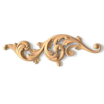
Routing is the process of creating relief on a flat surface using a router. The router (rotating cutting tool) removes material, creating grooves, channels, profiles. On wooden or MDF panels, patterns are cut: geometric frames, waves, plant ornaments, imitating panels. Routing transforms a flat cabinet door into an architectural element.
Routing depth: why fine relief disappears on white
Routing depth — the distance from the highest point of relief (convexity) to the lowest (recess). The deeper the routing, the greater the height difference, the stronger the play of light and shadow, the more expressive the relief.
On dark furniture, even fine routing (depth of 3-5 mm) is clearly visible — dark color enhances shadows, contrast is noticeable. On white furniture, fine routing is almost invisible. White color blurs boundaries, light reflects evenly from the entire surface, shadow in a shallow recess is too weak to be noticed by the eye. The furniture appears flat.
For white classic furniture, the optimal carving depth is at least 7-10 mm. At this depth, shadows in recesses are sufficiently contrasting to make the relief visible under normal lighting. If the carving is complex (multiple depth levels, different profiles), the overall height variation may reach 15-20 mm.
Types of carving: what works on white
Not all types of carving are equally visible on a white surface.
Geometric carving (frames, rectangular panels, linear grooves) — universal. Clear straight lines, sharp angles, deep grooves create a clear geometry visible on white. A classic facade with two vertical and two horizontal frames forming a rectangle — this carving works excellently on white enamel.
Profiled carving (waves, curves, ovals) — more complex. Smooth lines, rounded corners require greater depth to be noticeable. If the profile is fine, it may almost disappear on white. Solution — increase depth or combine with patina (see below).
Floral carving (leaves, scrolls, flowers) — most challenging for white. Fine details, thin lines, complex geometry. Such carving on white works only with sufficient relief depth (minimum 10 mm) and necessarily with patina or contrasting backlighting. Without this, details merge, and instead of an elegant ornament, you see a blurred spot.
Carving on solid wood vs. MDF: difference in relief
Carving on solid wood and MDF yields different results. Solid wood — a living material with texture and grain. The router removes wood, leaving slightly rough edges with natural texture. Even under enamel, this texture is tactile and visually perceptible (light surface grain). On white solid wood, the relief appears more 'alive'.
MDF — a homogeneous pressed material. The router removes it perfectly evenly, leaving perfectly smooth edges. After enamel coating, the MDF furniture surface is flawless, almost plastic-like. The relief is clear and graphic, but less 'warm' than on solid wood. For white furniture, this is not always bad: the perfect smoothness of MDF emphasizes refinement and modern classicism. However, for traditional classicism, where the feel of handcrafted work is valued, solid wood is preferable.
Patina: shadow painted with paint
Patina in furniture production — this is not a natural patina from time (like on old bronze), but an artificially applied coating that imitates aging and, more importantly, reveals relief. Patina is applied to white enamel to fill the recesses of the relief with a contrasting color. This creates an artificial shadow that reveals volume even under flat lighting.
How patina works on white furniture
Patina application process: on a surface already coated with white enamel and dried, a patina (special composition, usually acrylic or wax-based) of a darker color is applied. Patina is applied with a brush or sponge, filling all recesses of the carving. Then, while the patina is still wet, it is wiped off from the raised parts of the relief with a cloth. Patina remains only in the recesses — in grooves, in corners. Raised parts remain white.
Result: a white surface with dark lines and spots in the recesses. These dark lines act as painted shadows, emphasizing the depth of the relief. Even under bright frontal lighting (which usually eliminates natural shadows), the patinated relief remains readable — because the 'shadow' is painted with paint.
Patina colors: gold, silver, brown, black
The choice of patina color determines the character of the furniture.
Gold patina (from light champagne to rich old gold) — the most popular option for white classic furniture. Gold adds luxury, grandeur, and is associated with palace interiors. Light gold (champagne) gives a subtle effect, barely noticeable shimmer in recesses — this is restrained elegance. Rich gold (old gold with bronze tint) — more dramatic effect, furniture becomes solemn, suitable for baroque interiors.
Silver patina (from light silver to dark graphite) — a cooler, more modern option. Silver on white creates a monochromatic palette, suitable for neoclassical interiors where restraint without drama is needed. Dark gray (graphite) patina approaches black, providing maximum contrast with white.
Brown patina (from light ochre to dark chocolate) — imitates natural wood aging. Brown in recesses on a white background creates the impression that this is old furniture, once naturally colored wood, then painted white, and paint did not fully cover the recesses. This vintage effect is popular in Provence or shabby chic styles.
Black patina — maximum contrast. Black in recesses on a white background gives graphic quality, almost a charcoal drawing. This is the most expressive option, but requires caution — black patina may appear too stark if applied heavily. Usually, it is used sparingly, in complex ornaments, where every line must be maximally emphasized.
Degree of patina: from barely noticeable to saturated
Patina can be applied differently: barely touching the surface (light patina) or densely filling all recesses (saturated patina).
Light patina — barely noticeable hint of volume. Patina is applied and almost completely wiped off, leaving only thin lines in the deepest places. This is a delicate effect, not eye-catching but subconsciously perceptible — the furniture appears non-flat, though the relief does not shout. Suitable for minimalist neoclassicism.
Medium patina — patina is clearly visible but does not dominate. Recesses are filled but not clogged. This is a balance between white and contrasting patina color. The most popular option, suitable for most classic interiors.
Saturated patina — recesses are densely filled, patina sometimes extends onto raised parts, creating the impression of heavily aged furniture. Dramatic effect, suitable for baroque or chateau-style (French castle style) interiors.
Patina vs. natural shadows: when patina is unavoidable
Under ideal lighting conditions (side lighting that creates natural shadows), deep carving on white furniture is readable even without patina. But in reality, lighting is rarely ideal. Evening overhead lighting from chandeliers, frontal light from windows, flat diffused lighting from recessed fixtures — all of this kills shadows, making the relief less noticeable.
Patina solves this problem: it is independent of lighting. Even under the flattest light, a patinated relief is visible, because contrast is created not by light, but by paint. For white furniture, especially in rooms with complex or variable lighting, patina is not a decorative option, but a technical necessity to preserve volume.
Backlighting: when light shapes volume
Proper lighting for white furniture — not luxury, but necessity. A white surface reflects light, and whether the relief is visible depends on the angle at which light hits it — the furniture may turn into a white spot.
Side lighting: relief enhancer
Side lighting (light source positioned to the side of the furniture, not frontally or from above) is ideal for revealing relief. Light glides across the surface at an angle, illuminating raised parts of the relief while recesses remain in shadow. The contrast between light and shadow makes the relief appear three-dimensional and expressive.
Forclassic furnitureFor a white cabinet or chest placed against a wall with no window or light fixtures, the relief on its facades will be poorly visible. Solution: install wall-mounted sconces next to the furniture (not directly above it, but to the side, about half a meter to a meter away), directing the light to glide across the facades at an angle.
Backlit lighting: silhouette drama
Backlit lighting (light positioned behind the object, outlining its silhouette) creates not the volume of the surface, but the volume of the object itself, emphasizing its silhouette. For furniture, this is an LED strip hidden behind the furniture (between the back panel of the furniture and the room’s wall) or underneath the furniture (if the furniture has legs, with space between the body and the floor).
Light from behind or below the furniture creates a glowing outline, making the furniture appear to float, detached from the wall or floor. This does not reveal the relief of the facades, but creates an overall visual volume: white furniture stops blending into the wall, and its boundaries are clearly defined by light.
Backlit lighting is especially relevant for white furniture in light interiors (white walls, light-colored floors). Without backlighting, white furniture may visually dissolve into the space. The glowing outline anchors it, making it noticeable.
Backlit lighting is especially relevant for white furniture in light interiors (white walls, light flooring). Without backlighting, white furniture may visually blend into the space. The glowing outline anchors it, making it noticeable.
Built-in lighting: internal light
Built-in lighting — LED strips or fixtures embedded directly into the furniture. Classic examples: backlighting in display cases (cabinets with glass doors), shelf lighting, lighting in internal niches.
For white furniture, built-in lighting serves a dual function. First, it illuminates the contents (dishes in display cases, books on shelves). Second, it creates contrast: warm or cool light (depending on LED color temperature) glows from within, while the exterior surface is white matte or glossy. This contrast makes the furniture appear three-dimensional and layered.
Light color: warm white (2700–3000K) creates coziness and softness, suitable for classic interiors. Neutral white (4000K) — more modern and graphic. Colored lighting (RGB) — experimental option, rarely used in classic styles, but interesting for white furniture: blue backlighting inside a white cabinet creates a cool, almost cosmic effect.
Directed accent lighting: highlighting details
Directed accent lighting — spotlights or track lights aimed at a specific piece of furniture. This is a museum-style technique: light falls on the object, isolating it from its surroundings and revealing details.
For white furniture with abundant carving or complex routing, directed lighting is a way to turn the piece into an art object. A chest with carved facades, illuminated by a side-directed spotlight, becomes a sculpture. Light emphasizes every detail of the carving, every swirl, every shadow.
Important: directed lighting must be strictly side or upper-side (at a 30–45 degree angle to the facade plane). Frontal directed lighting (directly onto the facade) will flatten the relief — resulting in a bright white spot without shadows.
Hardware: function and visual accent
Hardware on white furniture — not just handles for opening drawers and doors. These are visual accents that prevent the white surface from appearing monotonous, create rhythm, add color and shine.
Contrasting hardware: black, gold, bronze
On white furniture, hardware is always contrasting. A white handle on a white facade is almost invisible — this is bad both functionally (difficult to find by eye) and visually (no accent).
Black hardware (matte black metal, black nickel) — graphic contrast. Black handles on white facades create a strict, almost minimalist effect. This is modern classicism, neoclassicism. Black hardware emphasizes the geometry of facades, highlights routing lines (if handles are placed on frames).
Gold hardware (brass, polished gold, matte gold, antique gold) — classic tradition. Gold adds warmth and luxury. Gold hardware is especially natural on white furniture with gold patina — the color of handles and patina harmonize, creating a unified color scheme. Polished gold (shiny) gives bright reflections, attracting attention. Matte or antique gold (with patina effect on the handle itself) — more restrained, vintage effect.
Bronze and copper hardware (dark bronze, patinated copper) — richer color than gold, with a reddish tint. Bronze on white provides a noble contrast, but less glaring than gold. Suitable for interiors avoiding gold leaf, yet seeking warmth from metal.
Silver and chrome hardware — cool sheen. Chrome on white — almost cosmic effect, sterile and cold. More suitable for modern styles than traditional classicism. Silver (matte or polished) is softer than chrome, offering a noble cool sheen, suitable for white furniture with silver patina.
Size and shape of hardware: scale matters
Small, understated hardware on white furniture disappears. The white surface dominates, handles are almost invisible. White furniture, especially large (cabinets, chests), requires larger hardware than dark furniture.
Handles (horizontal elongated handles) at least 10–15 cm long are clearly visible on white facades. Short handles (5–7 cm) may disappear. Knobs (round or square push-button handles) at least 3–4 cm in diameter. Small knobs on white are almost invisible.
Hardware shape should match the furniture style. For classic: curved handles with scrolls, leaf-shaped, ring-shaped, forged handles with floral ornamentation. For neoclassic: more minimalist forms — straight handles, knobs with minimal decoration, geometric shapes.
Hardware with crystals (crystal or glass push-button handles) — classic for white furniture. Transparent crystal on a white facade creates a jewelry-like effect, the sparkle of crystal matches the sheen of enamel (if enamel is semi-matte or glossy). This is a formal option, suitable for luxurious interiors.
Plates and sockets: additional decoration
In addition to handles, white furniture sometimes uses decorative appliqués (metal ornamental elements attached to fronts but not serving as functional handles) and handle escutcheons (metal plates to which a handle is attached).
Appliqués add decorative elements and create additional visual accents. Gold appliqués in the form of scrolls or crests on white cabinet doors — a typical Baroque classicism technique. However, it’s easy to overdo it with appliqués — too much metallic decoration makes the furniture look overloaded.
Handle escutcheons (e.g., a round bronze escutcheon to which a button handle is attached) add visual weight to the handle, making it more noticeable. This is relevant for large furniture, where expressive accents are needed.
Combination techniques: layered visual volume
Each of the described techniques works individually, but maximum effect is achieved through their combination. White furniture where proper enamel, deep carving, delicate patina, thoughtful lighting, and contrasting hardware are combined — this is a multi-layered system where each element enhances the other.
White enamel + gold patina + side lighting
Classic combination for formal furniture (buffets, display cabinets, commodes in the living room). Matte or semi-matte white enamel creates a noble surface. Gold patina in carved recesses reveals relief even under flat light. Side lighting (wall sconces nearby, floor lamp beside) adds natural shadows, enhancing the patina effect. Gold hardware (handles, appliqués) complements the patina, creating color harmony.
Result: the furniture appears voluminous, luxurious, and relief is clearly visible under any lighting.
White enamel + silver patina + backlighting + black hardware
Modern combination for neoclassical interiors. Super-matte white enamel gives a velvety surface. Silver (or graphite) patina creates monochromatic contrast. Backlighting (LED strip underneath or behind) highlights the furniture silhouette, making it appear floating. Matte black hardware adds graphic contrast.
Result: the furniture appears modern, refined, voluminous without Baroque opulence.
White enamel + deep carving without patina + directional accent lighting
Minimalist combination for furniture where clean lines are valued. Matte white enamel, deep geometric carving (straight lines, sharp angles), without patina. A directional spotlight, mounted to the side and above, creates dramatic shadows in carved recesses. Hardware is minimalist — thin handles or concealed (integrated into fronts).
Result: the furniture appears sculptural, monumental, volume created exclusively by light and shadow.
Common mistakes: when white furniture loses volume
Even knowing all techniques, it’s easy to make mistakes in details. Let’s examine typical errors that cause white furniture to appear flat.
Error 1: Fine carving on glossy white enamel
Ordered white furniture with delicate carving (depth 3–4 mm), coated with glossy enamel. Result: relief is almost invisible. Gloss reflects light, creating highlights that 'erase' small details. Fine carving doesn’t produce sufficient shadow to be noticeable.
How to avoid: for glossy white enamel, choose deep carving (minimum 8–10 mm) with clear geometry. Or opt for matte or semi-matte enamel instead of gloss.
Error 2: Patina of wrong color or too saturated
Chose brown patina for white furniture in a cool interior (gray walls, chrome hardware). Brown patina adds warmth that conflicts with the cool palette. Or applied patina too thickly — recesses filled with dark paint, making furniture look dirty rather than aged.
How to avoid: patina color must match the interior’s overall palette. Warm interiors — gold or brown patina. Cool interiors — silver or graphite. Adjust patina saturation: better to apply less (you can always add more) than overdo it.
Error 3: Incorrect lighting
White furniture with beautiful carving and patina, but lighting — only overhead (chandelier in the center of the ceiling). Light falls perpendicularly onto fronts, not creating side shadows. Relief is poorly visible, furniture appears flat.
How to avoid: add side lighting. Even one wall-mounted light beside the furniture dramatically changes perception. Relief will appear, furniture will become voluminous.
Error 4: Small unexpressive hardware
White furniture with large fronts (cabinet doors 60×120 cm), but handles — small buttons 2 cm in diameter, silver, understated. Handles disappear against the white background, are hard to spot visually, and do not create visual accents.
How to avoid: for large white fronts, choose large contrasting hardware. Handles 12–15 cm long or buttons 4–5 cm in diameter, gold, black, or bronze — what will be noticeable.
Error 5: White furniture on white background without backlighting
White furniture against a white wall, white ceiling, light floor. The furniture blends into the background, its edges are blurred, and it appears to be part of the wall.
To avoid this: backlighting (LED strip behind or under the furniture) clearly defines the boundaries and separates the furniture from the background. Alternatively, use a colored background — white furniture against a gray, beige, or blue wall will stand out.
Caring for white furniture: how to maintain its volume for a long time
White furniture requires more careful maintenance than dark furniture. Any dust or stain on white surfaces is more noticeable. But proper care is not complicated.
Regular dry cleaning
Dust on white furniture is clearly visible, especially on matte enamel. Regular (every 2-3 days) dry wiping with a microfiber cloth removes dust before it settles into the router grooves. This is important: dust in grooves washes away the patina, turning it gray instead of gold or silver.
Do not use abrasive cloths or brushes — they may scratch the enamel, especially matte finish.
Wet cleaning with mild detergents
Once a week (or as needed) — wet cleaning. A microfiber cloth slightly dampened with water (almost wrung out, not dripping wet) wipes the surface. You can add a drop of mild detergent (for furniture or dishes, no abrasives).
After wet cleaning, always dry the surface thoroughly — water leaves streaks on the enamel, especially on glossy finishes.
Do not use aggressive cleaning agents (with chlorine, acetone, solvents) — they may damage the enamel and patina.
Protection from direct sunlight
UV light may over time change the color of white enamel (yellowing) and fade the patina. If white furniture is placed near a window receiving direct sunlight, use curtains or blinds during daylight hours.
Removing scratches and chips
Small scratches on white enamel can be masked with a special wax pencil (available at furniture stores, color — white). Rub wax into the scratch, then polish with a soft cloth.
Deep scratches and chips require professional repair (local touch-up and varnishing). If the furniture is of quality and from a reputable manufacturer, you can contact the service center.
Conclusion: white as a challenge and an opportunity
White classic furnitureThis is not a compromise between the desire for a light interior and love for classic style. It is a deliberate choice that requires understanding of technology, materials, and lighting. White is deceptive: it can make intricate carving invisible, or — with the right approach — turn furniture into sculpture, where every line, every swirl, every panel is clearly readable.
Enamel coating — not just paint, but a multi-layer system, where each layer and each sanding affects the final result. Matte enamel preserves relief better than glossy, super-matte adds tactile quality. Gloss gives shine and depth of color, but requires caution with relief surfaces.
Routing on white furniture should be deeper than on dark furniture — at least 7-10 mm, to ensure sufficient contrast in shadows. Geometric routing works better than floral, but floral is possible if the relief depth and patina are correct.
Patina — not decoration, but a technical method of revealing volume. It draws shadows where natural light does not create them. The choice of patina color (gold, silver, brown, black) determines the character of the furniture and should match the overall interior palette. The degree of patina (light, medium, saturated) — a matter of balance: too little — effect is barely noticeable, too much — furniture appears overloaded.
Lighting for white furniture — not luxury, but necessity. Side lighting reveals the relief of facades, backlighting highlights the silhouette, directional accent lighting turns an object into an art piece. Built-in lighting in cabinets and on shelves adds depth and layering. Proper lighting can save even the least successful routing, improper lighting — destroys relief on perfect furniture.
Hardware on white furniture — visual accents that create rhythm, add contrast, prevent white from being monotonous. Large contrasting hardware (gold, black, bronze) is essential, small details get lost. Crystal handles add elegance, metallic inlays — decorative appeal.
Combining all techniques — enamel + routing + patina + lighting + hardware — creates a multi-layered system, where each element enhances the other. White furniture stops being a flat spot and becomes a volumetric, expressive, living interior piece.
Company STAVROS has been creating for more than 23 yearsclassic furnitureFurniture made from solid wood of valuable species, including white furniture with enamel finish. The enamel coating technology used by STAVROS includes multi-layer application with intermediate sanding, guaranteeing a perfectly smooth surface and deep, rich color. Routing is performed on high-precision equipment, with relief depth calculated for white finish — sufficient to create expressive shadows.
Patina application at STAVROS — handcrafted. Masters apply patina with brushes, controlling saturation in each groove to achieve uniformity and natural effect. All classic patina colors are available: gold (from light champagne to aged gold), silver, graphite, brown. The degree of patina is adjustable per customer preference — from barely noticeable to saturated.
Hardware for STAVROS white furniture is selected individually: gold, bronze, black handles from reputable European manufacturers, sizes and shapes match the style and scale of the furniture. Crystal hardware, decorative inlays, and handle-mounted knobs are available.
Each STAVROS piece — not mass-produced, but the result of master craftsmanship, who understand that white furniture requires a special approach. Routing depth, enamel choice (matte, semi-matte, super-matte), patina color and saturation, hardware size and color — all are discussed with the client, considering interior specifics, lighting, and personal preferences.
White classic furniture from STAVROS — not just a light piece in the interior, but a work of art where volume and relief are preserved, revealed, and emphasized by all available means. Where white color does not erase form, but becomes canvas on which light, shadow, gold patina, and hardware gloss draw sculpture. Where furniture does not fade against light walls, but stands out, attracts attention, becomes the composition’s focal point. And this is not by chance, but the result of technology knowledge, master experience, attention to detail — what distinguishes true classic furniture from its imitation.