


Article Contents:
- Railing rhythm: the visual music of the staircase
- Classic: eternal proportions on modern photos
- Modern and contemporary styles: geometry and minimalism
- Carved ornament: from tradition to modern interpretation
- Light and shadow: architecture of light on balusters
- Stylistic pairs: harmony of elements
- Conclusion: visual literacy through photography

A staircase is not just a functional structure for moving between floors. It is an architectural dominant of the interior, a vertical axis of space, a sculptural object visible from multiple points in the room. And it is precisely the balusters that define the character of this object, creating rhythm, texture, play of light and shadow, stylistic definition. The same staircase structure with different balusters becomes completely different artworks — classic elegance, modern minimalism, baroque luxury, industrial loft.
Photographs of staircases — a powerful tool for understanding design possibilities. What is difficult to describe in words is instantly perceived visually: proportions of elements, density of filling, color combinations, material interaction. Reviewing photo layout ideas for balusters, you are not simply choosing a 'beautiful option' — you learn the language of architectural composition, understand why one solution works and another doesn't, why one staircase looks harmonious and another falls apart into disconnected elements.
balusters photoThis is not a catalog of products, but a visual library of solutions. Each image is a complete composition where balusters interact with handrails, steps, walls, light, creating a unified impression. Analyzing these images, you understand the principles of building railing rhythm, rules for selecting stylistic pairs (balusters + posts + handrails), the influence of light and shadow on the perception of form.
This article is a visual guide to the world of balusters through the prism of photography. How the rhythm of baluster installation changes the perception of the staircase. What layouts create a classic, modern, eclectic character. How carved ornament works in space. Why light and shadow are critical for revealing the beauty of the profile. How to select stylistic pairs of elements for a cohesive composition. After reading, you will view staircase photographs with a professional eye, understanding the architectural logic of each solution.


Railing rhythm: the visual music of the staircase
Rhythm is a repeating sequence of elements that creates visual movement. In music, rhythm is the alternation of sounds and pauses. In staircase architecture, rhythm is the alternation of balusters and gaps between them. This rhythm is instantly perceived and forms the first impression of the staircase: calm or dynamic, dense or light, classic or modern.
Frequent rhythm (step 100-120 mm): on photographs of staircases with frequent baluster rhythm, balusters are perceived almost as a solid filling with thin gaps. This creates a sense of protection, reliability, solidity of the railing. Visually, the staircase appears more substantial, heavier. Frequent rhythm is typical for classic interiors, where solidity is valued, for families with small children, where safety is important, for wide staircases, where sparse balusters would look empty.
On photos, such staircases attract attention due to the density of vertical lines, creating almost a graphic pattern. Especially effective is frequent rhythm on curved staircases, where balusters installed along the curve create a wavy movement of verticals. Light passing through frequent gaps creates a delicate play of stripes on the wall or floor — an additional decorative effect.
Medium rhythm (step 120-150 mm): the golden middle, most common in modern staircases. On photographs, balusters and gaps are perceived as equal — a balanced composition where neither balusters nor gaps dominate. This creates a sense of harmony, order, classic correctness.
Medium rhythm is universal for most styles and sizes of staircases. On photos, it appears calm, does not overload space, but also does not create a sense of emptiness. Vertical lines of balusters are clearly readable, but do not overwhelm with mass. This rhythm does not compete with other interior elements, but delicately complements them.
Sparse rhythm (step 150-180+ mm): on photographs of staircases with sparse rhythm, gaps dominate over balusters. Vertical elements are perceived as rare accents, the space between them as the main part of the composition. This creates a sense of lightness, airiness, modernity.
Sparse rhythm is typical for minimalist interiors, where visual lightness of the structure is important, for narrow staircases, where frequent balusters would create a sense of confinement, for staircases with additional filling (glass panels, horizontal slats), where balusters play the role of a frame. On photos, such staircases appear graphic, modern, almost sculptural — each baluster is perceived as a separate object, not part of a dense row.
Variable rhythm: changing the step between balusters along the staircase — a bold design technique. On photographs, this appears as acceleration or deceleration of rhythm: balusters start frequent, then become sparse, or vice versa. This creates dynamism, visual movement, non-standardism.
Variable rhythm is rarely used in classic interiors (where regularity is valued), but popular in modern design, eclecticism, and custom projects. On photos, variable rhythm attracts attention, highlighting the staircase as an art object. Important: variable rhythm requires professional calculation to avoid violating safety norms (gaps should not exceed 100-120 mm anywhere).
Combined rhythm: alternating balusters of different thicknesses or types. For example, every two thin balusters (40 mm) — one thick (80 mm), or alternating simple balusters with carved ones. On photographs, this creates a more complex, richer visual pattern than a monotonous row of identical elements.
Combined rhythm is characteristic of eclectic, neo-classical interiors, where different stylistic motifs are combined. On photos, such staircases appear individual, non-banal. Thick balusters work as visual accents, breaking the monotony of the row. Carved balusters between simple ones create a sense of luxury without overloading.
Baluster grouping: installing balusters not evenly, but in groups. For example, three balusters close together (step 80 mm), then an increased gap (200-250 mm), then again three balusters. On photographs, grouping creates a rhythm of higher order — rhythm of groups, not individual elements.
Grouping is used in modern design projects where a non-standard visual solution is required. On photos, this appears graphic, almost like a barcode, creating a dynamic play of density and emptiness. Important: between groups of balusters, additional filling (glass, panels) is usually required to comply with safety norms.
Rhythm and scale of the staircase: on photographs, it is noticeable how the same rhythm is perceived differently on staircases of different scales. On a narrow staircase (width of 80-90 cm), frequent rhythm may appear overloaded, creating a sense of confinement. On a wide staircase (width 140-180 cm), the same frequent rhythm appears harmonious, creating an impression of solidity.
Sparse rhythm on a narrow staircase appears light and modern, on a wide one may appear empty, requiring either increasing the thickness of balusters or adding additional decoration. Photographs demonstrate these nuances: comparing staircases of different widths with the same baluster rhythm, it is clear how the visual impression changes.
Rhythm and perspective: on photographs of staircases shot along the staircase (from lower or upper landing), the rhythm of balusters creates a powerful sense of perspective. Balusters recede into the distance, decreasing in size, gaps narrow — this enhances the sense of spatial depth, creating a dynamic composition.
Frequent rhythm on such photos creates almost a stroboscopic effect — rapid flickering of verticals, drawing the gaze inward. Sparse rhythm creates a more tranquil perspective — individual balusters as markers, indicating the path. Professional photographers deliberately photograph staircases along the run to emphasize the beauty of rhythm in perspective.


Classic: Eternal proportions on modern photos
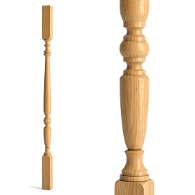
Classic style in staircase design is not copying historical samples, but following eternal principles of harmony, proportions, and clear composition. On photos of classical staircases, balusters always conform to classical orders: base (foundation), shaft (body), and capital or finial (top for posts).
Precision-crafted classical balusters: on photos, these are balusters with clearly defined elements — spheres, knobs, cones, ovales. The profile is symmetrical relative to the vertical axis, and proportions of elements conform to mathematical ratios (golden section, module). The number of elements is usually 2–5: more creates overload, less — primitiveness.
Classical precision-crafted balusters on photos appear elegant and recognizable. They do not shout about themselves, but create a sense of quality, durability, tradition. Light gliding over convex and concave profile elements creates soft chiaroscuro, emphasizing form. Dark woods (oak, walnut) on photos appear solid and respectable. Light woods (ash, beech) — delicate and refined.
Support posts in classic style: on photos of classical staircases, support posts are thicker than balusters (usually 100×100 or 120×120 mm against 50×50 mm balusters). They have more complex profiles and are topped with finials — spheres with diameters of 100–150 mm, cones, or decorative elements. Posts are installed at key points: start and end of the run, corners of turns.
On photos, posts act as visual anchors, marking the boundaries of the staircase space. A massive finial on a post at eye level becomes a sculptural accent. Often, directional light (from a window or lamp) falls on the finials, creating a dramatic effect — a light finial against a dark space or a dark finial against a light background.
Handrails in classic style: on photos of classical staircases, handrails are usually circular or oval in cross-section, 50–70 mm in diameter, made from the same wood species as balusters, with the same finish tone. The handrail may have a simple round profile or decorative (with ovales, protrusions), but is always comfortable to grip — rounded top, no sharp angles.
On photos, the handrail reads as a continuous horizontal line, connecting the verticals of balusters into a unified system. On curved staircases, the handrail smoothly follows turns, creating a beautiful three-dimensional curve. Light gliding along the handrail emphasizes its smoothness and continuity.
Color solutions in classic style: on photos of classical staircases, natural wood tones with transparent finishes (varnish, oil) predominate. Dark stained tones — walnut, mahogany, wenge — create solidity and respectability. Light natural tones — light oak, ash, beech — create a lighter, more refined classic style.
Contrast solutions in classic style: dark balusters + light steps, or light balusters + dark handrail. On photos, contrast looks striking, emphasizing the staircase’s graphic quality. But contrast requires moderation — too sharp (black on white) may look disharmonious in a classic interior, softer contrasts (dark brown on cream) are preferred.
Classic in modern interpretation: on photos of modern interiors, neoclassicism appears — classical baluster forms, but simplified, minimalist, often painted white or gray. Profiles are less detailed (1–2 large elements instead of 4–5 small ones), proportions slightly elongated. This creates a sense of classicism without heaviness, tradition without conservatism.
On photos, neoclassical staircases appear fresh and current. White balusters against light walls create a monochromatic, airy composition. Gray balusters add modern restraint. Such staircases harmonize with both classic and modern furniture, acting as a stylistic bridge.
Our factory also produces:


Modern and contemporary styles: geometry and minimalism
Modern styles in staircase design — a triumph of pure form, geometric precision, minimalist decoration. On photos of modern staircases, balusters are often extremely minimalist: square or rectangular sections without turning, flat panels, metal rods, glass inserts. Beauty is created not by decoration, but by proportions, materials, and play of light.
Minimalist square balusters: on photos, these are balusters with square cross-sections of 40×40 or 50×50 mm with minimal processing — rounded corners (bevels 2–3 mm) or sharp corners. No turning, no decorative elements. Pure verticality, emphasizing the architectural logic of the railing.
On photos of minimalist interiors, such balusters are perceived as part of the architecture, not decoration. They do not attract attention by form, but create a clear rhythm of verticals, graphic composition. Especially effective on photos are thin square balusters (35×35 or 40×40 mm) with sparse spacing (150–180 mm) — light, almost transparent construction.
Flat balusters: on photos, these are balusters made not from beams, but from boards 30–40 mm thick, installed flat. Board width may vary — from 80 to 150 mm, creating either narrow vertical strips or wide panels. Flat balusters often have decorative cutouts (geometric shapes, abstract patterns), creating play of light and shadow.
On photos of modern staircases, flat balusters appear as graphic elements dividing space. Light passing through cutouts creates projections on walls and floors — additional decorative effect. Flat balusters occupy less space than volumetric ones, visually lightening the structure.
Metal balusters-rods: on photos, these are thin metal rods with round (diameter 12–16 mm) or square (12×12, 16×16 mm) cross-sections made of stainless steel, black metal, brass. Installed vertically with spacing 100–120 mm or in combination with wooden posts (posts every 1–1.5 meters, with metal rods between them).
On photos of loft and industrial interiors, metal rods create a light, transparent structure with distinct industrial character. Black metal with matte finish appears brutal and modern. Stainless steel with polished surface — technological and cold. Brass or copper — warm and vintage.
Glass panels: on photos, these are solid glass sheets 10–12 mm thick (triple-glazed or tempered glass), installed between wooden or metal posts. Glass may be transparent (maximum visual lightness), frosted (diffusing light, privacy), tinted (color accent), or decorated (sandblasted patterns, photo prints).
On photos of modern interiors, glass railings appear almost invisible — space flows through them, creating a sense of openness. Light passes through glass without casting shadows — the staircase appears to float. Glass railings are especially popular in small spaces, where maintaining visual connection between levels is important.
Combined solutions: on photos of modern staircases, combinations of materials are often encountered — wooden posts + metal balusters-rods, wooden handrail + glass panels, metal frame + wooden inserts. Combination creates visual richness, emphasizing the materiality of each element.
On photos, combined staircases appear modern and individual. Contrast between warm wood and cold metal adds dynamism. Combination of opaque wooden posts and transparent glass creates a play of mass and void. Combination requires moderation — no more than two or three materials, otherwise the composition breaks into disconnected elements.
Color solutions in modern style: on photos of modern staircases, monochromatic solutions — white, gray, black — are popular. White balusters create a sense of purity, light, visually expanding space. Grays (various shades from light gray to graphite) — modern restraint, neutrality, harmony with any surroundings. Black — graphic quality, contrast, drama.
On photos, monochromatic staircases appear as graphic compositions, where lines, proportions, and mass relationships are important. Color does not distract, focus is on form. Popular contrast solutions: white balusters + black handrail, black balusters + white steps. Contrast enhances graphic quality, emphasizes architecture.
Get Consultation
Carved ornament: from tradition to modern interpretation
Wood carving — the oldest art, transforming a functional element into a piece of decorative-applied art. On photos of carved balusters, the beauty of handcrafted work is evident: every swirl, every leaf, every detail bears the imprint of the master’s tool and the character of the wood. Carving — is volume, relief, play of light and shadow, tactility.
Traditional carving motifs: photographs of classic carved balusters predominantly feature vegetal ornaments — grapevines with leaves and clusters, oak leaves with acorns, roses, lilies, tulips. Vegetal motifs are symbolic (oak — strength, grapevine — fertility, rose — beauty) and universally beautiful.
Carved plant motifs create a sense of natural organicity, life, and movement. Scrollwork vines guide the eye upward along the baluster, creating visual motion. Leaves unfurl toward the light, revealing relief and detail. Deep carving (relief 10–20 mm) creates expressive chiaroscuro; flat carving (relief 3–5 mm) produces delicate patterns.
Geometric carving: geometric ornaments — meanders (continuous broken lines), braids (interwoven ribbons), diamonds, stars, rosettes — also appear in photographs. Geometric carving is more rigid and architectural, evoking a sense of order and rhythm.
Geometric carving appears graphically and structurally in photographs. Repeating elements create rhythm within the rhythm of the balusters — a higher-order metronome. Geometric carving pairs well with classic profiled elements — profiled elements create volume, while carving adds detail.
Baroque carving: baroque carving — complex, multi-layered, with many details — appears in photographs of historical and neo-historical interiors. Asymmetrical compositions, cartouches (decorative shields), masks, putti (images of small figures), and volutes are characteristic. Baroque carving is maximally decorative, evoking opulence, excess, and theatricality.
Baroque balusters appear as independent works of art in photographs. Each baluster is unique, inviting contemplation for minutes as new details emerge. Chiaroscuro on baroque carving is especially expressive — deep recesses create almost black shadows, while protruding elements are brightly lit. Baroque carving requires large scale — on slender balusters, details are unreadable; massive 100×100 mm or larger columns are needed.
Modern interpretation of carving: modern design interiors feature carving reinterpreted through a contemporary lens. This may include abstract carving (non-objective forms, rhythmic recesses and protrusions), minimalist carving (concise patterns from a few lines), or conceptual carving (patterns carrying semantic meaning tied to the interior’s concept).
Modern carving appears fresh and unexpected in photographs. It combines traditional techniques (hand carving in wood) with modern forms (abstraction, minimalism). Such carving suits eclectic interiors where eras and styles mix, and for bespoke projects where individuality matters.
Carving and chiaroscuro: lighting plays a crucial role in photographs of carved balusters. Frontal lighting (light falling directly on the carving) reveals details clearly but renders volume weakly — carving appears flat. Side lighting (light falling at 30–60° angles) maximizes volume — recesses fall into shadow, protrusions catch light, making carving three-dimensional, alive, and expressive.
Professional photographers of carved items always use side lighting to emphasize relief. Such photographs appear dramatically and beautifully. When placing staircases with carved balusters in interiors, it’s important to consider the direction of light (windows, fixtures) — side-lit carving reveals detail, while front-lit carving loses expressiveness.
Finishing of carved balusters: photographs show carved balusters with transparent finishes (natural wood color, carving emphasized by texture) or opaque finishes (white, gray, black, colored tones). Transparent finishes preserve the natural beauty of wood, highlight texture, but carving is read through chiaroscuro.
Light tones (white, cream, light gray) with patina (dark patina in recesses) create an antique furniture effect — artificial aging emphasizes relief, making carving more expressive. Patinated carved balusters appear noble and vintage, suitable for Provence, shabby chic, or neoclassical styles.
Dark tones (black, dark gray, wenge) with gold or silver patina (applied to protruding parts) create a luxurious, festive effect. Gold-carved balusters appear expensive and striking, suitable for high-end classical and baroque interiors.
Chiaroscuro: architecture of light on balusters
Chiaroscuro — the play of light and shadow on three-dimensional forms — is a critical factor in perceiving balusters. Flat photography does not directly convey volume, but chiaroscuro creates an illusion of volume, showing convexities and recesses, making the form readable and expressive. On baluster photographs, chiaroscuro is the primary tool for demonstrating profile beauty.
Natural lighting: natural light on staircases near windows creates soft, variable chiaroscuro. Morning light (low angle, warm tone) creates long shadows, emphasizing baluster relief. Daylight (high angle, neutral tone) creates short shadows, making form clearly readable but less dramatic. Evening light (low angle, warm tone) again creates long shadows, adding coziness and warmth.
On photographs of staircases where balusters are lit by natural light from the side (window beside the stair run), chiaroscuro is most expressive. Each element of the profiled form — sphere, ovolo, ogee — has an illuminated side and a shadowed side, creating volume. Balusters lit frontally (window opposite the stair run) appear flatter — light is even, shadows minimal.
Artificial lighting: in photographs of interiors with artificial lighting, chiaroscuro is more controlled and predictable. Spotlights directed at the staircase at an angle create clear chiaroscuro, emphasizing baluster form. Diffused lighting (ceiling fixtures with diffusers) creates soft, delicate chiaroscuro — form is readable but without drama.
On photographs, dramatic solutions with downlighting (LED strip under the first step) or uplighting (ceiling fixtures above the staircase, directed downward) are effective. Light from below creates unusual chiaroscuro — shadows fall upward, making baluster forms appear inverted and dramatic. Light from above creates classic chiaroscuro — shadows fall downward, form appears natural.
Backlighting: in photographs where the light source is behind the balusters (window behind the staircase, fixture behind the stair run), balusters become silhouettes — dark outlines on a light background. Backlighting removes profile details, leaving only form. This creates a graphic, almost poster-like composition.
On photographs of staircases in backlight, balusters appear as clear vertical lines rhythmically filling space. Gaps between balusters are light, balusters themselves dark — an inversion of normal perception. Backlighting is effective for simple baluster profiles (square, round without detail), where silhouette matters. For complex carved balusters, backlighting is disadvantageous — carving details vanish in silhouette.
Dynamic chiaroscuro: on photographs of staircases at different times of day or changing lighting, one sees how chiaroscuro on balusters changes. The same baluster profile appears differently in the morning, at noon, and in the evening — light falls at different angles, creating varied chiaroscuro, accentuating different form elements.
This is important when selecting balusters: examine photographs under different lighting conditions. A baluster that looks beautiful under side lighting may appear flat under frontal lighting. Profiles with deep ogees and protrusions create expressive chiaroscuro even under diffused light. Profiles with smooth transitions require directional lighting to reveal form.
Color and chiaroscuro: photographs show how baluster color affects chiaroscuro readability. On dark balusters (dark oak, wenge, black paint), chiaroscuro is high-contrast — illuminated areas stand out against dark backgrounds, form is clearly readable. On light balusters (light beech, white paint), chiaroscuro is soft — transitions between light and shadow are gradual, form is delicate.
For complex carved profiles, dark tones are preferable — chiaroscuro is expressive, carving details are clearly readable. For simple, minimalist profiles, light tones are suitable — soft chiaroscuro avoids unnecessary drama, form remains calm and modern.
Matte and glossy finishes: photographs show differences in chiaroscuro between matte and glossy baluster finishes. Matte finish (matte varnish, oil) evenly diffuses light, creating soft, gradient chiaroscuro. Glossy finish (gloss varnish) creates highlights — bright reflections on convex profile parts.
Balusters with glossy finishes appear more dramatic and festive — highlights add dynamism and play of light. However, excessive highlights may look cheap, like plastic. Matte finishes appear more noble and calm, emphasizing wood’s naturalness. For classical interiors, semi-gloss varnish (light sheen without sharp highlights) is preferable — a compromise between expressiveness and nobility.
Stylistic pairs: harmony of elements
Balusters do not exist in isolation — they are part of a railing system including support columns, handrails, and intermediate rails (if present), and steps. Harmony among these elements, their stylistic compatibility, determines the composition’s integrity. In photographs of successful staircases, all elements work like an orchestra, each instrument in its proper place.
Balusters + columns: in photographs of classical staircases, support columns are 1.5–2 times thicker than balusters (balusters 50×50 mm, columns 100×100 mm), have more complex profiles, and are topped with finials. This creates visual hierarchy — columns dominate as structural elements, balusters subordinate as fillers.
Stylistic unity is achieved through consistency: one wood species, one finish color, one stylistic language of profiles (if balusters are classic profiled, columns are also classic profiled with similar elements). A column is an enlarged, more complex version of a baluster, not a different object. The column’s finial corresponds to the largest profile element on the baluster (if the baluster’s main element is a sphere, the column’s finial is also a sphere, but larger).
Balusters + handrail: On photos of harmonious staircases, the handrail and balusters are stylistically unified. For turned classical balusters — a round or oval handrail (echo of rounded forms). For square minimalist balusters — a rectangular handrail with sharp or rounded corners (echo of geometry). For carved balusters — a handrail with decorative profile (echo of decorative detail).
On photos, a handrail made of the same species and shade as the balusters creates a monolithic look — the railing is perceived as a single structure. A contrasting color handrail (dark handrail + light balusters or vice versa) creates graphic contrast — the horizontal handrail line clearly stands out against the vertical balusters. Contrast is striking but requires support in the interior — other elements should also have contrasting combinations.
Balusters + treads: On photos of staircases, treads and balusters can be made of the same species (oak treads + oak balusters) or different ones (oak treads + beech balusters, larch treads + pine balusters). One species creates material unity, different species — a play of textures and shades.
On photos, monochromatic solutions (treads and balusters of one color) create a calm, unified composition. Contrasting solutions (dark treads + light balusters, white treads + black handrail and dark balusters) create a graphic, dynamic composition. Popular approach: natural wood-colored treads + painted balusters and handrail (preserving wood warmth + color accent).
Balusters + walls: On photos of interiors, it’s noticeable how wall color and texture affect the perception of balusters. Balusters against light smooth walls (white, cream, light gray) appear as silhouettes; dark balusters contrast, light ones blend. Balusters against dark walls create the reverse effect — light balusters contrast, dark ones blend.
On photos of staircases with textured walls (brick, stone, wooden panels, patterned wallpaper), balusters compete for attention with the background. Simple, minimalist balusters (square, round without decoration) combine well with textured backgrounds — they don’t overload the composition. Complex carved balusters on textured backgrounds create visual noise — too many details.
Balusters + interior: On photos of interiors, the staircase is not isolated — it’s part of the overall space. Balusters must harmonize with furniture, doors, windows, decor. If the interior features classical forms (carved furniture, moldings, classical doors), balusters should be classical. If the interior is minimalist (simple furniture, smooth surfaces), balusters should be minimalist.
In eclectic interiors where styles mix, balusters can play the role of a stylistic bridge — for example, neo-classical balusters (classical shape, simplified and painted in modern color) link classical furniture with modern finishes. Or conversely, ultra-modern glass railings in a classical interior create an accent, contrast, showing a blend of eras.
Color triads: On photos of harmonious interiors, the rule of three colors often works — balusters, handrail, treads form a color triad. Variants:
-
Monochromatic: all three elements of one color (natural oak or all painted white) — maximum unity
-
Two + one: two elements of one color, the third contrasting (dark treads + dark handrail + light balusters) — balanced contrast
-
Three colors: all three elements of different colors (light treads + white balusters + dark handrail) — complex but effective composition, requiring professional approach
On photos, monochromatic solutions are universal and fail-safe, contrasting solutions are striking but risky (easy to overdo contrast).
Conclusion: visual literacy through photos
balusters photo— this is not just catalog illustrations. It’s a visual literacy textbook, where each image is a lesson in composition, proportions, harmony. Analyzing photos of staircases, you learn to see not only 'like/dislike' but to understand 'why it works' and 'how it’s done'.
Rhythm of railing — the first thing perceived in photos. Frequent, medium, sparse, variable, grouped — each rhythm creates its own impression. Frequent — reliability, medium — harmony, sparse — modernity, variable — dynamism, grouped — graphic quality. Choosing rhythm, you choose the character of the staircase.
Baluster arrangements — variations of element combinations. Classical turned balusters + massive posts with finials + round handrail = eternal elegance. Square minimalist balusters + posts without finials + rectangular handrail = modern minimalism. Flat balusters with cutouts + glass inserts + metal handrail = avant-garde boldness. Each arrangement tells its own story.
Carved ornament — the pinnacle of craftsmanship, transforming a baluster into a work of art. Floral motifs on photos are organic and natural, geometric — structured and rhythmic, baroque — luxurious and theatrical, modern — unexpected and conceptual. Carving requires proper lighting to reveal — side lighting creates expressive chiaroscuro, frontal lighting flattens the relief.
Chiaroscuro — architecture of light on volumetric forms. On photos, chiaroscuro reveals the beauty of profile, making flat images three-dimensional. Natural light is variable and soft, artificial is controllable and can be dramatic. Backlight turns balusters into graphic silhouettes. Color, finish, direction of light — all factors influence chiaroscuro.
Stylistic pairs — harmony of elements in the railing system. Balusters don’t solo — they are part of an ensemble. Posts are heavier and more complex than balusters, creating hierarchy. Handrail is stylistically unified with balusters by shape, species, color. Treads can be in unison or contrast with balusters. Walls and entire interior — context defining appropriateness of choice.
Company STAVROS offers not onlybalusters of various styles, but also visual support for selection: photo gallery of implemented projects with balusters of various types in real interiors, photos of balusters under different lighting (demonstrating chiaroscuro), photos of arrangements (balusters + posts + handrails assembled for assessing harmony), possibility of 3D visualization of your staircase with selected balusters (see the result before manufacturing).
Technical consultation includes assistance in choosing baluster installation rhythm according to your staircase parameters, selecting stylistically compatible posts and handrails, lighting recommendations to reveal profile beauty, color solutions considering the interior.
Photograph staircases you like (in reality, in magazines, online), build a visual collection. Analyze: what baluster rhythm, what element proportions, what color combinations, how light falls. This develops visual taste, understanding of composition. Show your photo collection to the manufacturer — visual references are clearer than verbal descriptions.
Request photos of balusters under different conditions from the manufacturer: daytime under natural light, evening under artificial light, from different angles, assembled with other elements. A single studio photo on a white background doesn’t convey how a baluster will work in a real interior. Photos from real projects are more valuable than catalog photos.
Visit manufacturer showrooms where you can see balusters in person, touch, evaluate under real lighting. Photography doesn’t convey tactility, weight, real color with tonal nuances. Live perception complements visual, creating a complete picture.
72.63 $ р.


